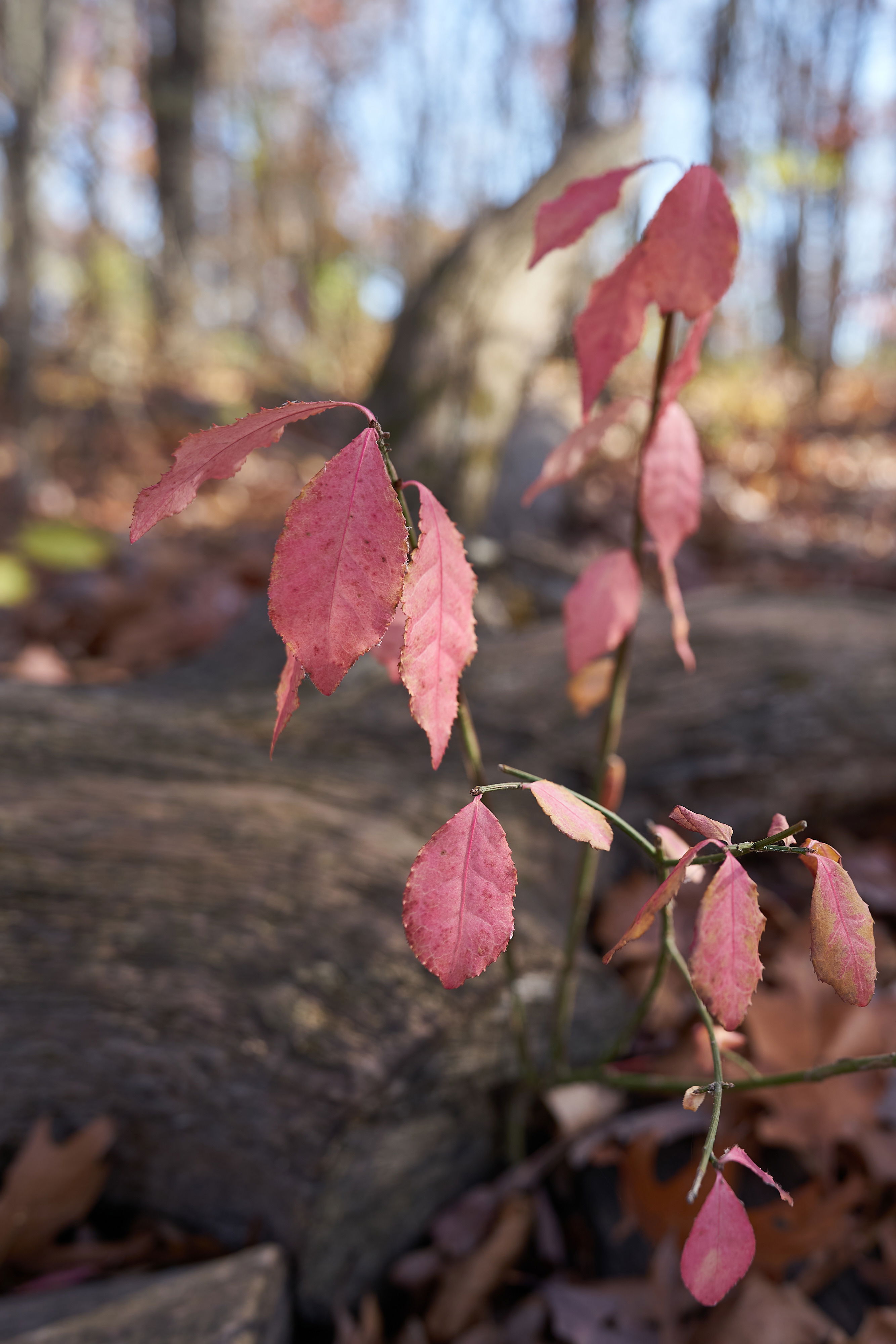
I was attracted to these pink leaves at the county park and thought that a pastel look at fall is perhaps a little unusual. I’m not sure if I’ve included too much background for this challenge though. I was playing with a 20mm lens to get close to my subject and still show the environment.
What technical feedback would you like if any?
Any
What artistic feedback would you like if any?
Any
Pertinent technical details or techniques:
(If this is a composite, etc. please be honest with your techniques to help others learn)
I cropped this to vertical and did some editing (manual vignette, clarity) to try and increase the focus on the leaves and draw them out a bit, since the dead tree has some stronger texture. I wanted to retain the more subtle colors as best I could. I’m not sure if it was successful.
 Thank you!