The photographer is looking for generalized feedback about the aesthetic and technical qualities of their image.
Description
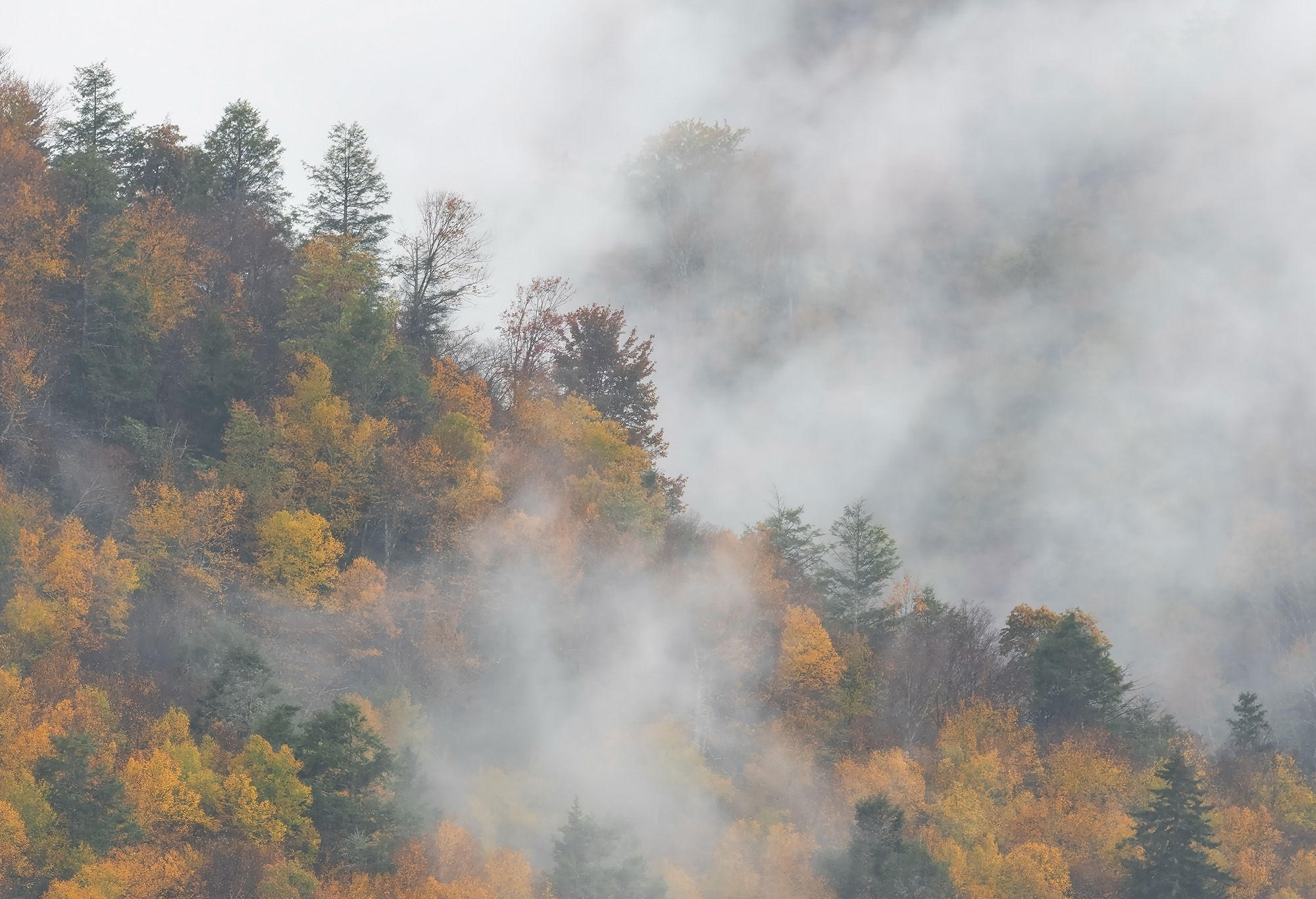
Another image from our trip in the middle of October to Blackwater Falls SP, WV. Although the colors were just a little past peak they were still quite lovely as was the foggy atmospherics swirling about. As it turned out the 100-400 was not quite long enough so I cropped the image down just enough to make these two triangles. I like how there is just a hint of trees along the BG canyon wall as it adds a bit of mystery to the scene. The rainy conditions were a little challenging, but they produced some of the best atmospherics we have ever encountered over the years of visiting the park.
Specific Feedback
Just wondering how the saturation of the autumn colors looks to everyone. I did use some dehaze on the scene trying to find the sweet spot on the saturation while retaining the mood with the fog. Anything else you notice please feel free to mention it.
Technical Details
Nikon Z 7, Nikon 100-400 @ 400 mm, f 11 @ 1/10 sec, ISO 200, Kase magnetic CPL, cable release & tripod.
Critique Template
Use of the template is optional, but it can help spark ideas.
Vision and Purpose:
Conceptual:
Emotional Impact and Mood:
Composition:
Balance and Visual Weight:
Depth and Dimension:
Color:
Lighting:
Processing:
Technical:
Another fine shot from this location under very challenging conditions, Ed. Don’t know if it clashes with your vision or not, but I added just a very slight s curve to add just a miniscule amount of contrast.
Ed: I knew this was you or Mike from the thumbnail. You guys are the masters of this area and these kind of conditions. The saturation looks good to me and I also like Mike’s tweak. Most excellent. >=))>
To tweak or not to tweak - this is a problem that I often have to deal with.
My own images show low contrast and saturation in many cases. When I am asking for critique, I usually get some suggestions to tweak contrast. For a moment then I sometimes think it is a real improvement. But later on, I become aware that this altered image does not really represent my own feelings and experiences. For people who did not encounter the moment when I pressed the shutter, higher contrast often feels better.
Looking at your original image, I think I can retrace your experience. The suggestion by Michael makes it a bit more vivid, but I am not sure if you intended this.
It is a matter of debate of course, but finally you as the artist have to make these decisions.
Thanks for sharing.
Peter
@Michael_Lowe : Thanks for taking the time to do a rework. I do like the little boost in contrast. @Bill_Fach : Thanks for the kind words; I am glad you enjoy them. We live four hours away from Blackwater so we can try to keep on eye on the weather conditions before making the trip. Of course it helps to be retired. @Peter_Richter : I always find it tricky to hit that sweet spot in scenes like this. The good thing is we can always change our minds later on. @John_Williams : I am glad you have enjoyed the first two. I have one more to share that I hope you enjoy as well.
Ed, this is another fine, moody fall view from Blackwater. My first reaction was to add more contrast, making the colors in foreground pop…but I do like @Peter_Richter point and often find that while more “pop” gets attention, that attention often doesn’t hold out for more than a quick view…and then move on. I’m a firm believer in the pleasure of looking again and again at subtler views, like this one, are good for that.
I think the saturation looks spot on for my tastes. The tendency to add more contrast and a little more pop to Fall color images is common and maybe even natural. We are out to photograph trees when they are at their peak of vibrancy. However, I agree with both @Peter_Richter and @Mark_Seaver about the initial pop from a quick view doesn’t last long and that perhaps a more subdued rendition has a longer lasting impression and makes for a desire to come back for another look. It’s really your call and you can make a case for going either way and neither is wrong. Maybe sit on it to see which way calls you back for more.
Love the trees poking through the fog on the far hillside adding really good depth to this scene. I can see maybe toning down the whites in the fog in the upper center left corner adding a bit of depth to that area.