To further pursuit more subtle scenes and trees really.
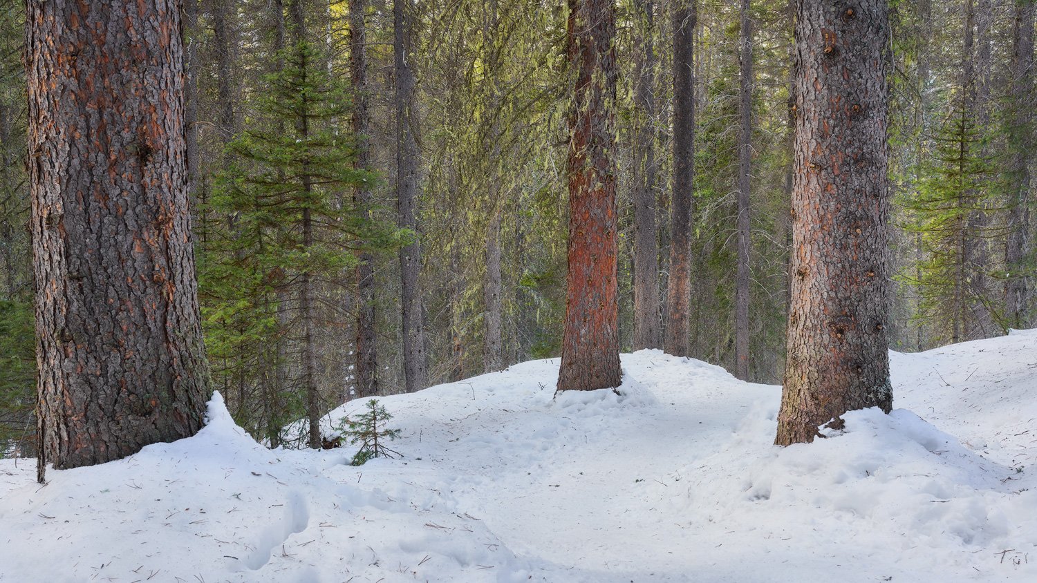
This middle pine tree just caught my attention as my friends and I hiked down trail back our cars.
The big tree to the left had some Graffiti which i cloned out .
I did slight dodging and burning to accentuate the very faded directional light that was making it through the trees.
I love images like this. The composition is simple, straightforward, and really good. I don’t see anything obvious. I just like what you saw and how you valued it.
Thanks for the feedback as always @Igor_Doncov
I ma growing a fascination with trees, often they require lots of work to simplify this was just there waiting for the black box to be clicked
A well executed forest image. These simple images can be deceptively hard to pull off in a chaotic forest setting. Well done. Personally, I tend toward slightly more balanced images so I wonder if you had considered cropping in a bit from the right hand side. The 16x9 crop is nice and you have don’t have any blown out sky in the image. I’ve attached an example of alternate crop with a small reduction in exposure on the right hand side but your version may be better as the path leads a bit to the right.
I like this nicely composed image. I especially like the convergent lines made by the edges of the snow. All in all a very simple and attractive image.
Thank you for the feedback guys
I think i would keep the original 16x9 crop
I see the case for shaving some space but the young pine in the right is important for me and initially i attempted to balance the whole scene to include it
Aref, this is a pretty neat scene I like how the soft light reveals the texture and subtle colors of the trees. The image has a calm, peaceful feeling to it as a result. The combination of red rust tree bark and green spruce needles is very appealing .
In terms of composition, I find the arrangement of the four primary trees to be nicely balanced in relation to each other. I also think a 16:9 or other panoramic aspect ratio works well with this scene. My only nitpick is the spacing on the left and the right. I think the space to the right of the right-most tree works well. But then my brain wants to see more symmetry, with some more spacing on the left (similar to equal the spacing on the right). I think you were trying to use the left tree as a framing element, but IMO the comp would feel more balanced with a slight bit more spacing on the left. The rework by @bryannelsonca aims for more symmetry by cropping from the right. I actually like the space on the right in the original (that sunlit spruce is nice), but if you retain that, then I would want to see more space on the left.