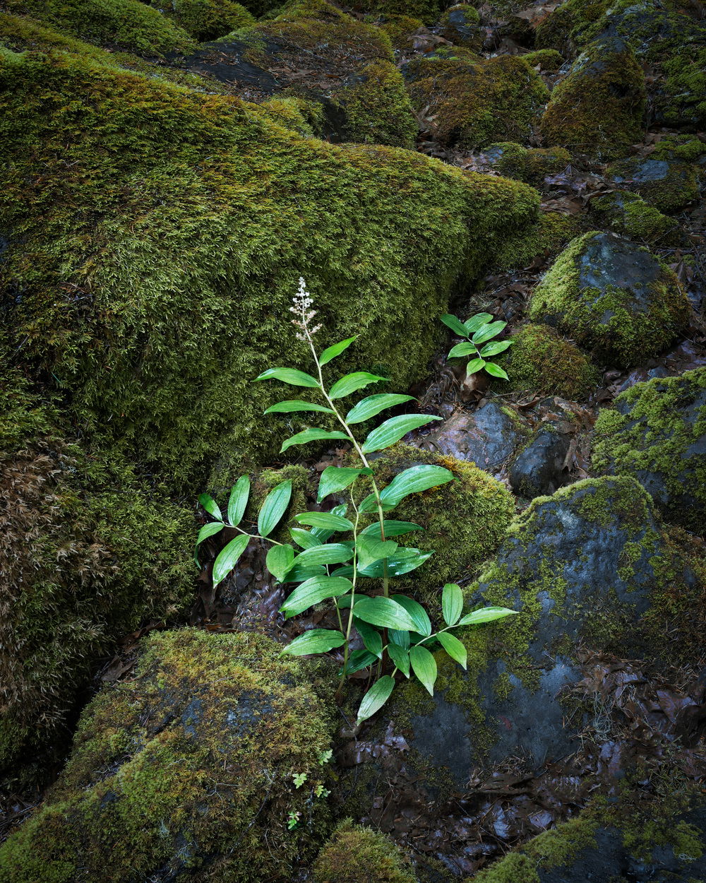
Hey Matt - I agree with various points that everyone has made!
The overarching issue is extraneous space and relatively unimportant forms and areas of brightness distracting from the main subject. To Dean’s point about the plant looking/pointing upward, I totally agree that there should be more space above, as we’re kind of led in that direction by the main subject. It would have been interesting if some of those boulders and extra details were situated in the upper-left rather than the top edge, because then this would have worked as a point-counterpoint type composition with the plant in the LR and the mossy rocks in the UL.
But as nature gave it to you, with the plant pointing to a relatively featureless/empty area, it’s more about the way the rocks cradle the plant, and the horizontally centered placement makes more sense as a result. A square crop like David suggested looks very balanced to my eye, but it does lack the extra space above and so it feels a bit “on the nose” with subject vertically centered too. Ben and Jack were thinking along the lines of cropping less and simply darkening brighter/busier distractions up there, and I agree with that.
I tried a crop right above the bottom-center triangle of moss, as I felt that was only a distraction from the subject, given how the edge of the moss exits the frame and then immediately re-enters to the right - it just feels kind of “incomplete” and not substantial enough to support the whole composition down there. At the top, I cropped below all the busy areas, and then darkened that little “hump” of moss as Ben suggested.
Ben also noticed that the plant looks a bit artificially dodged - it may be a bit bright and perhaps more green/saturated in comparison to the moss than we’d expect, but I think the biggest problem there is that there appears to be a dark outline around the bright plant. So I brightened up the dark areas right around the leaves, and I darkened the brighter, cooler leaves that seem to have a bit of a sheen to them.
I also went around and darkened various distractions and vignetted where necessary, and then brightened the whole image a bit to compensate for the then-too-dark look it took on as a result. I also lightened up the super dark crack in the lower left, and I brightened up the flower at the tip of the plant as it looked like it was too dark compared to the green leaves.
After all that, I noticed the moss around the plant still looked a bit “dirty”, but brightening it didn’t fix it. I think it was all the brown colors in the moss, so I took the hue of red in the moss areas and shifted it toward green, so there’s a bit more color homogeneity. I also darkened cyans overall, as some of those in the main plant and the rocks were pretty bright.
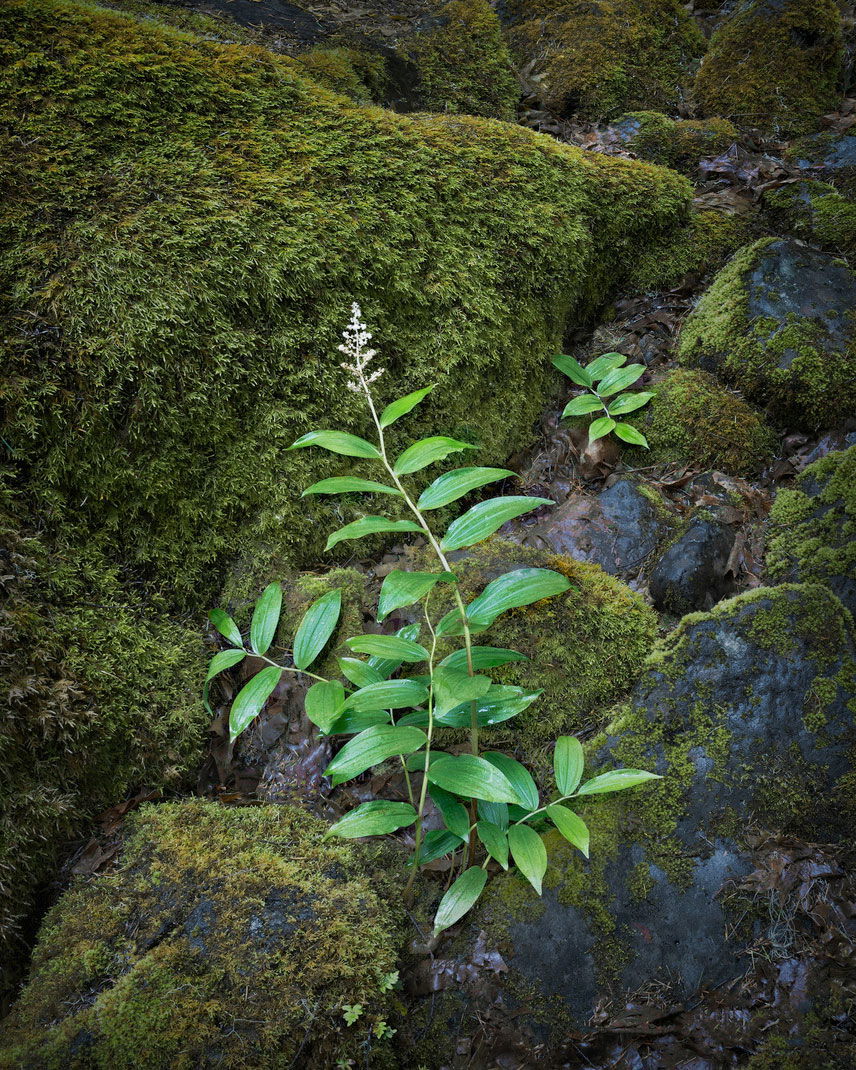
I think the result is a lot calmer and easier to focus on the main subject: