I have had a photo site on Smugmug for a very long time. It was gathering dust, so I spent the last several months refurbishing it: adding new photos, removing some old ones, and re editing almost all the photos currently on it. I would love it if you would take a look. I have two questions: first, do I have too many photos in some of the galleries? Second, which gallery/galleries did you find most enjoyable, and which least? You can find it here: https://tonysicilianophotography.smugmug.com/
Hi Tony: I haven’t made it through all your galleries. the three I’ve been through are stunning. The one thing I noticed right away in the “Sky” gallery and the “Mountains” gallery was that I couldn’t find my way back to the home screen when I was finished. The “Sea” gallery had an obvious box at the top that took me back, but I didn’t see one on the other two galleries.
Thanks for the compliment and the heads up on the navigation glitch! I don’t know how it happened, but I got it (and several other galleries missing the same) fixed. Again, thanks.
1 Like
I love the layout and ease of accessing photos (with an exception as commented below). The slide show at the beginning is quite wonderful. The images are outstanding. I noticed, as did Dennis, that several galleries (Flowers, Southwest, Death Valley, 8Mountains and the sky) do not have the “TO OTHER GALLERIES” entry on the top left. After I viewed the images in the full form in those galleries, I had to hit the back arrow several times to get back to the galleries. All in all I think the site is excellent and your images are quite remarkable.
Hi Tony,
I’m taking a slight pause from my sabbatical to offer my comments and suggestions. First off, I love and enjoy your photography and images. I also share your love of the Eastern Sierra - although you’ve got one up on me - I’ve never lived there!
I’m partial to, and my favorite galleries are Yosemite and the Eastern Sierra. But of course excellent images in all the galleries.
Generally, your site is clean, simple and showcases your work nicely. The answer to your first question is an age-old topic. Two schools of thought. 1. Too many images dilutes your message and/or dilutes the best images with lesser ones, if that makes sense. Simple is almost always good and there is a strong case to limit the number of images. In your case, I certainly don’t think you have too many. On the flip side, 2., Depending on the goal of a website, one might want a LOT of images, so vieweres (or potential clients, etc.) can search, browse and explore large numbers of images. One is not better than the other, but depends entirely on what you’re trying to accomplish.
Some comments, suggestions.
-
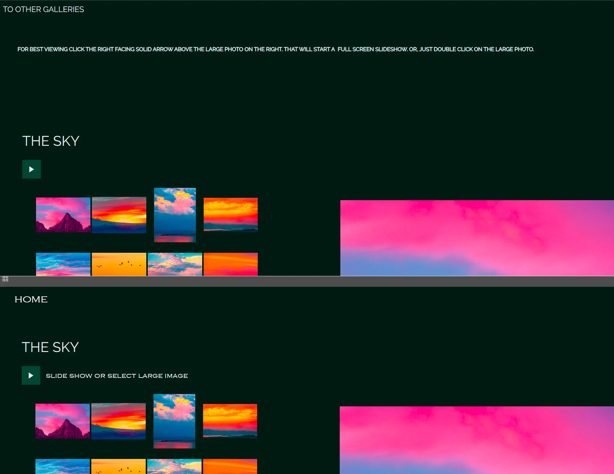
Layout - as the others have pointed out, there wasn’t a consistency between galleries, which it looks like you’ve corrected already. My feedback on the layout and navigation is that I think there is some unnecessary space at the top of all the galleries. Having that repeating “FOR BEST VIEWING CLICK THE RIGHT FACING…” is actually taking away from main goal of showcasing your images. I’ve included a mock-up below to show what I mean. I think this day and age, most viewers can deduce the large “arrow in a box” is a slideshow. If it were my site, I would re-think that layout and move the text, re-word it and/or make it smaller and less conspicuous. But of course it’s your site, so take these comments with whatever amount of salt you want…

-
In that same vein, the “TO OTHER GALLERIES” is A. not accurate and B. no really very inviting; ie. “other galleries” doesn’t celebrate the galleries, but feels more like “see more search results…” If that makes sense. So in reality, that link goes back to your Home page. You don’t have a “Galleries” page; they are included in your Home page. Either just have a "Home " link available on all pages, OR create a dedicated Galleries page. IMHO, your Home page works great, no need for a dedicated Galleries page. I would just consider changing the working of that link.
-
In the “8 Mountain” gallery, I like that you’ve added a quote and brief statement/info. It might be nice for consistency sake, to perhaps select nice quotes/text for the other galleries too? Just a thought.
-
On the image details page, there is a little “i” Info Icon. I would suggest disabling that since there is no information when you click on it. OR, you have the option of including image file details, keywords, etc. But I think for simplicity, I’d remove if you’re not going to use it.
-
This is of course personal preference and just my opinion, but a select few of the images are a bit saturated. I think mostly some of the “magic hour”, sunset/alpen glow images where the yellows/oranges are a bit saturated. But again, this is well within subjective preferences and I still enjoy those images very much.
Below is a rough mock-up. IMHO, the primary goal should be that larger image on the right, should be as fully displayed as possible when the gallery is opened. Viewer should have to scroll, and again there’s a lot of blank, negative space above the main image. Sure looks like you have plenty of real estate to modify/move the text and navigation links. Even very small text BELOW the main image that says “click to view large” is better than the long sentence up top. I’d even go so far as to say most folks would naturally click on the image. Well, maybe.
All in all Tony, you’ve done a great job doing what a photography website should do… and that is showcase your work!
I hope this helps, hope you’re doing well!
First, good for you for updating your site! And re-editing most of them - wow. Here’s my thoughts, as I go through your site:
-
The image you have on the landing (first) page, of the water drops on the green/lavender leaves is lovely, but jarring when the slide show is going because of the difference in colors. I found it a bit jarring. Perhaps just your name and logo (if you have one). Or maybe a faded-out b&w version?
-
This is really dumb of me, but upon opening your site it wasn’t immediately obvious that I needed to scroll down to see the galleries.
 Maybe have a “Galleries” link next to About Me & Contact that just takes us to the gallery list.
 -
I agree with Lon about the words at the top about clicking arrows, etc. (ha ha, I say that after I couldn’t figure out your landing page).
-
In general, it feels to me that a lot of the sunset/sky images with warm tones are quite saturated. As Lon said, that is a matter of personal preference, but I think they could be toned a tad.
-
The number of photos in each gallery feels about right to me, although Lon makes a good point about numbers of photos vs. what you’re trying to do.
-
All the images load quickly which is great!
-
My favorite gallery is the East Side, just because I like the East Side so much.
Overall, good job! You’re inspiring me to get off my keister and fix up my smugmug page. It’s been gathering dust because I felt like it would be too big a job to get it to “webpage status”.
Thank you for the kind words! And the glitches you found.
To @Bonnie_Lampley and @Lon_Overacker, thank you for you compliments and your incredibly detailed suggestions for improvements. I am very touched that you took the time do go over it and respond in such detail. I fixed most of the problems you brought up. Your comments regarding saturation were especially useful to me. When I told my wife that two people on this forum whose opinions I value thought that many of the photos were over saturated, she laughed and said “I told you so.” She thinks all of my photos, all the time, are over saturated, and like old married couples, I usually just roll my eyes when she criticizes me. I knew when I revised the photos that they were over saturated by my usual standards but I posted them anyway. It was fun to see them as eye candy. But, I know it is a slippery slope, that saturation slider, so after your comments I did decrease the warm colors in the SKY and SEA galleries. Only slightly though. I’ll let it sit that way for awhile and re-evaluate.
1 Like
Tony,
Thanks for taking the time and consideration of the feedback. The navigation/layout looks much better and definitely consistent!
Funny you mention your wife’s comments/criticism… my wife has really bad vision and doesn’t like anything that’s “fuzzy”. Consequently, she has no interest in my ICM images! ![]() Oh well.
Oh well.
Thanks for sharing!
1 Like