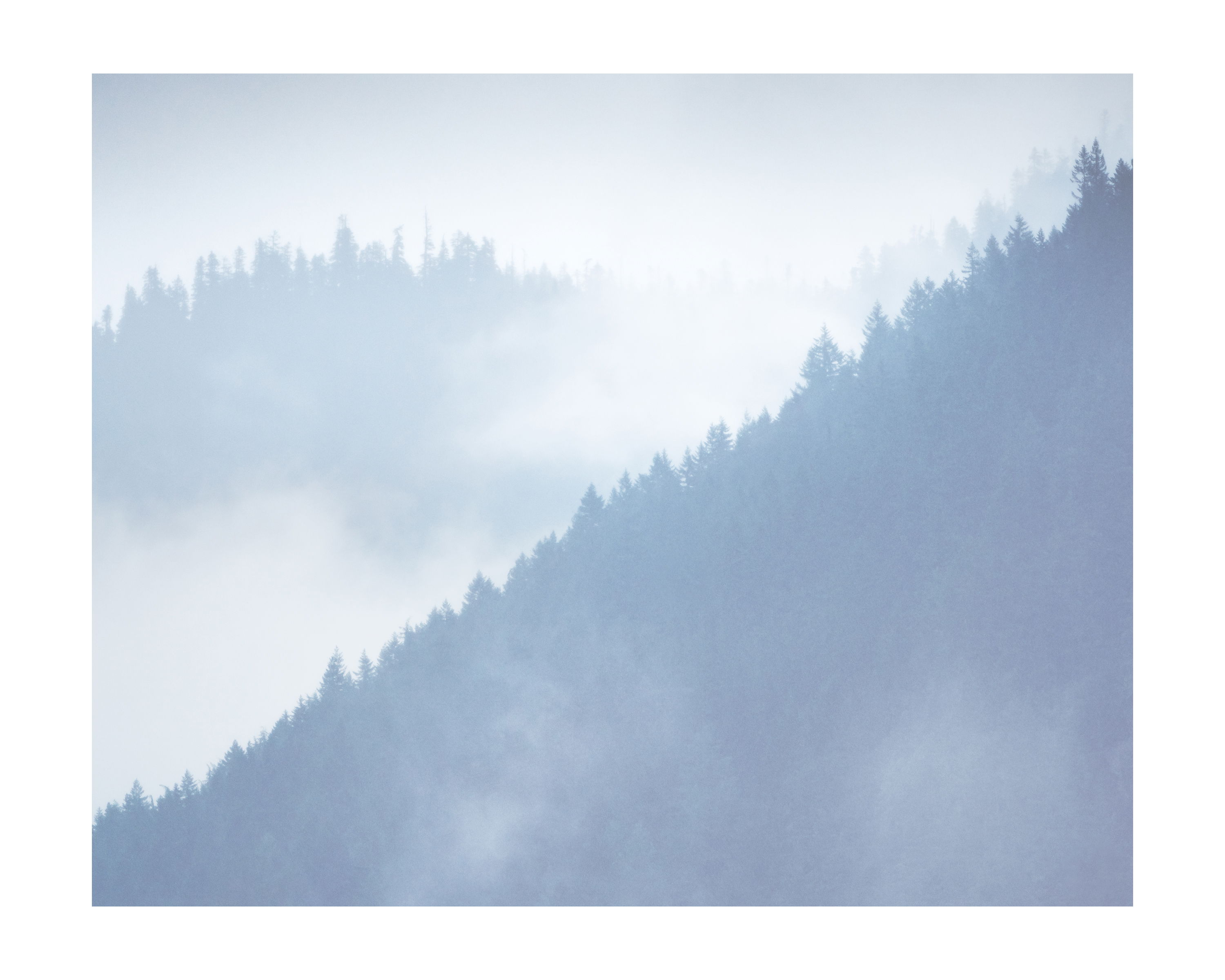
This image in a bit of an experimental composition for me. Essentially I was drawn to the triangular shapes of a ridgeline during a recent downpour.
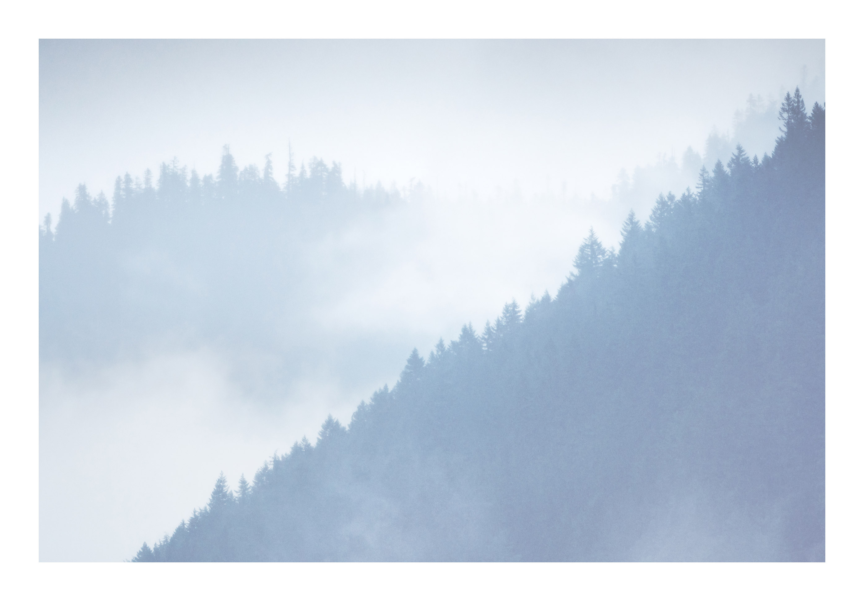
I’ve experimented with a couple of different crops but haven’t settled on anything yet. With the 4:5 aspect ratio do you find the darker forest space in the lower part of the frame to dominant?
What technical feedback would you like if any? Any improvements
What artistic feedback would you like if any? Any ideas
Pertinent technical details or techniques:
400mm, 1/500s, f5.6, ISO 800
If you would like your image to be eligible for a feature on the NPN Instagram (@NaturePhotoNet), add the tag ‘ig’ and leave your Instagram username below.
Hmmmm. You’ve got me thinking here. I was initially drawn to the 4:5 crop and then I saw what I assume is 16:9 or close. I’m love the wide crop in images and use it a lot.
However, I think the 4:5 does a better job here. I like the sense of symmetry between the two sides. It really accentuates two triangles; one dark one one light. Having the more distant trees on the light side gives it a better sense of depth. Also it’s nicely framed by the lighter tones, whereas I feel it’s a bit lost in the wider crop. The dark triangle also feels like it’s just been stuck in the corner where in the squarer format it’s more a feature.
Nathan, first, let me start by saying that this is a wonderfully moody image. These images represent an interesting case study in composition and aspect ratio.
We are talking about fairly similar images, so it comes down to very subjective and personal preferences. In Image #1 (square), I think the near ridge is too large and dominates the composition too much. but I like the subtle swirl of mist along the bottom edge. In Image #2 (pano), I think the smaller size of the near ridge is better balanced in relation to the far ridge (but you lose the bottom edge mist). In image 2 I think the near ridge creates a better proportioned and more pleasing triangle shape.
For my taste I would prefer something in-between, showing less of the near ridge, but retaining part of the bottom mist. Again, it’s a matter of personal taste, but I think I’d like a 3:2 aspect ratio to achieve this. Here is a rework reflecting my thoughts. I also think it makes the mist in the LLC slightly more prominent that in Image #2.
But frankly this is is quibbling about relatively minor issues, the underlying concept of the image is pretty strong, and the changes from one image to another are pretty minor. They all work pretty well.
Without second thoughts it’s the 2nd image. The composition is much more interesting. Yes, you lose some of the mist but more than make up for it with the comp. I might try lightening the fg ridge just a tad and see how it looks. It should remain darker than the distant hills, however. I like your second image very much.
First, let me say, I love this image. The subject combined with the cool, blue palette gives it a wonderful sense of serenity and calm. When it comes to getting opinions, well, that’s why there’s chocolate and vanilla. For me, there is no question that the 4:5 works the best of the two you presented and Ed’s third option. I think what you need to consider carefully is what this image is about - for you. The aspect ratio you choose is the one that defines your vision most accurately. What I love about the 4:5 is how grounded and contained it feels. But maybe that’s not what you’re after. I mean, it is a terrific image in any case so it comes back to your intention.
Nathan,
Hard to choose which version I like best as they all work for me. The atmospherics with the fog are spectacular and lend an air of mystery to this image. The diagonal ridgeline is lovely and adds some visual tension to the scene. Bottom line is that I do not think you can go wrong with any of them.
I really like this, Nathan. This is a great lesson on what a huge difference cropping can make. The 16:9 cropo is just fantastic and tells a completely different story than the 4:5. The 4:5 is nice enough but the pano version is much nicer IMHO. Excellent work.
Great mood and atmosphere. Seems a mixed bag of reactions between the two. Here’s my .02
I prefer the first, more compact composition. Reason? I like the juxtaposition and relationship between the two ridges better - they seem more connected, and thanks to the fog and mist. Also, the key in the first in preferring it, is because there is just a hint of mist in front of the primary ridge that makes a huge difference. Had there not been a couple swirls of fog… like in the more pano crop. The second one the two ridges are more separated and I think less connected.
Thanks fo the interesting conversation on this image. For me composition can be hard to articulate verbally or in writing but I think this discussion helps me quantify some of what I’ve been thinking about. Aspect ratio is a very powerful tool, especially for more compositions that aren’t very busy. I feel as though I still have a lot of exploration to do for 16:9 and 5:7 ratios.