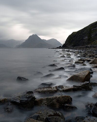
I have to admit I don’t usually go shooting when it’s pouring rain and windy. On a recent trip to Scotland I had no choice! But it’s opened my mind to a whole new area of possibilities.
What technical feedback would you like if any? Anything that comes to mind
What artistic feedback would you like if any?
I’m going for a moody interpretation here. I’ve posted a darker and brighter version. Do you have a preference? Any ideas on how to better convey more drama or mystery would be appreciated
Any pertinent technical details:
Long exposure of 30s shot under an umbrella with steady rain. The original was a landscape orientation but I’ve cropped this frame to be in portrait orientation at a 4:5 ratio. The 2:3 shot was at 29mm f9 iso 200
You may only download this image to demonstrate post-processing techniques.
Great shot, I like the moody feel you have here. For me, I like the textures the lighter shot brings out in the rocks but I like the darker clouds in the darker shot. I would even go a bit darker on the clouds in the darker image. Nice work!
@Nathan_Klein I like the openness of the fore ground of the top image, but I prefer the sky in the bottom image.
Before I offer any processing suggestions, what software are you using?
I like moodiness that rain brings, and I think you’ve done a pretty good job.
-p
l tend to agree with the previous replies. I like a little more detail in the lighter image, but much prefer the clouds in the darker image. If I had to chose one it would be the darker because it has more drama. I also like the leading line the rocks make leading you into the image.
nathan,
i like your composition, it’s got nice leading lines and an interesting distribution of elements. the long shutter speed works well here.
mood-wise i think it’s not quite there yet. i would suggest a much more dramatic approach in processing: a darker, more contrasty sky and darker background-mountains should do.
cheers,
joerg
Hey Nathan, I love the composition and the use of the curve in the foreground and midground to reach the distant peaks. Also love the setting, because, you know, Scotland!
I’d agree with the above comments in that the lighter treatment is better for the land and the darker one is better for the sky. However, i’d go further and really bring the drama to that sky. I’d also consider carefully bringing out the detail and shaping the peaks a bit more to make them stand out as the subject. Also, at the moment the colour present in the image doesn’t seem to bring much to the image. I’d consider b&w (not that I can ever do a good conversion on my images) or increase the separation between what colour is there to help distinguish detail, etc.
Good luck, and great image!
Hi guys,
Thanks for the ideas! I’ll work on keeping a lighter foreground leading to a darker more contrast mountain line. I’ll post the result tonight.
@Preston_Birdwell I use Lightroom for broad adjustments and raw conversation and then photoshop for detailed work.
@Richard_Bauld Scotland is so photogenic and so completely different to Australia! The image currently has a complimentary colour scene of orange and blue but I’ll try saturating either the darks or lights a bit more to see if the colours appear more seperate
@Nathan_Klein If you have not used them, this image would be a perfect candidate for Tony Kuyper’s Luminosity Masks. You can get the Basic V6 Panel for free.
Tony also has excellent tutorials for using the masks on his site. If you have not used his masks before, I encourage you follow the tutorials.
Another option for this image is to use Quick Mask in Photo Shop to select separately (say) the foreground, the mountain on the right, and the sky, create the masks and then use Levels or Curves adjustment layers to work those areas.
Personally, I find TK’s masks much easier to use than doing separate selections.
-P
Thanks Preston, I’m a big fan of Tony’s masks. I used them in this image to create a different white balance for the light lights versus the darks while keeping the mids neutral.
As well as luminosity masksI’m starting to use Bruce Percy’s approach to using curves for contrast adjustments - still a work in progress for me
Thanks all for the feedback. Finished image below
Looks good. You did a good job with a difficult scene.
Thanks for taking the time to tweak this one.
-p


