What technical feedback would you like if any? Any & all please
What artistic feedback would you like if any? Any & all please
Any pertinent technical details:
Canon EOS 700D
EF100-400mm f/4.5-5.6L IS USM
1/500 sec, f/10, ISO 100, 100mm
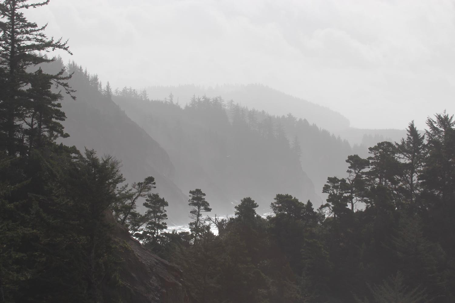
This image taken along Highway 1 in Northern California. I intend it to be moody and project that rainy kind of day feeling. Did I get away with my intentions?
So you’re hearing from a real nitpicker, so take this in stride. I’m not sure that you did get away with your intentions. I’m not getting the sense of a moody, rainy day feeling; as in like kinda gray, dark and gloom? Wet, drizzly?
Several reasons why not. This looks like bright, mid-day light judging by the contrast and shadows in the foreground. The sky is also too bright to bring across that moody look. We’ve all been on the coast during these times and so I think I know what you were after.
I think you made the right choice going with the b&w.
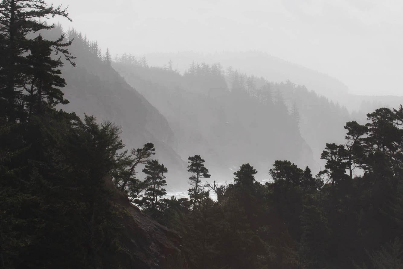
A question and an observation. First, is that a splashing wave on the left behind the foreground rock/trees? As far as processing goes, it looks like a pretty rough selection of either the sky, or the land mass - But the edge selection is pretty apparent. Hard to know what to suggest without knowing what you started with. If you want to post the RAW perhaps we can make suggestions.
Jim, I agree with Lon, this image has some technical issues such as the noticeable halos along the tree line. Lon’s suggestion to post an unprocessed file is a good one. You might be able to get better comments on how to achieve what you were trying to accomplish, if we knew what the starting point looked like.
Ed, I think I’ve convinced myself that what I posted stinks! LOL
Lon and you are on track. I want to post better landscapes then I go too far!!! LOL
However, one reason I like NPN is because I can get honest critiques. I take critiques as intended and appreciate the time you folks take to make them! They help me determine what works and what doesn’t.
Jim, I’m glad you took our comments constructively. Sometimes we get caught up in our processing and push stuff too far with edits unless we seek input from others. I still would like to see what the starting point was for this image. You might get some suggestions on how to approach this differently while still achieving your goals for this image.
Ok, since I asked, I should be prepared to offer some thoughts. First, the conditions sure don’t look very inviting for photography. I mean, the ocean mist is heavy, reducing contrast everywhere and just making things hazy. Combine that with a bright sky and you have very tough conditions, photographically.
I do think you did well in framing and composing this. I like the shallow “v” of the foreground trees and rock that frames and shows us the layers of the bg headlands as they meet the sea.
So my immediate reaction in seeing your original was black and white, hands down. The conditions mention aren’t setting up well for a color photograph. (And I notice a little reddish lens flare? at the center bottom?) I think b&w helps mitigate the conditions and hazy atmosphere. I think you recognized it in your first post by going b&w from the start.
Didn’t do a whole lot with this other than render this in the Nik Silver Efex Pro2 plugin for PS. I forget already which template I used. I also used an unadjusted Levels layer and put it in Soft Light blending mode and reduced the opacity of that layer way down to 15% (This in effect increases contrast globally). Also burned down the sky/clouds a bit. (Easy to overdo the processing with the very small rez file.)
I was tempted to go nearly all silhouette with the foreground, but I think that’s too much. so tried to leave some texture/detail in the trees, yet have enough dark to contrast against the rest of the scene.
Also cropped a little from top an bottom for a more pano look; helping to emphasize the layers of the headlands.
Not sure if this fits your vision. Just not sure where else this one could be taken.
Whoa!!! Lon, I’m smiling. What you did is a vast improvement on what I did. You hit the nail on the head! You make me even more convinced that NPN is where I belong! Thank you for taking the time and trouble with this. My PS skills are more basic and I’m far beneath your level of expertise with it.
Final comment: I’m in awe!
Btw, just posted another image taken on the Atlantic coast a few years ago.
You’re welcome Jim. And no worries, we all started out knowing nothing about processing (not saying you don’t…) but only that it takes time, lots of practice, watching videos, etc. etc… Take your time, you’ll get there.
Jim, I also asked you to post the original, so it’s only fair for me to circle back and show you how i would try to re-work this. I think you have a pretty good composition to start with, those receding ridgelines are pretty interesting, and they are nicely framed by the foreground. I like @Lon_Overacker re-work, it creates a very dark and moody image that I like very much. I probably would have gone in a similar direction first, if I hadn’t already seen Lon’s rework.
So instead I’ll take this in a different direction, with a lighter look, just to mix things up. I actually think the receding ridge lines are more interesting than the clouds, so I cropped away some of the sky. I reduced the exposure in the sky, and added some mid-tone contrast to the overall image. Then to enhance the misty feel in the ridge-lines, I added some Orton effect for a glow in the highlights, using TK actions. These techniques may be beyond basic Photoshop skills, but stick around at NPN, look at comments made on other’s images, and over time you will see things like this discussed in detail. Here is my re-work, trying for a lighter look. I think this look does provide the feeling of misty day.