The photographer is looking for generalized feedback about the aesthetic and technical qualities of their image.
Description
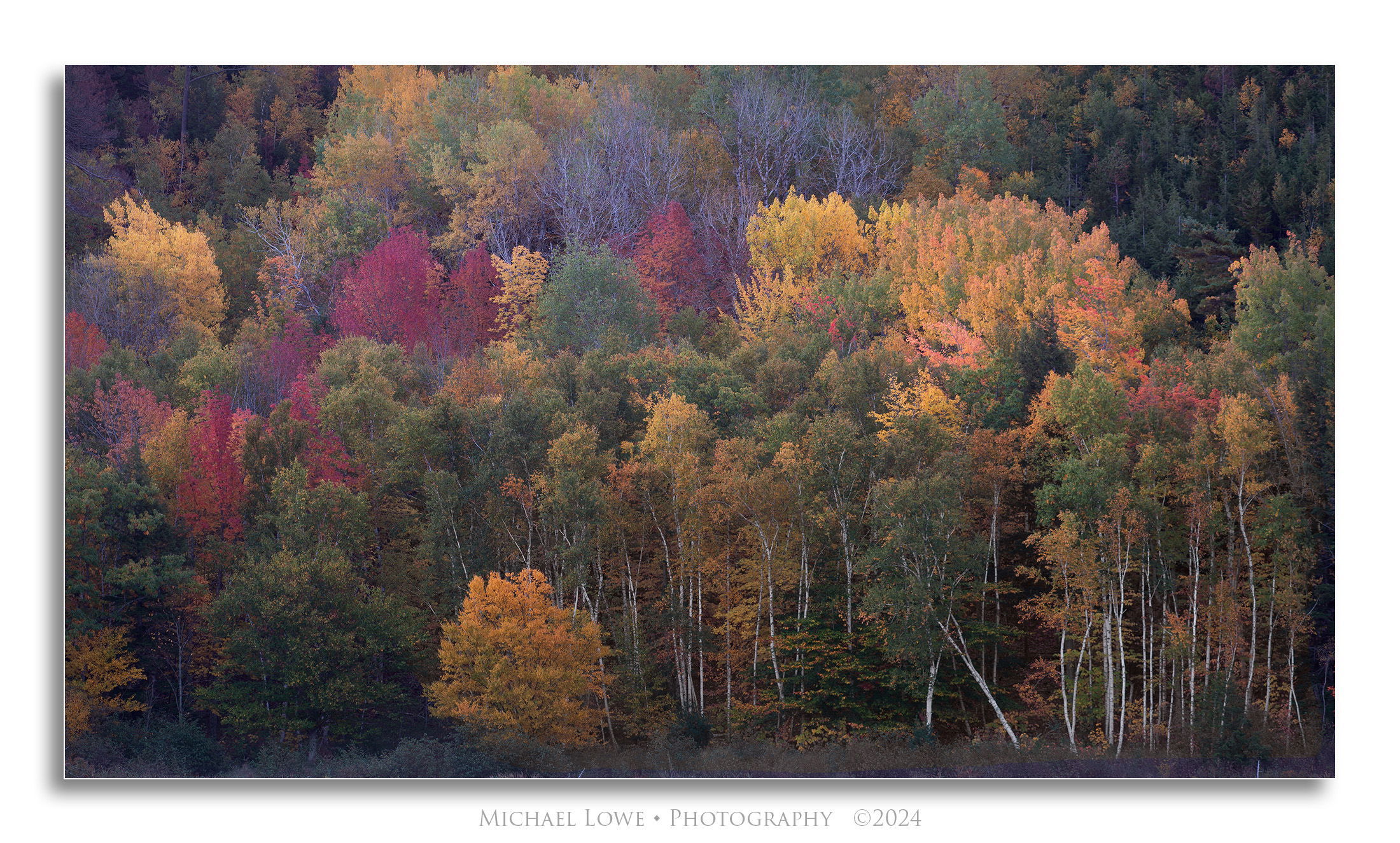
This is an image I’m thinking about submitting for a project for the Natural Landscape Photography Awards.
I leave my cameras always on auto white balance. My Nikon seems to render a lot of blue in images especially bare trees. Sometimes I like the result and sometimes I don’t. Here I think it adds to the nice color palette. I removed it from the lower birches. What say you. I would like others opinions before I submit. And anything else you notice.
Specific Feedback
Beside my question any and all feedback or critiques is always welcome.
Technical Details
Nikon D800, 112mm, 4 sec @ f/8, ISO 100
Critique Template
Use of the template is optional, but it can help spark ideas.
A lovely capture! But it feels a bit low in contrast, and the bare trees at the top feel too blue. The trunks at the bottom feel good. If you haven’t changed the WB from Auto it might be worth playing with the WB/tint sliders, or even digging into the Process sliders. My Canon tends to lean toward reds if left unchecked. Interesting that your Nikon seems to go toward blues.
If it’s allowed for the project, you might remove the orphaned trunk in the UL corner, or darken it.
Michael, this is a gorgeous fall scene. The composition is excellent. As always if the focus and composition works it’s personal taste from there.
I would experiment with color and contrast ideas a bit more. I took a few minutes and set the black & white points, a bit of contrast and lowered the blue saturation too. Just some ideas.
What a gorgeous autumn scene. I’m really enjoying the compact compsition; compact in a good way, meaning how you isolated and extracted this little scene from the broader view. The composition is well balanced and the variety of colors, trees shapes, etc. allow the viewer to explore the entire image. Very beautifully seen and captured.
I also am not aware of the NLPA constraints on editing/processing, although in general I think those edits are supposed to be minimal and apply primarily to color, WB, exposure type adjustments. So I’m not sure if cloning out a tree trunk is permissable. I too noticed the one in the ULC. The good news is that it’s fairly dark and doesn’t reall draw the eye too much. Now there is a little bright stick or object in the LRC that is a distraction for me. Again, not sure if remove is allowed.
The main suggestion I have goes right along with the previous comments. I agree that this seems a bit low in contrast, almost murkey. I’m pretty sure the colors and saturation are accurate, and so it goes back to how much processing is ok? I tend to punch things up to the limit of what I think is “reasonable” - but that is always subjective.
I do think the image, content, framing, etc. are most certainly worthy of submission. I would only question the contrast and color/sat.
Another beauty deserving of a large and fine print!
Thanks @Paul_Breitkreuz , @Diane_Miller , @Ben_van_der_Sande , @Lon_Overacker for the comments and suggestions. @Paul_Breitkreuz , your rework is something to consider if I ever wanted to print, but iss probably beyond what is allowed in the contest. They are very strict about too much processing. @Lon_Overacker, you’re right the image does look kind of murky. I could probably get away with some minor curves adjustments but not too much. @Diane_Miller, removing anything is not allowed unless it’s something transient like a leaf or twig. Even too much cropping from the original raw is frowned upon.
This is a classic New England scene beautifully rendered. It does seem a bit ‘murky’ and the rework is an improvement, especially the pronounced white birch trunks but the upper part looks a bit brighter than I would like.
Hi Mike,
This looks like Beaver Dam Pond. Have you decided on what your project is going to be? My only suggestion is the already mentioned murky. I think the sweet spot for me would be something between your original version and the rework by @Paul_Breitkreuz. I do like the framing of the scene and the autumn colors are gorgeous. Beautifully done.
Michael, this is a very inviting fall scene, with a fine mix of colors, set off nicely by the tree trunks in the lower right. If you’re shooting RAW, the camera doesn’t care what your white balance setting is, that only effects the in-camera jpeg conversion and it has no effect on the processing unless you set it during processing. If you look at the NLPA winners over the years, it’s clear to me that they mostly include quite a bit of saturation, so turning up the contrast here would fit right in.
I do agree this is a tad murky; the slight blue balance may be part of that. (I find cameras sometimes head toward blue if there are really strong yellows in the image.) I also think a bit more pop in contrast is an idea to play with.
To my knowledge NLPA frowns on cloning, but are pretty okay with targeted luminosity adjustments.
Another beautiful Fall scene, Michael. I was actually enjoying those blueish trees in the middle of the frame and it’s what made me open this image up. Yes, they are not natural looking but I find them to be really beautiful. I also love that aspen in the lower right corner leaning. I agree with what some of the others have said about this looking a little bit washed out. I wouldn’t go too far to correct it and it could also be exactly what you want for this image but I think just a little bit of pop might help this and you need to stand out out if you are submitting this to the NLPA.
With that in mind and knowing that you can’t clone anything except dust spots I would burn that tree trunk in the ULC, add some overall light to the ULC since it’s much darker than the rest of the image, add a little bit of pop to clear up the washed out look but I think I’d leave the blue in those bare trees. I really like that blue. I’m not sure how the judges will feal about the blue and it’s certainly a risk to include it but it’s why I opened this image up. Oh, and I just found a couple of things that could be burned along the bottom edge of the image. In the very LRC there is a white branch coming in from the frame. Burn that all the way down. There is another smaller branch sticking up out of the bottom of the frame just to the right of that yellow aspen just left of center.
I think @John_Williams edit is nearly perfect for the colors but I would still bring the black point and shadow detail out in the ULC since it’s still quite dark.
Oh boy, this one’s a real treat. I do prefer @John_Williams edit of the image as the colors feel more accurate and have a touch more pop. The trunks in the bottom right that form an X are interesting because my eye is drawn to them, but then continues exploring the rest of the image before darting back to them. That’s not criticism; just an observation. Bravo, Michael!