PS: Agave

Project Images

Gallery Overview

Individual Images


Image 1


Image 2


Image 3


Image 4


Image 5


Image 6


Image 7


Image 8


Image 9


Image 10


Image 11


Image 12

Project Description

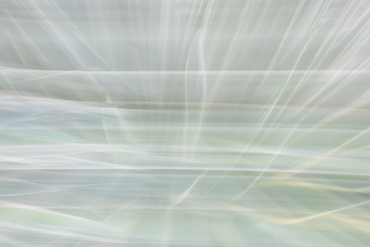
This project began in the back yard of a Palm Springs house I rented in the Winter of 2026. It began on a whim: “I wonder what these would look like with a Zoom Exposure technique?” However, it evolved into a regular practice of playing with both ICM and zoom exposures of this cluster of Agave in both sunny and shaded conditions. Initially, the series was almost entirely high key in my approach to shooting and processing, but as I got deeper into the subject, my color considerations deepened as well.

Frequently, my photography projects quickly develop a kind of symbolism–a connection to a larger concept, what Alfred Steiglitz and Minor White might call an “equivalent.” In the case of this project, however, that has not yet happened. It remains an exploration of agave color, shape, and line, and perhaps a bit of a desert vibe.

I entitled it “PS: Agave” for several reasons: One is the obvious connection in my mind to Palm Springs, a place I love to visit, and a place associated with the agave and the the swimming pool colors of mid-century modernism. The other is the familiar if now dated concept of a post-script (information added after the body of the message). To me, it works as an identifier of the subject of the project, and also as something that goes without saying (as in PS: I love you, or PS: Please write back). So that works here as well.

Self Critique

What I like about this project is the variety in colors and shapes achievable with basically the same 2-3 agave plants in a single location. I love the cool breezy desert feel of most of the images.

What I feel could be improved are the following:

  1. The sequencing
  2. The symbolic conceptualization or perhaps refinement of the intended emotional impact

Creative Direction

I do have some specific looks and impacts I would like this project to evoke in a viewer:

  1. Breezy light and free experience of sunny, desert escape
  2. The ephemeral and occasionally surreal effect of being without commitments or the structure of time
  3. A sense of the infinite

Specific Feedback

Always eager for all feedback, as you all know. I’m open to it all. Specifically:

  1. Do any of these images feel out of order or out of place entirely (i.e. should any be removed)?
  2. Do you connect with the conceptual and emotional experience that I have described above, regardless of your experience with the California desert or Palm Springs
  3. Do you see a completely different direction to take with sequence or what to include and exclude?
  4. Do the wider views (first and last) fit and add to the experience or detract from it?

Intent of the project

Gallery on your website

Additional Details: I will likely upload this to my Adobe Portfolio, and I might offer to print a couple of these big, face-mounted on acrylic for the host at the rental house in exchange for a reduction in next year’s rent (lol!). The art work in that house kind of sucks!

Alternate Images

Please provide feedback on whether any of these images would fit more cohesively in the project.


Alternate Image 1


Alternate Image 2

Marylynne, you’ve got some great material here. However, I don’t know what your thinking of in terms of what will you do with these. If your thinking about a wall mounted group, I’d suggest that you put one darker image in the center (or near center, if not in a balance group) and leave the second dark one out (I like image 8 better). You might also want to consider their directionality as some are very symmetric while others “point” in specific directions. That can be used to lead the viewers eyes around/through the group.

I’m especially taken by image 9. It’s very dreamy, while the prickles on the leaves add a nicely subtle emotional contrast. The bit of yellow in the upper left makes a nice visual surprise.

If your thinking about an online or projected show, then you need to use some of the slightly darker images as a visual transition between the darker one and all of the bright ones which gives you the opportunity of pulling a few more.

I’d suggest a discussion with the house owner, because the shape of the print may be important when it comes to placement. There are several that would look great, large and on a wall.

Hi Mark,

Thanks for the feedback. I definitely don’t expect to present these as a wall mounted group. There are just too many and too varied. I could see a diptych, but really, I’m aiming for my online gallery.

For the house decor, I would just pick one for the living room and one for the dining room as a suggestion for them. See whether they are interested. The high key radial ones would look best in their home. Probably numbers 4 and 5.

Hi Marylynne. These images are all pretty special. To me, the weakest image is #12 and it doesn’t feel like it quite fits with the rest with all the hard lines in the brighter area. In my very humble opinion, I think #4 and Alt 2 would make the best opening and closing images as they’re more neutral in directionality than the other images. I can’t decide which of those I’d use as the first and last . Of the remaining, I’d be inclined to go: 1, 2, 3, 7, 5, 6, 11, 9, 8, 10.

P.S. I’m not sure about Acrylic for these. Somehow it just doesn’t feel appropriate, but then I haven’t seen many acrylic prints.

Thanks Dennis. I’m waiting for more feedback before making adjustments. I was unsure of the one with a bit of the house. # 1 shows sky and some white so I thought it might work. I like your order. I want to get both directionality and tonality figured out before adding it to my online gallery.

I like the shiny and frameless quality of acrylic fur images without a lot of texture or grain, and I think it’s more durable for a rental home. Of course, they might say, “ no thanks we love our contact paper wrapped over a frame.” Regardless, I’ll stay there again next year and probably shoot a few more of these,

Marylynne: Hearty congratulations for the effort to put this together. I’m not sure my generally short attention span would lend itself to such a project. All of these are excellently conceived and captured I I can only imagine the time you had to put in on concept, capture, selection and processing. Seeing all of these together on a wall would be mesmerizing. Many kudos and :+1: :+1:>=))>