Please share your immediate response to the image before reading the photographer’s intent (obscured text below) or other comments. The photographer seeks a genuinely unbiased first impression.
Questions to guide your feedback
Is it interesting as a photograph? Or is it just some shades of greens and grays?
The title gives it away, but is it reminiscent of anything else?
Does it evoke a particular feeling? season? mood?
Other Information
Please leave your feedback before viewing the blurred information below, once you have replied, click to reveal the text and see if your assessment aligns with the photographer. Remember, this if for their benefit to learn what your unbiased reaction is.
Image Description
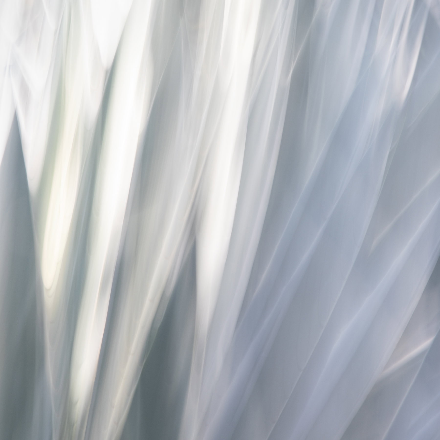
After sharing several other agave images last month, I came across another whole afternoon of shooting that I didn’t even rate or look at until yesterday. I’m curious about any suggestions for this one:
Is there any part of it that you find most interesting?
I didn’t do much in post on this one, so I’m interested in whether you would want more color? more brightness to go fully high key, etc.
Technical Details
Canon 5DIV with 24-105mm zooming between something and 105mm
ISO 100, f/22, .6 sec, zoom exposure
Shadows raised and contrast increased slightly, sharpened, and lens corrections are only processing
Specific Feedback
I know I’ve been throwing a bunch of agave images out there, and I am wondering if this one has some interest value in that context. It’s very different from the others–whiter, less zoom blur, more abstract, I think.
I’m not sure why, but with the subtle tonal variation like folds of cloth and the removal of almost all the green my first thought on seeing this was wedding. It’s a beautiful image.
Reading the questions in your description, I’d say all parts seem to play pretty equally in the composition, though the very upper left does seem to be at the point of starting to lose definition due to its brightness. I like the lack of color and I wouldn’t go high key.
A fine abstract here, Marylynne. As far as any thoughts of evoking a given genre or other ideas, I might go with a close up of a sawn plumage maybe? Or a delicate handheld feather fan? Regardless, just a fine image overall…
I do agree with @Dennis_Plank on the brightness in the ULC area. Maybe some changes on gamma intensity there would be a good idea. Just a thought…
I quite enjoyed this image and wanted to keep looking at it. I particularly enjoyed the way that the folds provided a medium for the subtle tonal changes - between light and darkness and back again. Lovely abstract.
Marylynne: First impression? . Just beautiful in every way for me. The soft color palette mixed with the dynamism of all those wonderful lines really resonate with me. Well seen, composed, captured and presented. >=))>
Thanks, everyone. I did a little reduction of the highlights and whites via a linear gradient from the upper left. It created a brownish hue, so I cooled it to keep the corner in the same palette. I’m not sure it made much of a difference.
@Paul_Breitkreuz: Gamma intensity? I use LR, and I’m not sure I have that function, unless it goes by a different name. I used to adjust gamma in Photomatix Pro when doing exposure blending.
@Marylynne_Diggs this looks very good to me. The Gamma slider is in PS. Layer>Exposure>Gamma. I use it when an image is almost too hard to look at with it’s “intensity” if you will. I’m sure there are many other tools to obtain the same results. I do not use LR although I’m sure it has a similar adjuster too.
By turning down the Gamma I find it may take turning up the Exposure & Offset to provide the same look without it burning my old eye pupils…