The photographer has shared comprehensive information about their intent and creative vision for this image. Please examine the details and offer feedback on how they can most effectively realize their vision.
Self Critique
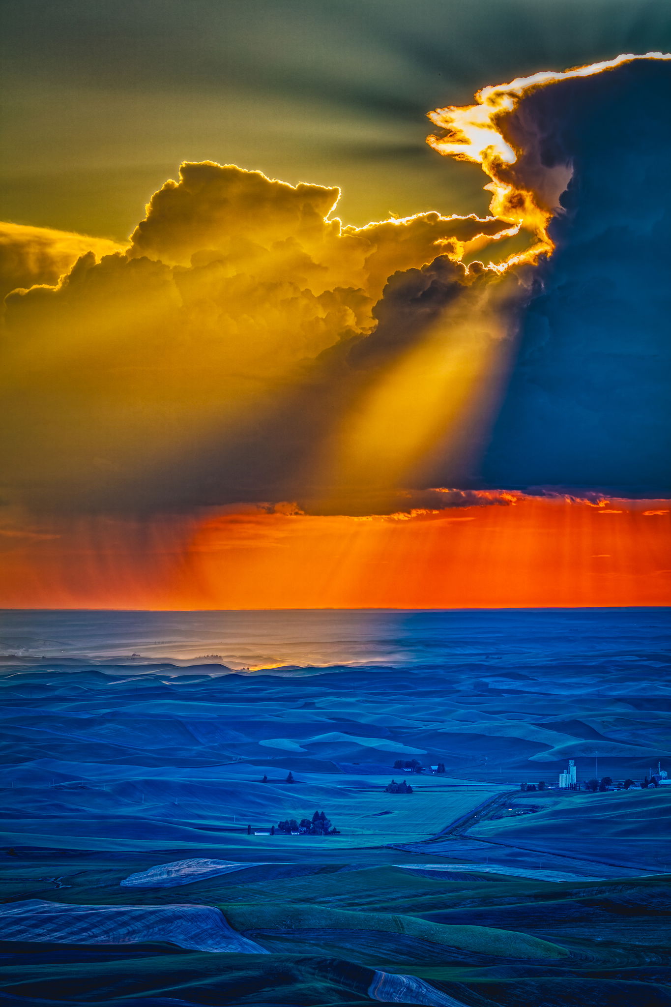
The bas relief effect in the area where the sunbeam strikes is my favorite part of this photograph. The abstract colors, the shapes, and the textures in the foreground are something I like. Overall, the effect is pleasing to me.
Creative direction
I was lucky to get this storm during our one and only trip to the top of Steptoe Butte. We had all the different weather effects while we were up there. Perhaps it was a compensation for the first time we showed up and the road to the butte was inaccessible due to paving on the highway leading to the area.
Specific Feedback
Since this is so abstract, I would imagine the emotional aspect is going to be the most dominant.
Technical Details
Canon 5DsR, EF 100-400 II + EF 1.4X III @ 140mm, f/8 @ 1/200, ISO 100. Tripod mounted. This was HDR processed in Aurora 2018, ACR, and Photoshop CC.
Description
We had tried to go up the mountain in the fall of 2016 and the road was closed. This time we showed up at the end of May, 2019 and made it. We did not go all the way to the top since it was a zoo up there. We stopped on the long curve on the southwest side and it was great. As I said, the weather ran the gamut while we were there and this thunderstorm was a very happy addition to the session.
Critique Template
Use of the template is optional, but it can help spark ideas.
Vision and Purpose:
Conceptual:
Emotional Impact and Mood:
Composition:
Balance and Visual Weight:
Depth and Dimension:
Color:
Lighting:
Processing:
Technical:
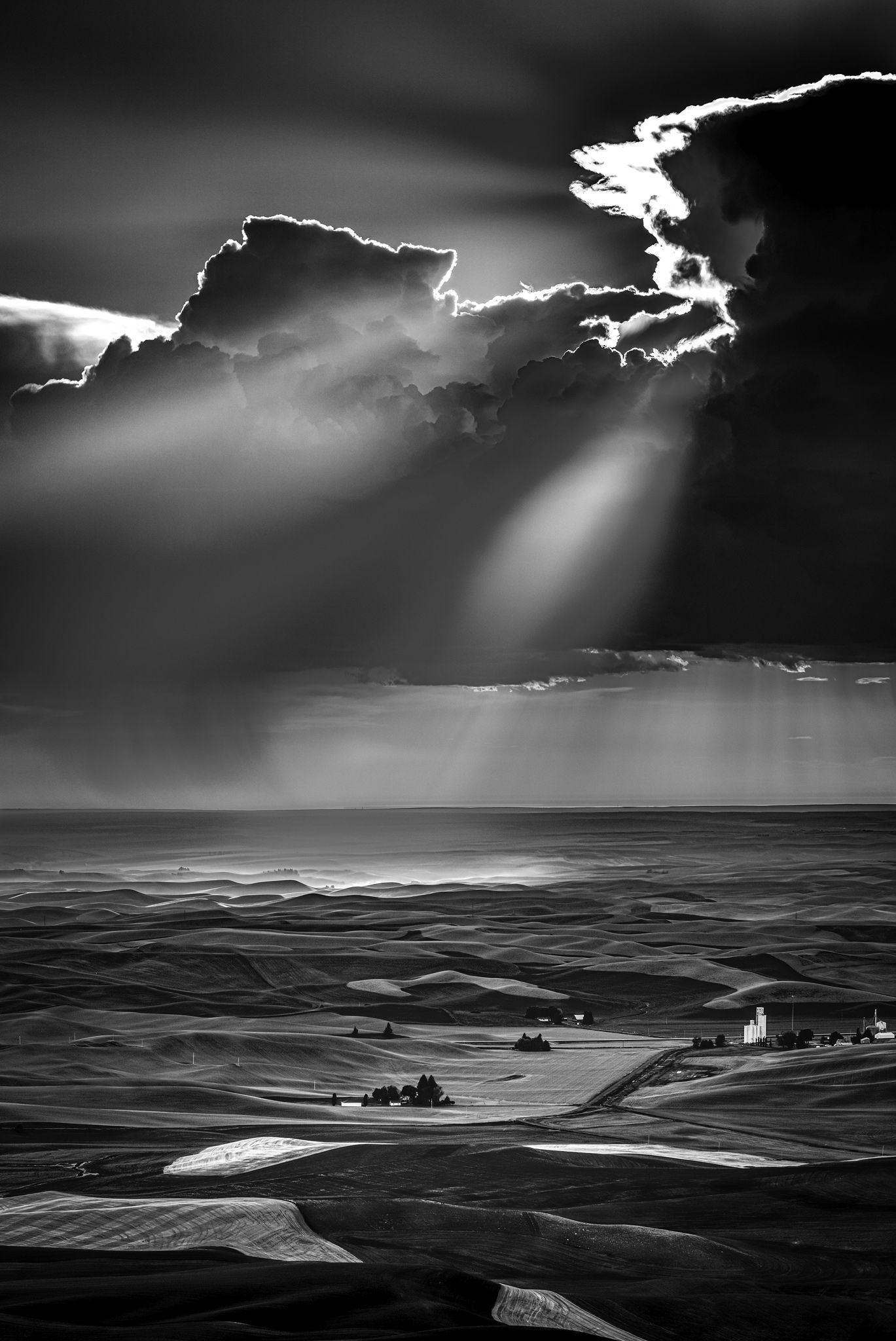
WOW! It doesn’t get more epic than this does it? It’s an incredible image of an incredible moment. Nicely done. If I had any critique it would be the small buildings against the left side of the frame are maybe a little craped. It is minor however.
@Michael_Lowe Here’s one for the other end of the spectrum. When I used to race cars, the saying was “If you never go past the limits, you’ll never know where they are.” I went right out there on this photograph. The cross-colored lighting is very strange in the original image and it was easier to either go strange or go monochrome.
I prefer the monochrome. Actually has more drama. Question: did you make the mono from your saturated color photo, or start with the RAW and convert to mono?
@Kent_Bossange I started over using Affinity to make a new HDR composite file and then processed it to get to the monochrome. The color file was originally made using Aurora 2018 HDR software which always created oversaturated files for me. Things (and I) have changed over the years. I seldom use dedicated HDR software now. I tend to use Dx0 PhotoLab 9 on photographs that are exposed to the left because I like the interface. They go through ACR and Photoshop CC for the final output. I have to say the new Affinity by Canva is pretty darned good for older photographic files though.
Hi Fred,
This is quite the view for sure and those light rays are very special. I much prefer the B&W version for it’s wonderful tones and mood as I find the colors in the original way to oversaturated and unnatural . This is just my opinion of course and may not be your vision for this image.
I had a similar reaction to the color version. A bit too saturated, with the sky too green and ground too blue.
The monochrome version is a different story. As I look at the two together, the scene may have felt like amazing color in the field, but it translates better as tonality. That’s the real drama.
One thing I love about this community is how well we help each other see possibilities. I know that as a photographer, I can get really focused on one aspect of an image and lose sight of alternative approaches.
Even if you still prefer the color version, you now have a spectacular alternative to it.
@Ed_Lowe@Michael_Lowe@Marylynne_Diggs Thank you all for your considered comments. I like both versions for very different reasons. I do appreciate your opinions and I see where you’re coming from. My background is in graphic arts which has driven me in some fairly outrageous directions at times. Not quite Andy Warhol but definitely not Ansel Adams.
I’m right with the others Fred. I’m often not a fan, as you know, of HDR, but it definitely works better for BW in my humble opinion. The black and white is a much better photograph to my eye, and the spots of light work very well in that version.
@John_Williams Thank you for your remarks. It seems to be unanimous. In the past, I’ve been really into HDR processing. My personal goal was always to create images that weren’t obviously put together with HDR software. I have seven different applications for doing it, three of which are specific. They all result in different versions of the scenes. I have, however, found that the newer digital sensors will often work very well using a single expose-to-the-left frame. If the range of light is too great, it’s still possible to use the software. I still always shoot brackets but don’t use them all consistently.
I much prefer this version, I think the original is over saturated, but this is very nice and accentuates the composition and the great light better. It also makes the sun spot on the ground in the distance more noticeable and helps move the eye through the image. If you can tone down the highlights in the clouds in the upper right I think that would help as well. Well done!
Just seeing this one now, sorry about that. The color version just doesn’t do anything for me. Maybe if it was posted in the abstract category but in the landscape category, the color version is just to much for me. However, I saw the black and white version that you posted and it’s a MUCH better image in my opinion. I very much like the black and white and the huge dynamic range you achieved here but like many here, I’m not at all a fan of HDR, particularly the old HDR when it first came out and produced garish images. Your black and white I find to be beautiful though. Thanks for giving us a different look.
Thanks to all again for your comments. I fiddled a bit with the photograph but I’m wondering if it’s worth it to go back all the way to the beginning and toning down the highlights on the edge of the clouds. The highlights are totally blown on this version. Addendum: After going back to the original frames, even the darkest one is pretty much blown in the cloud highlights. The Canon 5DsR is not particularly amenable to shadow lifting in any case. I’m going with what is there in this version.