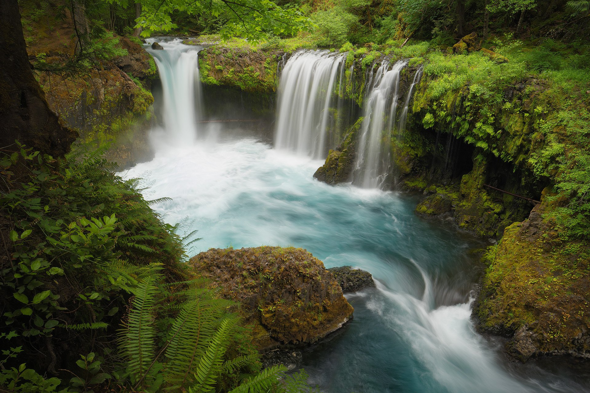
It took a lot longer than I expected, but here is the promised fall image I took of Spirit Falls in October when visiting with @steve_kennedy . (It’s been so long, I’ll post the spring version again for comparison below.)
Despite the fact that it rained most of the long weekend we were out exploring (although fortunately it gave us a break while here), the summer had been so dry that the water flow was restricted to the main falls. In addition, the water wasn’t as cyan as it is in the spring; I’m not sure why.
I would like to have returned in a couple weeks to see if some of the green vegetation on the far wall had fall color, but that wasn’t in the cards this year. Maybe next time…
Specific Feedback Requested
As always, all thoughts and feedback are appreciated.
The composition was a little tight on the sides, but wider brought in competing elements and in the end I stuck with this. Does the image feel too restricted?
Technical Details
Is this a composite: No
NIKON Z 7II
NIKKOR Z 24-200 f/4-6.3 VR at 24.0 mm with a variable neutral-density filter attached
1/8, 0.5 and 1.6 sec. at f/5.6 and ISO 64
Truth in Blending Statement: Four images, two manually blended for depth of field and two more for water texture/pattern.
It’s interesting how much the fern in the llc adds to the image. It balances out the bright area above the falls. Without it you would have a 50/50 light vs dark image. I also prefer less narrow verticals. However, I prefer the vertical to the horizontal, which feels like a less personal image and more like something to showcase the falls at a visitor center.
Hi John! This is nice. Your photo here is definitely better than mine. I like the fall color you got in the upper left section and the ferns, especially the bottom left as Igor mentioned, really balance the scene. You got me thinking I should take another look at my photos from that trip and post a couple more.
When I looked at the smaller image, my first thought was, wow having the white water exit the frame in the LRC is kind of a brave move in terms of composition. But when i looked at the larger version, I came to appreciate how the rest of the image is super well composed, and balanced, and the white water water placement just fits with the rest of it really well, It just plain works. And I also noticed you did the same thing in the horizontal. I think the water creates balance against the ferns in the LLC.
My suggested tweak for this image is subjective, and whether you agree with it depends upon what goals you have for the image. I think both the yellow leaves in the ULC and the waterfall are strong visually. If your goal was to emphasize the falls, I might suggest slightly de-saturating the yellow leaves directly above the falls. Maybe this helps, maybe not…
John, both this and the spring image are excellent. I will admit that the three spouts and turquoise water make the spring version my favorite. (BTW, the turquoise color is usually suspended very small dirt particles, which makes sense when dusty snow melts or the excess melt is picking up some extra very fine grained sediment. Glacial runoff is one of the best places to see this color.) I’m with Ed in thinking that the yellow leaves in the ULC are taking interest away from the falls. My thought was to crop down about half way from the frame to the top of the falls, but Ed, desaturation may work as well or better. The balance between the exit flow and the falls look great.
I have to say that both versions of this waterfall are flat out gorgeous, John. What I find so amazing is the lushness of the surrounding greens in both seasons. The way you arranged the water to flow diagonally in the scene is perfect IMO. I could see de-saturating the yellow leaves just a little, but that is more of a personal preference. Both images work equally well, but I am partial to the horizontal because of the lovely aquamarine color of the water.
I’m sorry that I’m so late to the party here John but this is just terrific. All has already been said but both images are just extremely well composed. I am picturing you literally hanging on the side of a cliff trying not to slip, to get these images. Maybe not true but that’s what I see. I must say that as much as I like the portrait view I just love the balance of the landscape view. I think it’s the bright yellow fall colors in the ULC that are pulling my eye where everything else is just so green. I also love the water texture in the landscape image and the color of the water better. Two incredible images John. And to think you have others that you have not gotten to yet…Wow!