@Steve_Kennedy and I took three photography trips last year, and all three had significant rain and/or fog; I think we were a little stir crazy from it by the last one. One plus side though, was that on the May trip Spirit Falls had a massive water flow.
Normally a spring/early summer feature at Spirit is the turquoise color of the water, but an interesting negative of the high flow is there is so much air in the water that the color is much less obvious. (I’ll post an example of that below.) The falls, on the other hand, are nicely massive. It’s hard to convey the energy and experience in a photograph.
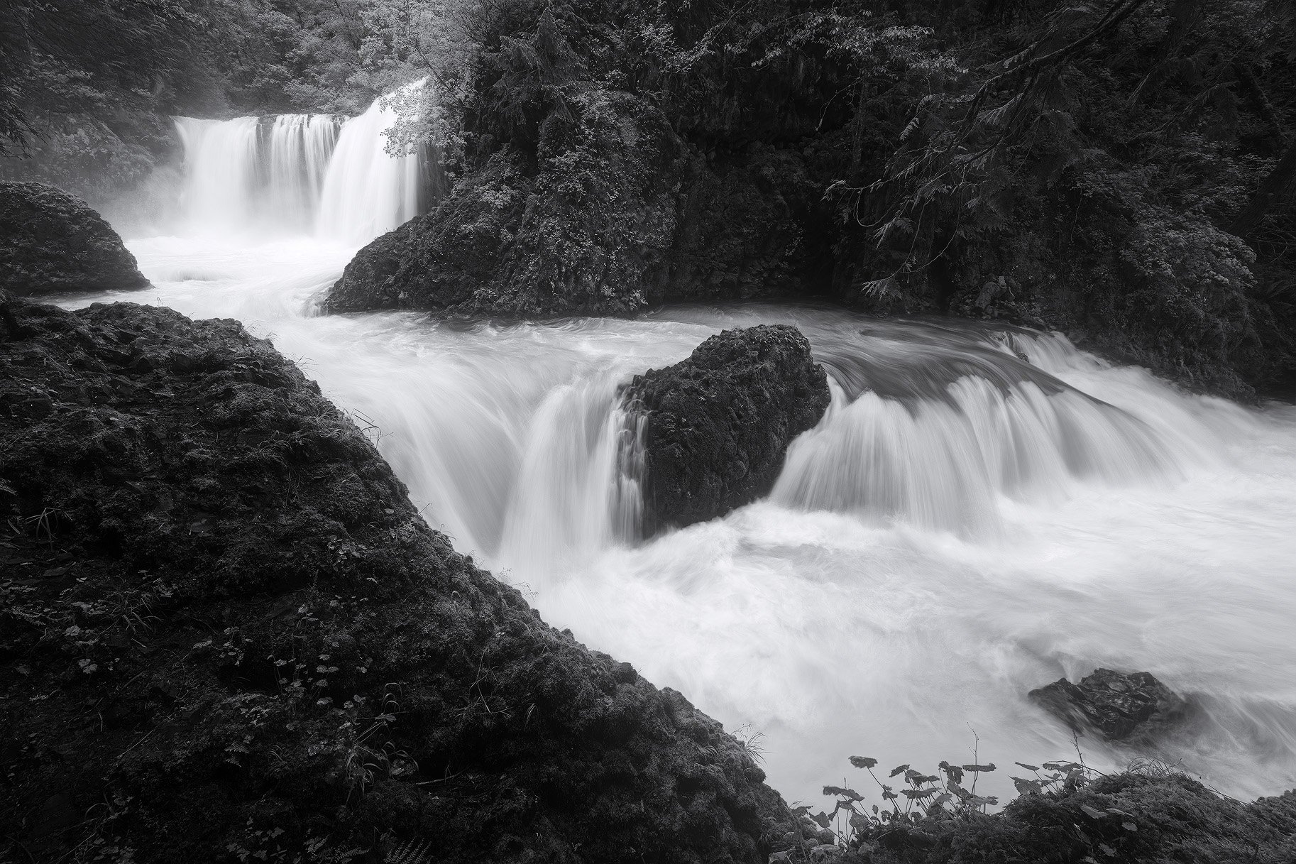
There are two main views where the trail reaches the waterfall, and this is the downstream view. The high water flow made the lower falls attractive to me, especially on the right side of the image. Because only a small amount of the water had color (the dark water areas in this image) and there was little color on that large rock dominating the lower left, I decided to play with a black and white version.
Type of Critique Requested
Aesthetic: Feedback on the overall visual appeal of the image, including its color, lighting, cropping, and composition.
Technical: Feedback on the technical aspects of the image, such as exposure, color, focus and reproduction of colors and details, post-processing, and print quality.
Specific Feedback and Self-Critique
One of these days I hope to reach a level of photography where I’m able to try to convey Conceptual and Emotional ideas, but currently (especially with black and white) I’d love to know if you have Aesthetic and Technical thoughts. Any and all thoughts and suggestions are always welcome, but I’m especially interested in your thoughts on the balance of shadows and highlights. I find that to be a tricky part of BW photography, and find slight differences in monitor calibration and room lighting make a significant impact.
Technical Details
NIKON Z 7II
NIKKOR Z 14-30 f/4S at 14.0 mm
Six images:
1/25 sec. at f/6.3 and ISO 64
1/13 sec. at f/8.0 and ISO 64
1/13 sec. at f/6.3 and ISO 31
¼ sec. at f/22 and ISO 31
Truth in Blending Statement: the field of view was slightly wider than what I could capture at 14mm, so I stitched two images to get the entire waterfall on the right. I then transformed the right edge to bring it back to a 3:2 format. In addition, I used other images blended for depth of field, reducing motion (there was a lot of air movement from the waterfall), and water texture.
Here’s an image from 2021, with lower water flow, showing the difference in the water color and appearance of the upper falls from that lower viewpoint.
And here is a picture from the upper viewpoint with the higher water flow. Compare it to the spring and fall images I posted last year; it’s amazing how the falls change with the various flow and time of year.
I like the overall composition. One thing that’s nice about the b&w is that the bright green areas in the back don’t draw you in as strongly as they do in color. There is there more balance in the b&w. I found little to add to your image except that the very large dark area in the front could use more definition in my opinion. At least as much definition as the dark area on the opposite bank. Sorry about the halo.
Great to see this posted. I like the B&W treatment. This works better than color with the large flow. I also like Igor’s suggestion and sample edit.
I’ve struggled with my version as the huge water flow made it less attractive because of the lack of color in the water. I didn’t consider B&W so I’ll give that a try. I’m working on photos again. I finally broke down and bought a new computer. Now I can work more than 15 minutes before it locks up and requires a forced hard boot. I just posted a shot from our October trip.
I really like that change Igor; thank you for the suggestion.
@Steve_Kennedy, I hear you. It was so dramatic to be there, but so hard to come away with that in a photograph and the blues were less than optimal. Glad to hear about the computer; I remember you mentioned the struggles.
I think your B&W image is very nice. I too want to start processing more B&W and find it harder than you would think. Your SS for the water was spot on, IMO. I generally like having contrast and a little detail in waterfalls and streams. I like what Igor did to the dark LC. It does match the other side better. Great job!!
A beautiful and well composed image. The flow and the balance between the water and non-water elements is very comfortable - if that’s a relevant term…
The b&w works very well, but I wonder too about how the colors in these scenes just seems to add so much beauty and interest. For me at least, the details of the greenery - and detaiils in the foreground rock as Igor tried to bring out - I think those details are lost - or at least diminished when color is removed and you’re left with just ranges of gray. Same goes for the back wall. What the b&w does do however, is make a clear separation between the high flow of the water, and the rest of the rock and vegetation. And not to belabor this too much as I don’t have a reference to the color in the water that you’re talking about. I just think that any level of color in the water is a bonus, but losing it entirely… I dunno maybe I just am stuck thinking that the scene is supposed to be in color. That’s just me.
Thank you for your thoughts Lon! I think I went with BW for several reasons, including that I prefer the color version from spring that I linked to above, I wondered if the color would rob from the feel of power that I experienced, and I’d like to keep dabbling more in black and white to improve in that format. I suppose that always in the background of my mind is what images I’ll post on my website (despite the fact that I am woefully behind in updating it ) and I don’t really desire lots of color images of the same waterfall.
This led me on a mental walkabout on just how variable the alignment can be between the creator and the consumer of art. A pretty common flow I think I observe in NPN forums is that a commenter will say something like, “That’s a great image, but I think making this change would make it even better,” to which the poster will answer something along the lines of “But that takes it away from my vision/intent.” That may well be true (that it no longer matches the original intent as well as the original post), but the often ignored question is does the recommended change make it a better photograph? It’s all subjective in art, so in the end I guess we each choose what we personally like, but when you broaden the question to ask what would a large group of photographers (or judges in a competition, etc.) say, I think it’s a different story.
That’s a long-winded way of saying you are probably correct, and that while the black and white is an interesting version (to me at least) and it was fun to play with, it may not bring what I took to its full potential. I’d be interested to see what others think, so I’ll post a new thread with both color and black and white and ask that question.
Thanks for the response John. This is a great and timely topic - one that I think deserves it’s own thread, but I’ll still comment here. I agree and appreciat your thought process.
This begs the question. If the critiquers comments/suggestions alter the artist’s vision/intent… then WHY critique the image at all? If you as the artist think your image expresses exactly what you want to express? then no amount of critique or suggestion is going to make you change the image. It gets back to a discussion from somewhere about critiquing. I think there is value in the technical/objective comments where someone is pointing out a “flaw” or something technical - sensor dust, a bright “eye magnet” or errant twig or weed breaching the edge of the frame. Most of the time, those suggestions don’t alter the bigger vision or impact of an image and simply serve to improve it’s technical points.
The vision, message and intent component of a critique is purely subjective. Once entering this arena, all bets are off. We as the viewer/consumer of the image created may, or may not see/feel the same as the creator of the work. That should be understood by both. If we don’t at least try to recognize and understand that, then again, what’s the point of a critique? Just post on Instagram.
Ultimately in the end, it’s you (us) as the creator that gets to determine what and how you want to present a scene that captures what YOU want to show; ie. that feeling of the “power of the water” and of course exploring everything, including B&W is what a creative photographer should do.
Thank you for your deep thoughts Lon! I really like this quote, because IMHO it is an important responsibility for all of us to remember this key point. I shouldn’t dismiss your thoughts as “wrong” just because they may be different than what I intended or envisioned, I should use them (whether, or not, I implement them isn’t the important part)to understand how my art is perceived and in the end how I can best be true to myself.
A good critiquer tries to understand what the artist attempts to convey and provides suggestions on how to achieve that. It has little to do with being subjective or being incapable of understanding of any intent other than your own. If we all could only understand our own takes on an image art would be dead because there would be no communication. At its very core art is about sharing. There is a commonality about people that art reaches. What makes Tolstoy great, for example, is that he reveals hidden motives that we all share. Mussorsky’s Night on Bald Mountain was never completed. Rimsky Korsakov wrote part of it. But it still sounds like Mussorgsky and not Korsakov. So, yes, you can understand intent and help provide useful suggestions (in music as well as photography).
John, as a confirmed appreciator of B&W, this works so well. I takes the scene to its simplification, in texture, shape, and flow. It’s a powerful image that is all the more so in B&W. Well done.
I may have to revisit my waterfall/stream shots with an eye to B&W.
Thank you for your input Igor. I am trying to improve/understand this better, and I highly respect your expertise.
When the critiquer’s understanding and the artist’s intent are aligned, I think it’s a happy marriage. Where I struggle is when they are not aligned. If a critiquer fails to understand the artist’s intent, or even more if the artist’s intent is misguided and the critique points that out, does that make it a bad critique? Is the fact that @Lon_Overacker thinks this type of image works best as color invalid since I posted it as a BW?
I also wonder how this relates to photography competitions. I’ve been thinking about this a lot with Tim’s participation. Do judges read what a submitter adds when viewing the photo, or do they view it blind? Do they try to understand the submitter’s intent, and what if they understand wrong? Or, do they ignore intent and just judge based on the merits of the image as is (without taking into account intent).
This is a good discussion for me, because I think I tend to disconnect the image from the artist’s intent. I tend to judge it on its merits alone, and I’m not sure that is wise.
Thanks David! Lon’s comments really set off a wonderful argument I’m having with myself, and once Tim’s reviews are done I’ll post a color version to compare. I’d love your thoughts when I do!
I have often seen comments such as “I don’t understand what this image is trying to say”. I’ve seen this from the the professionals that come here and from members. I think that’s a valid comment. It could mean that there is no point or that the viewer is not getting it or that the point is not made strongly enough. By a point being made I usually mean an emotional point. If an image is all high tonal value and he gets a comment to add more contrast then that’s a suggestion that ignores the purpose. If, however, you are reviewing an image that has a weak composition then there is nothing to be done other than to not comment at all or show an alternative strong composition. In my opinion, a b&w is
alternative to the original color but it might be better than the original. In my experience here at NPN an alternative will be rejected by the poster. They have something in mind and the effort in creating an alternative may not be wisely spent time. I still do them because sometimes alternatives are so much better than the intended image that it’s at least worth looking at.
Personally I like to make images that are ambiguous. They’re purposely ambiguous. They’re purposely designed for the viewer to interpret it in their own way. I think Bonnie does that sort of thing. Such images are harder to review but even then you can see the general direction the poster is going. Actually reading an image is surprisingly easy. Maybe because because we see so many of them.
I’m really not convinced that titles are a good idea. I almost always have trouble coming up with one. The problem is that visual communication is really different than verbal. Some things can’t be put into words. If a picture is “worth a thousand words” than why should we pick 3 or 4 and omit all the others? My last image was titled “Mariah” but is that what the image is about? It’s about fierceness. It’s about danger. It’s about unbridled power about to be unleashed. It’s about wild colors to match all that. I mention this because somehow we try to add a label for what the image is about. Maybe I’m looking at this the wrong way. Weston’s Pepper #30 is not about a vegetable yet he labeled it so. Maybe that’s it. Titles have little to do with content other than at the obvious superficial level. In that case the title should not be one of the criteria used by the judges (which it is).
I think some do and some don’t. Alex Noriega, who did the first critique session at NPN, did not. Alister Benn did. I thought Noriega’s critiques were excellent though. I was amazed at how quickly and accurately he could see ‘craftsman’ issues. I participated in the first NLPA competition and found little evidence of choosing by intent. All the images were chosen based upon aesthetics. They were easy to read and obvious. I thought Bonnie’s ‘leaping tree’ image was the best, most imaginative, image of the lot and it did get honorable mention. I don’t know if this was intentional or that the judges all valued images in the same way. Most of the images were what I would call ‘strong design’ images with great composition and usage of color. Yeah, basically aesthetic appeal.
I forgot to mention. There is no verbiage submitted with images at the NLPA competitions.
Consider reading or purchasing this book. It might be helpful. It looks at art from a psychological and neuroscience point of view. He breaks art since the Renaissance into 4 periods: Mimesis, Romanticism, Formalism, and Conceptualism.