Color or Black and White?

Image Description

A few days ago I posted the black and white version of this image, and it included a discussion on whether this type of image is typically better in color (which led to a tangent on the artist’s intent and how it relates to an image and the critique of the image; I’m still trying to wrap my head around that one). I’m curious to see what others think is the preferred version.

Specific Feedback and Self-Critique

Of these two, which version do you prefer?

Technical Details

Technical details are in the original post.

1 Like

I didn’t join in the first thread, but I will jump in here with an approach rather than a distinct opinion. Whenever I do a monochrome conversion with a waterfall or roaring river, I usually will take a lot of time with the water itself. That is to add as much detail, contour, texture and modeling as I can with post processing tools. All in an effort to draw your attention to the power in the water rather than the color of it.

Admittedly though, color like this doesn’t exist in the rivers around me; those are tannic, like root beer. So I’d be hard pressed to want to convert this one because it would be so rare for me to encounter. Given that, it might be rare for others as well so the color becomes a more distinctive element than the fall itself. If that makes any sense.

If you want to present just the power and grandeur of the falls I’d say go with B&W and do your best to bring up that aspect in the water. If you want to show the distinct color of the water then I think that tack with processing would be the way to go.

Oh dear, I think I just muddied the waters. :grin:

1 Like

John, this is a tough choice. The color version has some glacial runoff color to the water that is so unusual and distinctive. And of course the foliage is your typical Northwest wonderful green. The two colors seem to compliment each other nicely. At least in my opinion.

The B&W scene is more striking for the textures and contrast. I agree with @_Kris that spending some time on the water to raise the visibility of the texture of the water would raise the image a notch. B&W is an opportunity to play around with the contrast, light, shadows, and texture that can make it an exciting abstraction from the reality.

I know you’re looking for a preferred version, but I have to say I like them both for entirely different reasons.

Cheers,
David

1 Like

I’ll go with colored this time. It’s really comparing apples to oranges though.

1 Like

John, the color palette of greens and turquois is inimitable for me and makes me feel like standing in the middle of the scene, breathing the fresh air.
Viewing the b&w version full size, there are delightful details also in the foliage that keep my attention for a long time. This is quite a different experience for me.
So both versions work for me extremely well, yet in a different way. It is about the experience of colors versus graphic elements and structure. Maybe you could use these two versions in different context. I just think of a series of coherent b&w images from this region, that might be very interesting in my opinion.

1 Like

Sorry I missed the first post, John. I toggled back and forth several times between these two beautiful versions trying to decide which I prefer and I am leaning toward the color image. The greens are just so lush and vibrant and the turquoise water from the glacial runoff is quite beautiful and captivating. I also love the textures and details in the water along with the way you let it flow through the frame. Fantastic scene for sure.

1 Like

Hi John,

I followed the comments in your previous post but I didn’t feel like I had anything of value to add. This post however, seems to be one where I might be able to add something, I’m not sure how valuable it will be though.

Until a few weeks ago, I never really explored the B&W genre in terms of purpose and value, I had always looked at B&W as just a way of imitating antique photography but a comment left on one of my images sparked my interest and curiosity, it was suggested that I should convert it to B&W to accentuate the shapes.
The comment that sparked my curiosity was: “The Colors are Too Distracting”.
My knee jerk reaction was a simple “WHAT?”, “Color is Too distracting?”, what the heck is that all about? Why did he say that? I was almost offended but I figured it would be best if I study the B&W genre to try understanding what he meant.

I decided to use an image that had a compelling story as a test image for B&W.
After some time spent tweaking lights and darks, it started to sink in what he meant.
At the link below, you can see the image in color and in B & W. It’s an elderly lady needing heart surgery, she is sitting outside of a church hoping people will help her out as they pass by.
Link >> Help Me - Heart Surgery Needed <<Link
In the color version, the viewer will likely notice that the lady is asking for handouts but they may not take the time to figure out why she’s asking for handouts.
But the B&W version is very different because the viewer isn’t “Distracted” by the colors which means it’s more likely they will spend enough time to see the story of her needing heart surgery.
Removal of color can be as effective as removing a lone distracting limb that doesn’t belong in a scene.
I’m hoping that someone reading the above story will benefit from my initial venture into B&W.
I’m a little slow at discovering things sometimes but “Better late than never”, right :slight_smile:

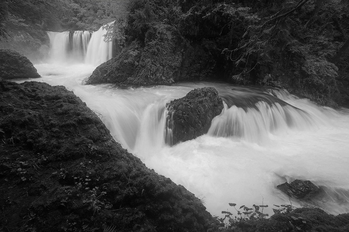
When it comes to your image in this post, you want the viewer to feel the power of the water as you did when you were there (I hope I am understanding that correctly). Personally, I don’t think any image or video can ever achieve that to the same degree. The only thing that comes close is sparking a memory in the viewer but that depends on if the viewer has experienced such an event in person.
I do think you’re on the right track though, by removing the color, it pushes the focus onto the water as you intended, the downside is that the surrounding foliage is still fairly bright, so the question becomes “Are the bright highlights in B&W also a distraction?” Should those highlights be brought down so the foliage is less noticeable?


I purposely exaggerated the darkening of the highlights for demonstration purposes.

So now we’ve removed the color and we’ve removed the brighter highlights, does that work better? I don’t know.
OK, what about the color in the water? Have we removed part of the sense of power in the water by removing the color of the water?
Do we want the viewer to struggle to figure out how deep the water is by evaluating the dark areas? Dark areas in water in a B&W image can mean that there’s a slab of rock just under the surface, or it can mean the water is deeper there, but which is it?
Color in water usually indicates that it’s deep in that area, the darker the color, the deeper the water.
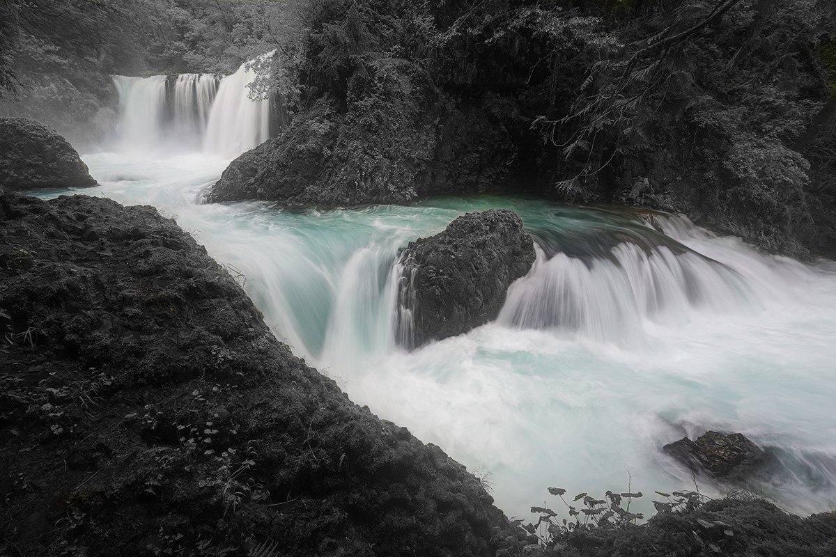
So, now the question becomes: “Do we convert the foliage to B&W but leave the water in color?”


That looks kind of odd doesn’t it? I’m not sure that an image with B&W foliage with colored water is what we want to put out there, do you?

Now, what about leaving the foliage in color but convert the water to B&W, does the removal of color from the water accentuate the foliage? Personally, I don’t think it has the same effect as converting the foliage to B&W because we commonly see water with no color.


Now, what about the idea of converting to B&W but reduce the opacity of the B&W mask to roughly 50% so there is still color in the foliage (albeit muted), then leave the color of the water at full strength?


Does that help to direct focus to the power of the water in an effective way? I don’t know.

Those were all rhetorical questions BTW, not expecting an answer :slight_smile:

These kind of things are worth spending some time thinking about and exploring in post processing in my humble opinion because in my mind, it’s worth trying to figure out the most effective way to present our images so they do convey the emotions and/or messages that we intend to convey.
In my very humble opinion, the most effective image we can put out there is one that triggers a special memory in the viewer’s mind.

This has turned into more of an article than a response, sorry about that.

Bottom line is this; I am not recommending any changes at all, I just put this out there as food for thought.
BTW, I’ve looked at this in so many different ways, I don’t think I can pick a favorite :smiley:

And finally (aren’t you glad?), I really enjoy this image because for me, it does absolutely trigger special memories of my time exploring Transylvania County in Western NC, I had a three week photoshoot trying to photograph all 250 waterfalls in that county.
Hmmm, this triggered another thought, I might be interested in doing that again with modern gear, especially since I’m retired now. Thanks for that!

All the best! :slight_smile:

1 Like

As an old black and white photographer I much prefer the color version. The subtle colors in the foreground and the rock in the stream along with the turquoise water makes a much more dynamic image.

1 Like

John,

Well, I guess I should chime in since I think I might have started the discussion on wanting to see the color version… :slight_smile: And then there’s that whole concept of what message are we trying to convey.

Someone else already boiled this down - but I think this scene can portray two different reactions, emotions. The b&w of course does a better job of showcasing the water, the power within etc. I would agree with the comment from Kris on possibly working on the contast, texture, etc. in the water to emphasize even more.

And so if the water is the subject and focus of the attention, I don’t care so much about the PNW greenery, vegetation and details surrounding the water. So this works in favor of emphasizing the water.

Ok, that’s my case for the b&w. If the intent is to capture the majesty and picturesque pure beauty of area then it’s all about color of both the water AND the surrounding vegetation.

Not withstanding your intent on showcasing the power of the water, I have another case to make for the color version. And this is the light. The original has the upper falls - and surrounding vegetation in a beautiful light - that almost glows. It isn’t overpowering, but I think the light in that UL is like the source, the beginning, and everything else flows from their. B&W loses the light. At least for me. Also, the vegetation, the varying color/hue and light is differentiated beautifully in the color version.

BOTH are wonderful - based on what impact you want to show. BOTH stand on their own, but for different reasons. And so, there is no right or wrong. Only the search… :slight_smile:

Thanks John!

1 Like

Thank you @_Kris , @David_Bostock @Igor_Doncov , @Peter_Richter , @Ed_Lowe , @Teep , @Lon_Overacker for your deep thoughts on this; I’m learning a lot from your comments. Thank you for taking the extra time to share your reasonings.

Thanks for all the versions and thoughts @Merv ! I really enjoyed looking at your variations. A couple of those I had played with, but definitely didn’t think of the others!

1 Like

Just say no…, puleez!