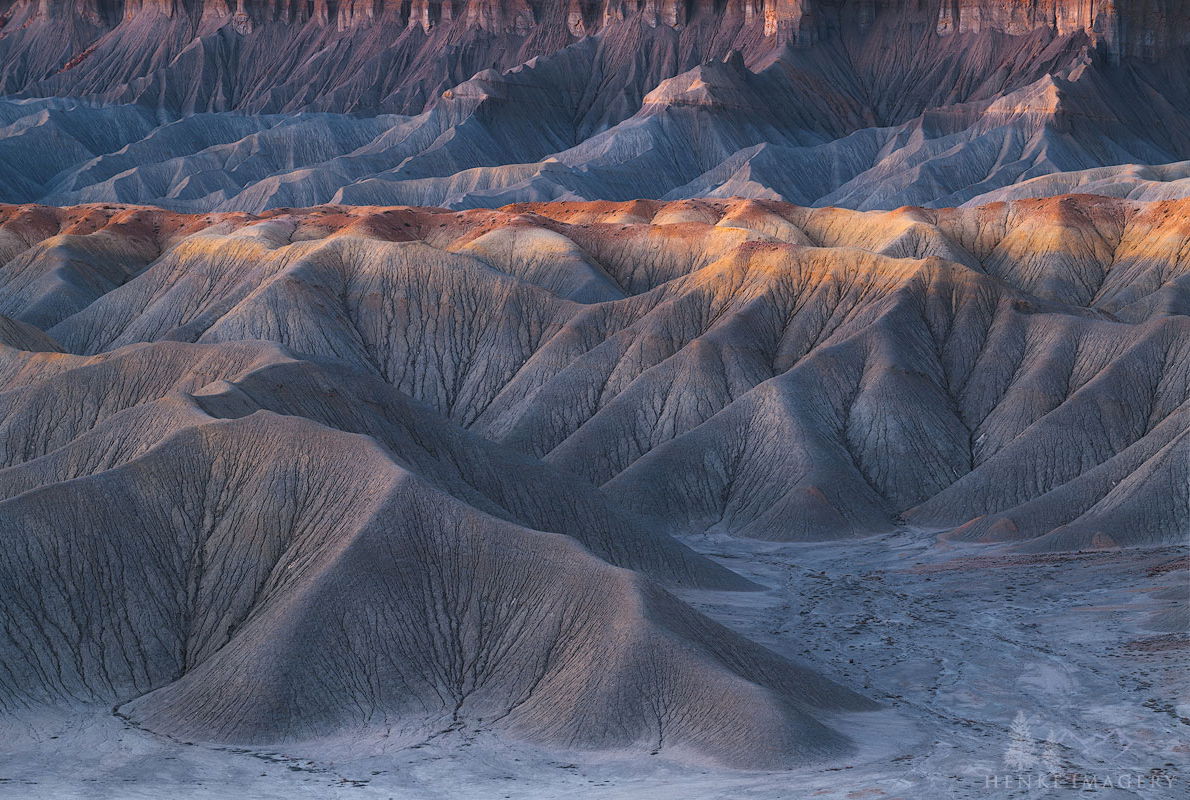
I simply can’t get enough of the badlands of the Southwest. For this image I wanted to focus on soft. Soft color palette and tones. Additionally, I wanted to display the “texture” of the soils.
Hope I pulled that off?
Any comments welcome!
I simply can’t get enough of the badlands of the Southwest. For this image I wanted to focus on soft. Soft color palette and tones. Additionally, I wanted to display the “texture” of the soils.
Hope I pulled that off?
Any comments welcome!
I’m also rather partial to Mancos badlands - a prime location for retirement property for geologists. ![]() For my taste, I would slightly increase the contrast, although there is nothing wrong with this softer interpretation. Was this a drone shot?
For my taste, I would slightly increase the contrast, although there is nothing wrong with this softer interpretation. Was this a drone shot?
Yea, I suspect a never ending world of excitement for geologists in this area! No drone image this time. Just perched on a mesa with a view.
Cheers
Hi Ken,
I think the colours look great. The pastel blues mixed with some warmth.
Compositionally I’m on the fence about the warm cliff band on the upper edge of the frame. For me it carries a bit too much visual weight and I think with a crop the eye would spend more time engaging the upper third war, section which for me is the star of the show.
What a gorgeous shot. I like the soft contrast but then again I am very partial to this soft and gentle light. I too tend to agree with Nathan and would move to exclude the warm cliff edge at the top of the frame which does indeed gravitate my vision toward the very top of the frame rather than keep it well towards the centre. That cold blue ridge above the red summit peaks would be a lovely crop but if too severe even the shaded maroon mountains above the twin illuminated peaks above that cool coloured ridge would seem to work well too.
Wonderful image with great tones. I agree that the texture to the cliffs at the top of the image draws your vision to that area making you wonder what the cliffs above look like. I think you have a variety of options if you agree.
Thanks John, Ian, and Nathan regarding the composition. I was on the fence myself about the most appropriate crop. I appreciate your opinions. Another potential option is to darken the brighter areas of that cliff face.
Cheers
Ken,
Gorgeous capture! I think you’ve handled this beautifully, especially the soft or even muted colors. This would could easily get over done. The warm, graceful light is very nice too, just right and not too much.
The other thing that really stands out for me is the lack of scale. Quite deceptive here, which keeps the viewer engaged. Excellent.
Lon
Hello Ken,
I really like the textures, the lighting, and the subtle colors in this photo. The only thing is the wall at the top of the image is catching my eye and taking away from the lovely textures in the foreground. Maybe try darkening the top just a bit. This image is beautiful!
You surely succeeded with the soft! I’ve never seen such scenes myself and always get amazed! Such delicate color changes and textures everywhere. I can imagine it’s challenging to find a composition that works. I do agree on the background comments. I think I prefer the crop at the top of the blue mountains, that looked most appealing to me when quickly testing. Would love to see such a landscape one day!