
Hi Patricia,
What an interesting scene. Great texture in the hills and mountains.
My suggestion would be to darken the foreground a bit with a gradient and to add a bit more contrast to the image. Adding contrast will add some saturation to the coloured hills also.
It looks as through you have some artefacts on top of the ridge line. This may have been from sharpening.
Nathan

I like this, the hills are really fascinating and I especially love the textures and red hues in them. One thing I would suggest, and this is just my personal preference (others may not agree) would be to add a vignette and/or darken the sky a bit. As it is, the bright sky keeps pulling my eye away from looking at the hills and I think you need something to focus the viewers attention on them.
A very lovely image of this beautiful location. There is so much to see and enjoy throughout the frame.
I prefer your original version over the one with more contrast. It has a softer feel and a more interesting sky.
Patricia,
I’m really enjoying the layout, layers and also the cropped/narrowed format. The colors are wonderful and I think you processed this quite naturally. The comp is quite good with those layers going front to back starting with the greenery at the bottom, the painted hills formation and all the way through to the eroded peaks and finally the sky and clouds.
I would agree a bit about the sky - but mostly the entire right side, say like 20%? Seems brighter than the rest of the image. And what’s weird is that the shadows tell us the light is falling from left to right, yet the scene is darker on the left than the right. I would think it would be reversed.
I think the good news is that this could be an easy fix with something as simple as burning that right side and maybe much of the sky. I think in your repost you lost all the contrast with whatever technique you used to darken the sky.
I went ahead and made some minor changes to show you what I suggested. I simply burned down some areas on the right, including the sky and rest of sky in general. But I also dodged/lightened the small area on the left to balance out the light (I’m guessing it was more in shadow from something we can’t see off frame, but a little dark on the left and a little bright on the right seemed a little off balance.
Also, in TK’s Save for the web dialogue, I also boosted Sat by 3 little points and also a wee bit of contrast using an unadjusted Levels layer in Soft light blending mode way down to 10%. Quick and easy. Hope this fits your vision of the moment.
Lon
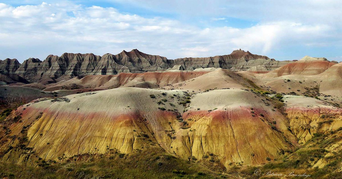
This is a really cool area. I like the comp. with those big hills in front. I agree that the sky is a little bright. I was also going to suggest going somewhere between your first and second post, like Lon has done. I’d love to see this area in early morning or late afternoon.
Thank you for all your suggestions and comments. I have followed Lon’s suggestions and reworked the image (except for the Tony Kuper sequence because I don’t have that software). I appreciate all input I received.
Great capture! I really like all the horizontal elements in this image. As others have pointed out the sky and right side of the image feel a bit bright. A graduated filter from the right with a touch from the top could bring balance. I also believe this image could take a fair amount of clarity and look so real you feel you could reach into the view. It definitely makes me want to visit the Badlands!
I like Lon’s rework of the sky and overall saturation. Adding contrast imo was a mistake as it makes the tones even more unbalanced with the sky.