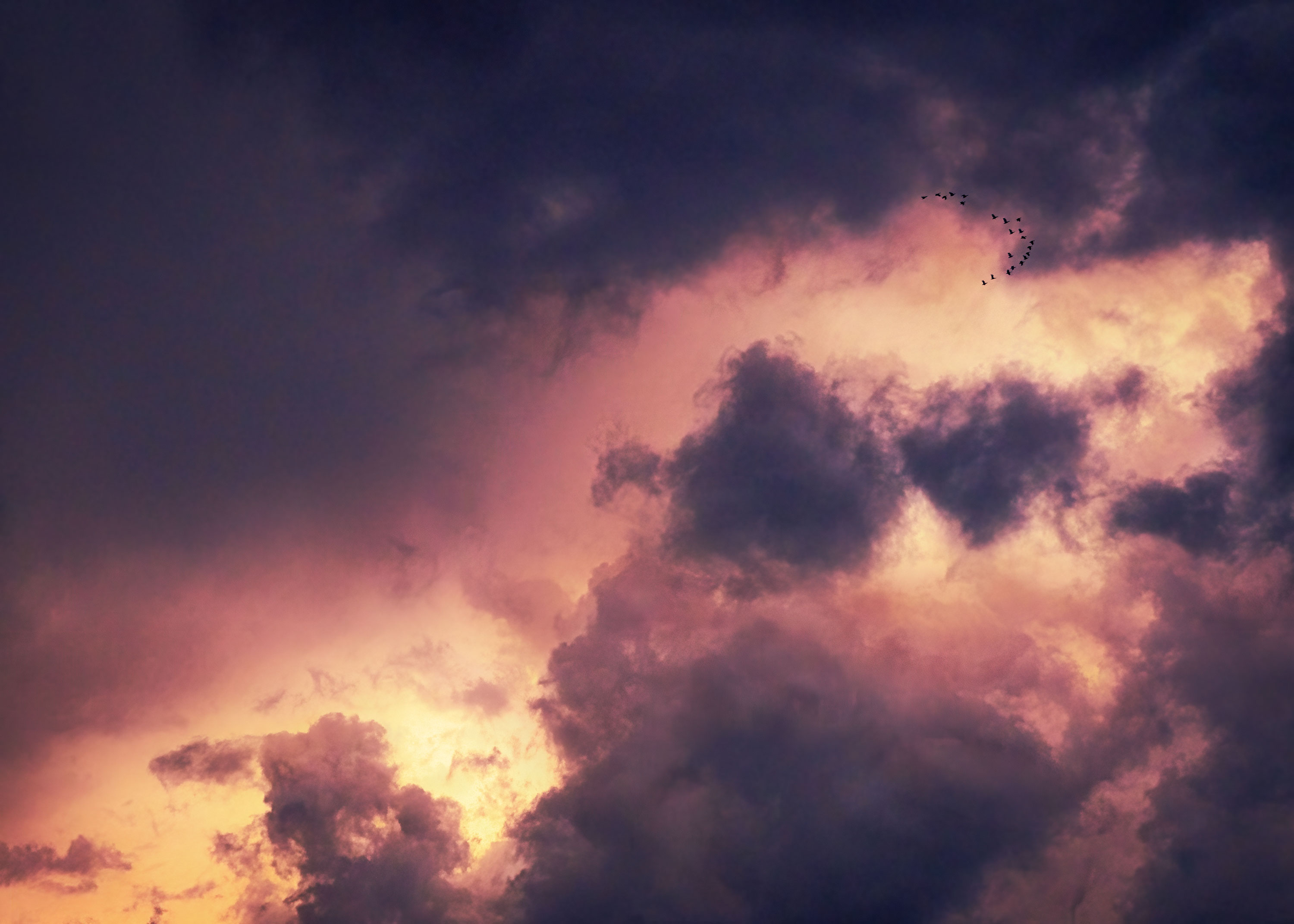
This picture represents something entirely new for me and I would appreciate getting feedback around a number of things.
First, I’d like to share how this photograph came about. Last week, I drove with two friends to spend three days a couple of hundred miles north of Toronto. Nearing sunset, after about an hour of driving, we ran into an enormous storm front. It was truly awesome. I was gob smacked by what I was seeing out the window. I did something I never would have done in the past. I took out my camera. I mean, you’ll never make “good” pictures through the window of vehicle moving at 120 k/hr with barely enough light to see. But I grabbed my camera anyway and started merrily shooting away. It was very dark, and my ISO was cranked up to 800 (which on my Fuji is pretty high). I shot for about forty minutes before the sun finally went down and I put my camera away. When I got home and downloaded these pictures, I was amazed at what my camera had been able to see. This particular picture was especially surprising because of the gaggle of geese, which I hadn’t been able to see when making the photographs. The geese were exactly where I would have put them if I had placed them there myself.
So, the image – the cloud formations, the geese, the lighting and so on – is what was there, and what my camera saw. The colour, however, is of my own design. There were traces of yellow in the highlights, but it was mostly shades of indigo and grey. And, indeed, I have an initial version of this photograph where I’ve left it almost as an indigo tinted monochrome. But I recently purchased my new favorite photography book called “Crimson Line” by Trent Parke (check it out – amazing!!) and I fell in love with his use of colour, especially in his shots of late or early light on clouds of smoke. So, I decided to push the colour and see where it took me. My tendency is to keep things looking natural and, if I am to err, do it on the side of “less is more”. That’s how I started with this image. And then I started to experiment with masking in colour – first with light painting (dodging and burning with colour) and then getting into Photo Filters and finally boosting further with Curves layers. As I was building this up I felt a little disappointed until I pushed it “all the way” and got to what I had in mind when I started working with it. So really, it’s as much a painting as a photograph. But it is so over the top (at least for me) that I’m not sure whether I trust my own judgement. There’s a voice that says, “Too much, too much, tone it down” and another voice that says, “Go big or go home!” I was going to put up other more subdued versions, but since everything I did with this image was non-destructive, I can easily go back and tone things back if I choose to. But for now, I think this is the one that excites me the most and I’d be interested in your overall impressions as well as any feedback you might have in terms of composition, lighting and especially the dramatic use of colour and tone.
Specific Feedback Requested
Technical Details
Is this a composite: Yes
This is technically a composite. I added an 1/8th to the bottom and cut an 1/8th from the top. I had shot a series, all hand held, tilting the camera variously because it was so hard in the low light to see precisely what I was getting. In the end, it was a very quick and easy blend.
I like the idea and your pushing the envelope with the color. A storm shot of mine went this way so I know how you feel about trying to wrestle something dramatic out of the 1s and 0s. Overall I think it went well except that it may have introduced some noise into the darker areas - looks like some of the groups of pixels aren’t blending well.
I’ll trust you on the geese - it is a fortunate placement, but I think they get lost in the overall bigness of the sky. If that’s the intent, then it works. If you want to draw attention to the geese I think you need to crop instead of add to the canvas.
There seem to be two competing compositions here - the one with the geese and the lighter portion of clouds in the lower part of the frame. Possibly cropping into two images would make for a more straightforward composition - putting our attention into a single place for each.
Either way you slice it (groan) I think this is a powerful image creatively processed.
My first impression, before reading your description, was that this was a spectacular “natural” sky. It doesn’t look as if it is beyond reality, no matter what PS magic you did. It probably feels over-the-top to you because you know the raw file.
Your use of color and luminosity are effective. The strong diagonal line of the lighter, yellow band leads our eye to the tiny geese, which, in turn, makes us know the scale of the clouds (big sky!) which are the (ostensible) subject.
If you were aiming for the mildly apocalyptic feel of Trent Parke’s project, this succeeds. Leave it big - don’t go home.
Kerry,
Until I looked at this one large I missed the “riders on the storm”. I am not sure the geese add much for me to this dramatic sky, except scale. I certainly do not think this is overdone or beyond reality and like the mood you have created. The longer I look the more I tend to agree with with @Kris_Smith regarding two competing compositions. Regardless, it’s nice to see someone push their personal envelope and I think this is successful as posted.
Kerry, first I have to say how much I enjoyed reading your story about the image, both the experience of shooting it, and the processing of it. It’s not often at NPN where someone talks so extensively about taking risks in the creative process, it made for an interesting read.
The colors here look very natural to me. The light and colors looks very realistic relative to what I have experienced during periods of “storm light”. I was not familiar with Trent Parke, but I can see the influence of the Crimson Line here. However I’m glad that your image is noise free, unlike some of the images in the Crimson Line (I think the grittiness is too unappealing). Your treatment of smooth clouds here has more of a sense of purity and lightness that I like a lot.
You have received some comments on your image about having “two competing images”. I think that’s perhaps too clinical a view, and I look at this image from a different perspective. Instead I see this image as a story about the awesome and immense power of nature. The small size of the geese speaks to their (or humanities) insignificance relative to the forces of nature. A crop to emphasize the geese both reduces the feeling of insignificance, and it reduces the power of the diagonal line in the clouds. I would leave this image exactly as presented, wouldn’t change a thing about it.
@Kris_Smith , @Bonnie_Lampley , @Alan_Kreyger , @Ed_McGuirk . I wanted to be sure and thank you all for taking the time to not only look at this image but actually offer your insights. Bonnie, I especially appreciate your support. I feel like you “got” what I was trying to do and, given the quality of your own work, I value your feedback. Ed, as always, your feedback is thoughtful and detailed and I especially appreciate, not only that you read my ramblings but actually found it at all of interest. Who knew!? And so, I am going use your words, which pretty much nail my intention, in response to Alan and Kristin: “I see this image as a story about the awesome and immense power of nature. The small size of the geese speaks to their (or humanities) insignificance relative to the forces of nature. A crop to emphasize the geese both reduces the feeling of insignificance, and it reduces the power of the diagonal line in the clouds.”