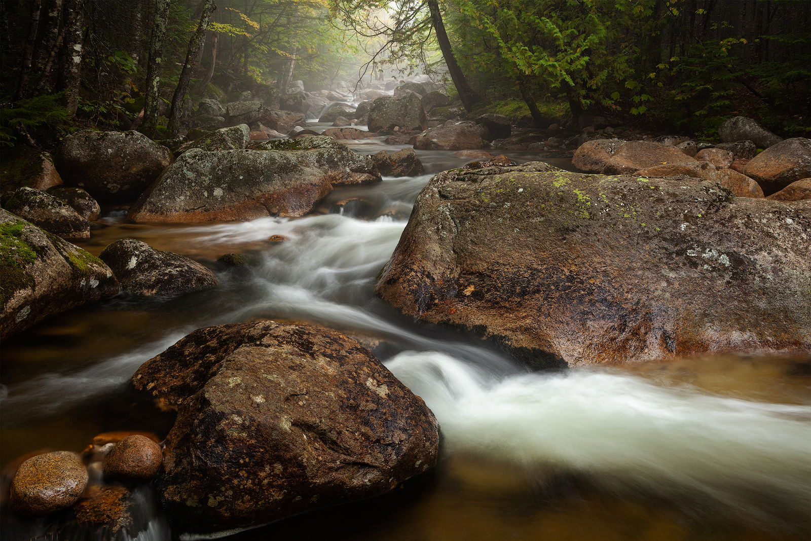
Here is another shot from Baxter State Park, ME.
This image is a blend of two frames:
Overall: f/11, 2.0s, ISO100
A couple small areas of whitewater: f/11, 0.3s, ISO800
All comments and critiques welcome.
This image is a blend of two frames:
Overall: f/11, 2.0s, ISO100
A couple small areas of whitewater: f/11, 0.3s, ISO800
All comments and critiques welcome.
I quite like this one, Craig. I love the way it fades back toward the mist and highlights. To further emphasize that effect, I might burn down (or do the 12% clone technique) the white water in the foreground. I find that area pulling my attention and holding it. Cool image.
Lovely. I like the zig-zag of the white water into the background.
Craig - your light management here is really beautiful. The eye easily moves upstream to the foggy lit background. The shadowy edges create a wonderful vignette continued by the dark rock in the LLC. The texture/detail is strong and captivating, and (this is a matter of taste) to my eye competes a bit for attention making it a little more difficult to wander deeper in to the scenery. Also, I’m not sure if you masked out texture/detail interventions from the water, but they look just a bit sharper than I would expect. Sure is a beautiful scene and I really love the color of the rock you have here! Thanks for sharing.
This is very nice, Craig. I like the zig-zag of the foreground cascades which leads my eye through the frame. I like how you used the shadow areas in the upper 1/3 to contrast with the misty highlights. This simplifies the composition, adds mystery and directs my eyes. Very nicely done!
@Craig_Moreau I like how you’ve maintained detail in the atmospheric background. Very nicely done. My only nit would be the water. I think that a quicker shutter would have given you less total white and more texture. The area in the lower right side distracts me from an otherwise incredible image.
The thumbnail for this one stopped me in my tracks. Beautiful work Craig.
Thanks @Bonnie_Lampley and @Brian_Schrayer and all for the comments!
@Harley_Goldman, I’m not familiar with the 12% clone you mention, but I’ll take a look at darkening that up, or revisit other frames for quicker shutter speeds as @Gary_Randall mentioned. That bit does pull my attention somewhat.
@Jim_McGovern, I didn’t sharpen this more than usual, but I’ll take a closer look at the texture and detail you mention. I wonder if it’s because it’s compared with the relative lack of detail at the back due to the fog? Not much was done to the water, but I did do an overall midtone contrast curves layer to the whole image. Maybe I’ll take that down a bit in the layer mask.
Beautiful image Craig, it has a lot of mood and atmosphere, enhanced by the strong contrast in your processing. The light on the mid-ground boulders and the fog in the background is marvelous. From a composition standpoint, the zig-zag flow of the water is very dynamic.
The top 2/3’s of the image is the most interesting to me. The bottom third is nicely balanced composition-ally, but there are some bright areas that pull my eye away form the center. As @Harley_Goldman already pointed out, you could burn down the brightest highlights in the white water in the LRC. If you use luminosity masks that would be easy to do. I also find the two bright small bolulders in the LLC to be a slight eye magnet too, I would suggest burning them down so their luminosity is similar the big boulder to their right.
This is real nice, Craig. Excellent composition. Conveys that North Woods look. I would agree with the input you received on the bright areas of the water water in the lower right but other than that the processing looks good to me.
Craig,
Love this as presented. The balanced composition, the darkness and the misty light all come together beautifully. At least for me, there’s just enough texture in the water that I wouldn’t suggest any changes there (although I won’t argue you work on some alternatives…)
The only suggestion I have would be to elevate the two upper corners. I do like the darkness, but a bit of the corners are without detail. Certainly, not much is required.
Only other suggestion - burn down the round rock in the LLC - not a big deal, but it does sort of stand out.
Lon
I added more texture to the LRC water (same Raw file reprocessed at -1 exposure and then cloned in) as @Harley_Goldman, @Gary_Randall, @Ed_McGuirk, @Dave_Dillemuth, and @Lon_Overacker mentioned.
I lightened the upper corners just a bit to bring back some detail.
I darkened the small round rocks LLC.
I like the way all of these edits look, thanks!
Outstanding job on the rework! Amazing how the little changes can really make a difference.
@Craig_Moreau Nailed it!!! ![]()
I’m late to this critique, but as a new member I learned a lot reading through everyone’s comments. I really like your new version as now the distractions are gone. What I liked about this scene is how the foreground rocks and the stream lead me into the rest of the photo. It’s great to see how small changes can have such a large effect.

