The photographer is looking for generalized feedback about the aesthetic and technical qualities of their image.
Description
A friend and I spent a day photographing in the Columbia River Gorge last month. She is newer to photography and the gorge (mostly traveling through it on the Interstate in the past), so we spent some time stalking the target-dense icons which don’t take a lot of time to access.
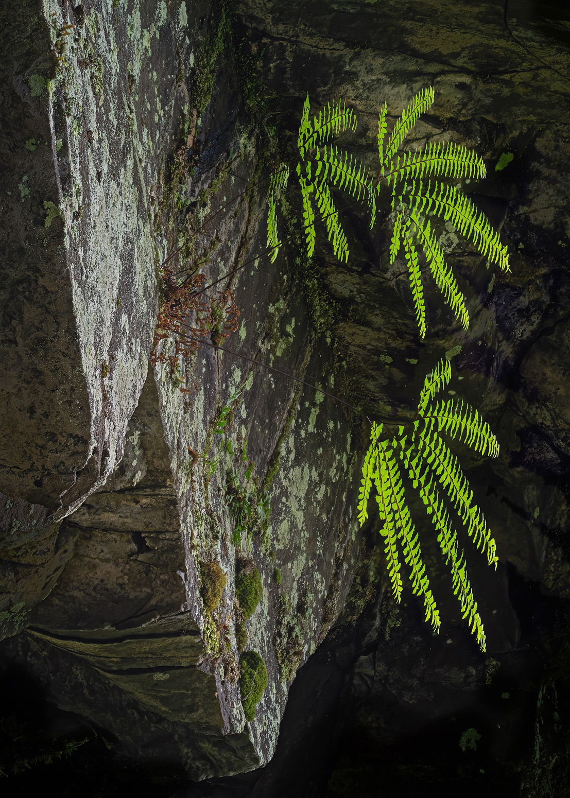
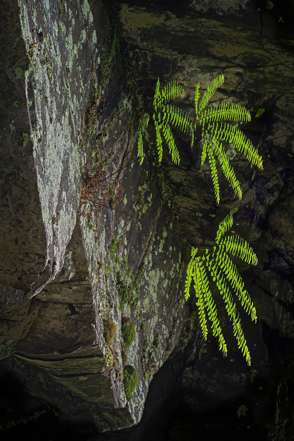
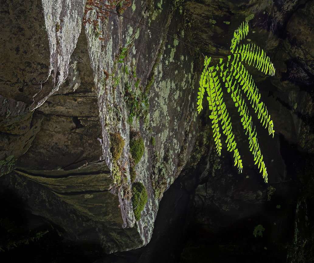
One of the places we went was Ponytail Falls. Unfortunately, there was a log hanging over the top of the falls. (Fallen trees cluttering streams have been a much bigger problem since the big Eagle Creek fire.) While grumbling about that, these ferns (Western Maidenhair?) under the overhang where the trail passes behind the waterfall caught my eye. This is looking at them from the underside; I had to point the camera up at a pretty steep angle to capture them.
This is a focus blend of nine images. The ferns were whipping in the turbulence, and as a result there is some softness of the rock behind the ferns from the blend. Fortunately, even at high resolutions it is dark enough back there that this issue is subtle. (I really like full-size sensors for most things, but really miss the depth-of-field of crop factor sensors.)
Specific Feedback
Does the balance of the composition look okay?
The foreground moss was pretty bright and I’ve toned it down. How does this level look to you?
Same story for the corners and edges. Should I take those even farther?
All thoughts and comments welcome. It’s often answers to the questions I don’t think to ask that are the most helpful.
Technical Details
NIKON Z 7II
NIKKOR Z 24-200 f/4-6.3 VR at 135 mm
5 images at 1/125 sec. at f/10 and ISO 3200
4 images at 1/125 sec. at f/16 and ISO 10,000
Critique Template
Use of the template is optional, but it can help spark ideas.
John, this looks well worth your efforts both in capture and in processing. The greens of the ferns almost vibrate. They contrast well with the bright rocks alongside and against the dark background. The only place where I notice the bright “movement” artifact is near the tip of the smaller fern, 2nd frond from the top, you can fix that by cloning in with a very small brush, if you want to make the effort…
This isn’t the type of image that we normally see from you. I like it very much. The contrast between the darkness and the ferns make them really stand out. There is no ambiguity on that account. I personally think a slight crop from the top would be good.
But it’s the lower half that intrigues me the most. The ferns are obvious but it’s the shadows that interest me. The sharp point, the V, is a natural element. In fact it and the brighter and darker shapes could be compared to the compositions from the slot canyons in Arizona. I would crop just below the fern that’s above the bottom fern and make this a horizontal. Then perhaps play with the shadows vs brighter areas as a complement of the single fern. That would result in an interesting composition with some tension to it.
I love this photo. I think the physical composition is excellent and perfect as is. My suggestionswould be to darken the rock in shadow on the left a bit, and lighten the shadows on the bottom. To my eye, the difference in light between the left side and the right side and bottom unbalances the composition a bit. Lastly, the focus stacking is amazing. Good job!
This one’s a mind bender, John. I keep looking at it and my brain can’t figure out what’s going on, even though your description clearly describes how you found and composed the image. Don’t take that as a complaint, though. To the contrary, I like it. It makes me think. All of your processing looks spot on. I love how vibrant the ferns are and how much the pop from the background. I’m not usually a big fan of metallic prints but I think this one might be a great candidate as the luminosity of the ferns on metal would be nuts. Thanks for making my brain work today!
OMG, I’m so disoriented. I agree with @Bret_Edge that this is a total mind bender. It took me a little bit before I figured out how the orientation of this went. Now that I see it, I think this is sensational. I love the playful vide that the ferns are are giving off, almost like shock waves and movement even though they are sharp. That bottom rock point and the rock point on the left edge are to me what this is about. I might play with the light a little bit particularly the shadows on the left edge that seem too bright to me to help give this more dimension. I like the idea of @Igor_Doncov’s crop suggestion. I think I’m seeing a little bit of a yellow cast in the shadows behind the ferns but that may actually be natural. I’m looking for little nits and not finding much. Once I got my head wrapped around this it’s really growing on me. A lot. Actually, I think I like it just the way it is.
Hi John,
Kudos for being open to other possibilities when Plan A does not work out. I am loving that soft light kissing that diagonal section of rock face along with the even more subtle light underneath. It took me a few moments to figure out what was going on and I have to say that I quite like this scene for it’s uniqueness. All of your processing looks great and you have just enough detail in the shadows. One of my favorite things in this image is the light on that rock point at the bottom of the frame. While I quite like this as is I could maybe see a little crop from the top. With less room at the top it makes the ferns appear more suspended above your head. I hope that makes sense. Very nicely done!
Thanks for all the feedback! As Igor noted, this is not a typical image for me and the input is very helpful.
I’m not sure if I worked on the correct frond, but I played with my best guess by darkening the background where the background “softness” wasn’t good when I played with Igor and Ed’s suggested crop posted above.
Thanks for that suggestion Igor. I didn’t see that at all. (I fully expect to depart this earth in a quixotic quest to “see” better, but, fortunately, in many ways the chase is more fun than the arrival .)
I didn’t have the time to play with that suggestion yet, but I will. Thanks!
I’ll keep that in mind. I don’t print much, but it would be fun to play with if I ever get the opportunity.
I didn’t shoot a neutral card (I’m often too distracted/lazy), and the camera read those shadows as neutral to a tad yellow. I’ll play with moving them cooler.