The photographer is looking for generalized feedback about the aesthetic and technical qualities of their image.
Description
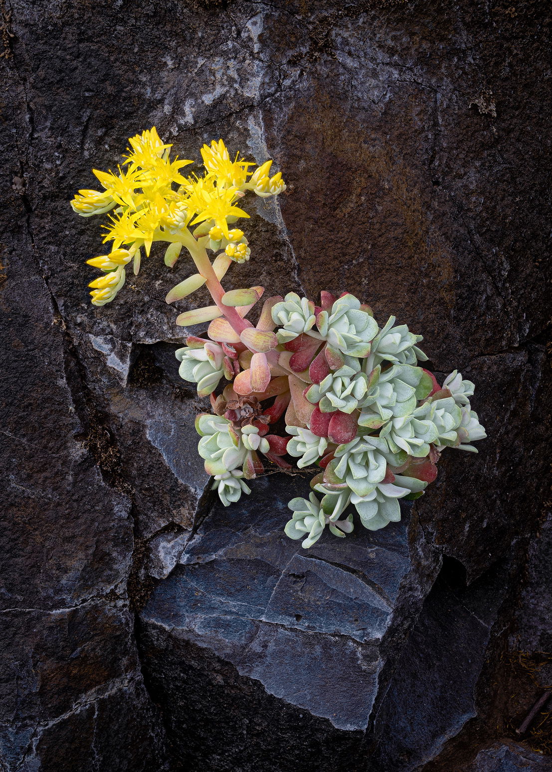
This is another photograph from a trip earlier this spring. I’m a sucker for the Balsamroot that grow on the walls of the Columbia River Gorge each spring, and I liked the rock that this little guy was perched on.
Specific Feedback
I photographed this because I really liked the character of the plant and flowers, but as I noted the rock shelf it was growing on as well. Does the composition balance those two adequately?
As always, all thoughts and comments appreciated! It’s often the answers to the questions I don’t think of that are the most important.
Technical Details
NIKON Z 7II
NIKKOR Z 24-200 f/4-6.3 VR at 88 mm
1/30 sec. at f/9.0 and ISO 64
13 images stacked for DOF in Helicon Focus
Critique Template
Use of the template is optional, but it can help spark ideas.
I like the succulent and the rock, John, but the composition feel unbalanced because of the brightness of the plant compared to the rock. It tends to feel top-heavy to me so I’d crop up from the bottom into the shelf that’s supporting the plant. Also, if you have it, a bit more room on the left with the plant slanted in that direction would feel more comfortable to me.
The detail in the plant and exposure of the surrounding rock work really well for my taste.
John, I love this type of image with the plant hanging on in a little crevice and thriving with vibrant life in a very inhospitable environment. It speaks to the spirit to survive and be productive. I call it “Bloom where you’re planted.”
I love these little Stonecrops – they must be the Pacific coast version of the tropical epiphytes. Composition and detail are wonderful to me. I wonder if Dennis’ concern could be addressed by darkening the yellow a little (Selective Color should do it with no need for masking). Or maybe a little CW rotation if you have the extra canvas. I’d hate to lose the little ledge it is perched on.
I do like the darkness of the BG against the bright colors of this little plant. The plant fills up the center of the frame and I’d hate to see the rocks get lost from cropping. you could reduce the saturation in the yellows of the flowers a bit if so desired. Otherwise, I like what you captured here…Jim
Oh what a terrific find - I love this kind of stuff, too. Plants find a way in so many seemingly impossible situations. If you wanted to put attention on that aspect, you could widen the scene a bit to include more of the rock ledge. As it is, the story is all about the plant rather than its place in the environment. The plant looks excellent in terms of detail, although the hot yellow could be toned using one or all of the methods suggested by the other folks. The colors look quite natural and I really love the pinks and the greens together. Did you happen to see what pollinates this plant? That would be a cool sight to see, too, whether bee, beetle or ant.
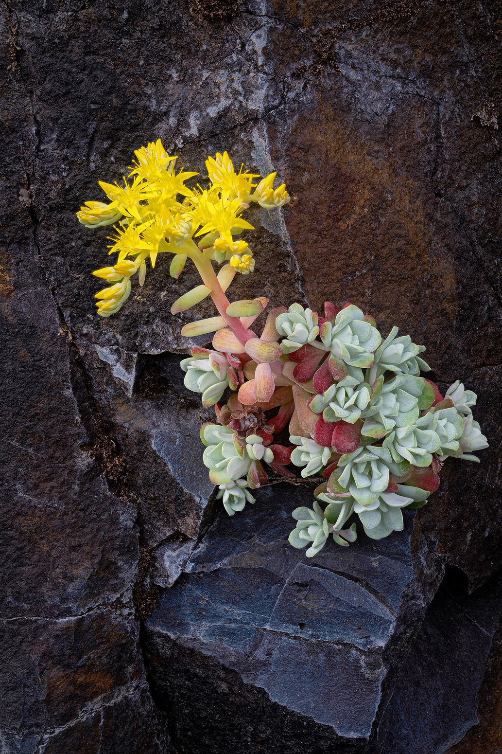
Thank you @Dennis_Plank@Ed_Williams@Diane_Miller@Jim_Zablotny and @Kris_Smith! It sounds like the tension between trying to include the full triangle of rock, which I like a lot, with the tight placement of the flowers I was worried about is a shared concern. I do have a bit of room at the top I had cropped I can add, but not on the left. I can’t remember what was there, but I remember I didn’t want to include it. I could crop tighter to the right side of the plant, and that might help the balance a little?
I’ll add a version trying to address the crop some, and adjusting the yellows and a couple of other things just a little. Thanks for the invaluable feedback!
While I think the suggestion to tone down the yellows just a bit was good, I must say I think the crop was not a good idea. The edge of the rock shelf I feel is to close to the photo’s bottom edge and the leaves of the succulent feel crowded on the right edge. I like the original crop as you presented it.
John: I’m really late to this party but in reviewing the images for consideration for 2024 awards this caught my attention. I’m also going to be a bit contrarian with the crop and agree with Youssef that the repost is too tight on the right side especially. That was my first impression and I think a lasting one. The original crop with more of the surroundings suits me better. A wonderful find and a terrific capture. >=))>