Igor, another beautiful image. Let me throw out another idea and feel free to totally disreagard it but what about flipping the image so that the top becomes the bottom. This would put the mass of the largest rock at the bottom
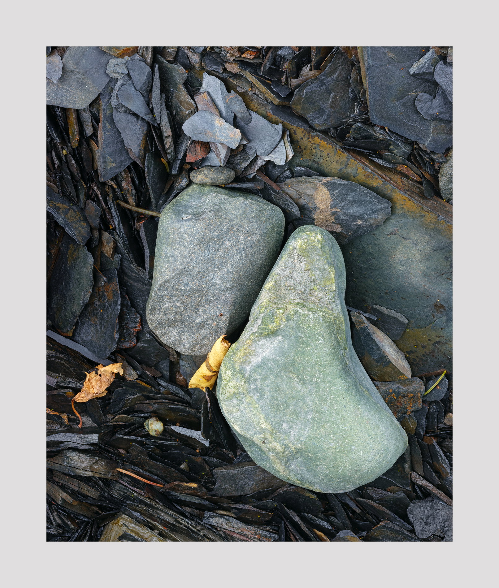
Well done, Igor, as your images almost always are. The composition is unusual but effective. There are a lot of diagonal lines in the background that add some zip. Like Dennis, I find myself looking more at the background than at the rocks in the center.
The flipped version makes me question the composition of both the original and the flipped version. Sometimes you get used to looking at something and don’t notice things. I’m starting to think that the composition in this image is awkward. Well, time will tell.
1 Like
Igor: I’m woefully late to this but the upside is I get to look at all of the comments and variations. I like your saturation tweak and the orientation of the original posting. I do have questions regarding your techniques as your images tend to have a flat solid feel to them without any sheen or reflections on your subjects. Do you use a polarizer or do anything else to produce this marvelous result? And I was also wondering if you saw the little dinosaur at the tip of Africa?  >=))>
I could tell this was your image before I even saw your name, Igor and I have to say that I like it quite a bit. To me the composition is really thought out and everything in the frame has it’s place and nothing feels like it shouldn’t be there. Nicely done.
1 Like
The 120mm lens has no filters whatsoever. I do see a sheen on some of the rocks. This was shot beneath overhanging branches and therefore in the shade which reduced reflections.
I certainly like both, Igor. I do think that your punched version is more striking. Having said that, i wonder how this might look with a softened background ?
By softened do you mean unsharp?
By background do you mean everything other than the big rock?
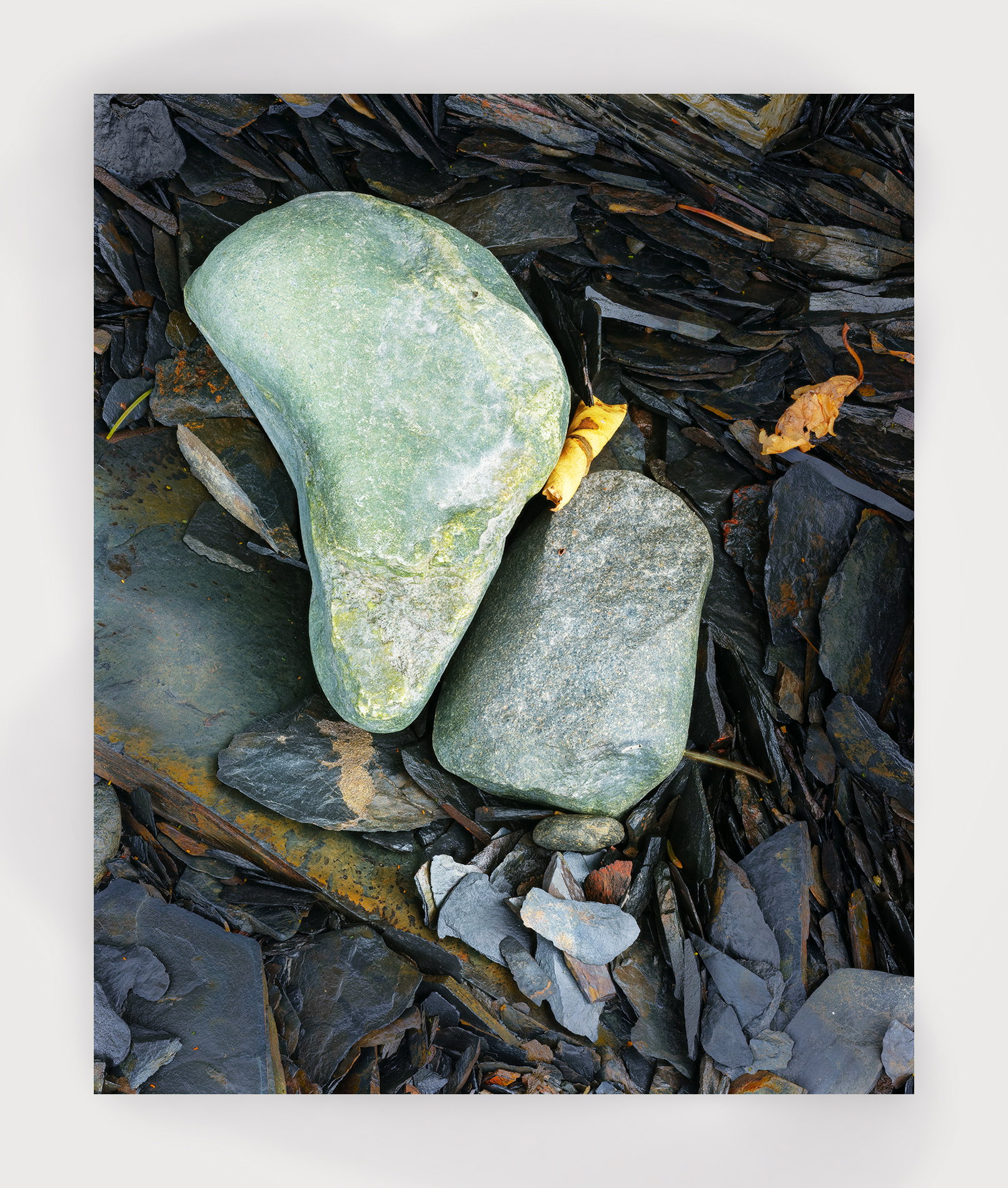
Thank you Karl. I added your version with the others to see your changes better. It seems that you boosted the contrast. I do like how to brought out those small shards below the two large rocks.
Somehow my explanation of what i did did not go through! Whilst I did make the central elements “pop”, I also applied negative clarity and some positive texture to the surroundings - I think that this may help bringing out your main subject better
A wonderful photo to spend some time with; that’s a hallmark of yours. I think the composition is well done, and really like the flow through the image, with lots of wonderful small details to explore along the way. The shards are my favorite part.
I prefer the saturated colors. I do think that circular rock grabs the eye a bit, but I wouldn’t remove it. Rather, I’d just reduce its luminosity (and of the wood to the left of it).