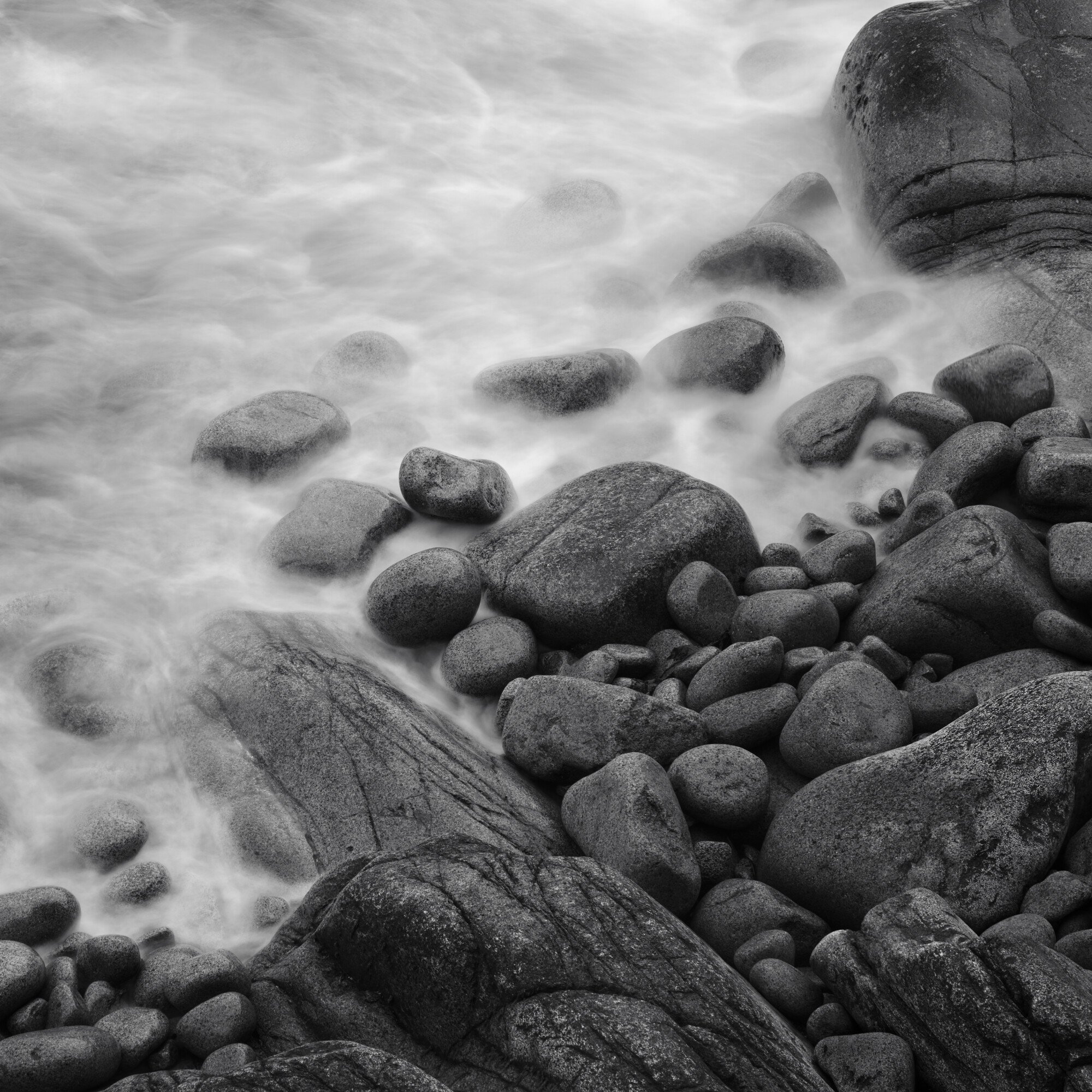
You could spend your whole life just taking pictures of the rocks in Acadia and probably only shoot half of them. I chose black and white which is rare for me to further simplify an already simple scene. I wanted to have just a bit of texture in the water, something to make the viewer look more closely but also be able to see the gradual appearance of the rocks. I tried to use some of the ideas from my recent Bruce Percy purchase (https://www.brucepercy.co.uk/store/tonal-relationships-the-art-of-tonal-adjustment) by separating the tones of the rocks from the water making one half darker and the other lighter.
I am not good at assigning a mood or feeling to my images. If anything I would think it is calming in nature due to the round rocks and the calm water due to the long exposure. Not sure if I should be thinking of the “mood” in the field or just shoot what catches my eye and think about it more later.
Happy Thanksgiving by the way!
Specific Feedback Requested
I like the water, not sure the rocks are there yet. I feel they could be darker. Assigning moods/emotions to images is challenging for me…Interested in if this evokes anything, and if so, why?
I agree the rocks could be slightly darker and with a touch more contrast…but not much. I love the soft, silky water. And B&W is a great way to show this off.
If the tone you are seeking is calming, I think you have done very well. If it is something moodier, then I think leaving the water as is, but darkening the rocks more than slightly would help.
@David_Bostock & @Jim_Gavin Thanks for taking a look, I have an updated interpretation here where the contrast in the rocks is more pronounced, its not necessarily darker though. I had a really hard time pushing it darker without it all just turning to a blob of dark objects. Seemed to lose detail rather quickly…open to suggestions there!
Hi David,
thanks for sharing your image as well as sharing your thoughts about conveying mood. There is a sombre beauty to this scene for me, and I think your first version conveys it immediately to me. The higher contrast in the second version counteracts it in my opinion, therefore I have a clear preference for the first one in this case. I also appreciate your choice of the square format with its intrinsic stability. The diagonal that divides the water from the rocks adds an interesting dynamic to my eye.
In most cases you will probably try to convey the mood you experienced standing in the middle of the scene. So I think it might be useful to make some field notes , if that seems appropriate for you. But on the other hand, one always will be in a more or less different mood during the processing of the image. Maybe some new aspect is revealing to you and it might be worth to show it in the final print.
Hope that makes sense to you.
Peter
I think the original looks best. The added contrast in the rocks and water in V2 cause the yin-yang separation between the two to be lost to some degree.
Peter, that is a really good idea regarding notes int he field. I guess I’m always so interested in getting the next shot that I don’t slow down to think about the shot I just took, or why I even took it to begin with other than something about the scene caught my eye…something to ponder.