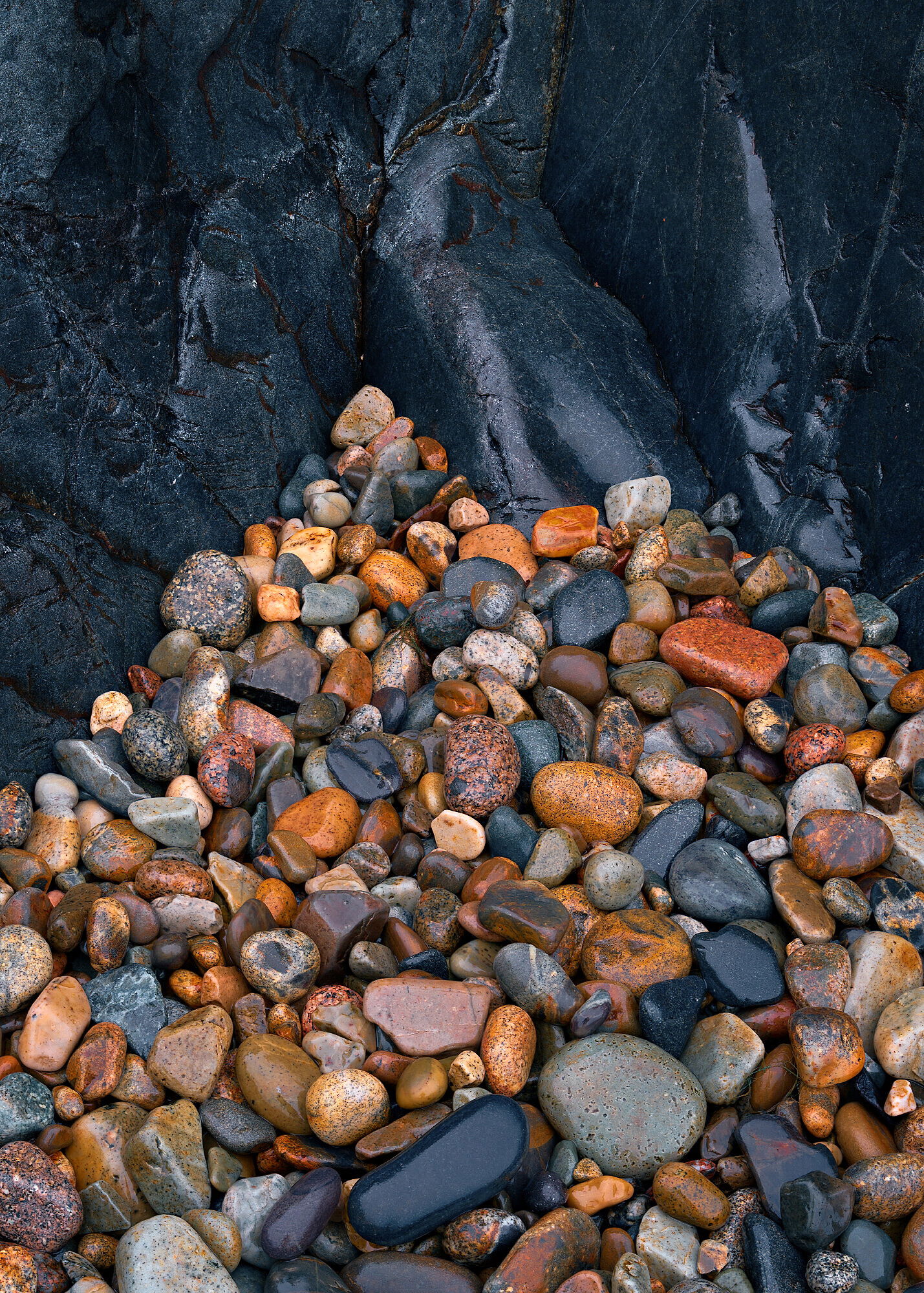
This is a tiny little “beach” in Acadia known for these small smooth rocks. It is unlike any place I have seen before. Lots of people take top down shots and fill the frame with the interesting rocks. For whatever reason on this day I couldn’t come up with one I was really happy with. On my way out I found this little nook in the black rock wall that surrounds the beach and liked the contrast between the small and large, smooth and rough(ish), round and angular.
Specific Feedback Requested
I think it still needs work in processing but I can’t quite put my finger on it.
Harmonious with lots of interest. Your instinct to go tighter in composition is a good one. The wet rock has such depth and color range. Good to use the dark cliff as a backdrop - the contrast is great. In terms of processing, have you messed with the dehaze slider at all? Sometimes that can help bring depth to dark shiny surfaces, but a little goes a long way.
This is a fine Little Hunters Beach cobblestone abstract. The composition is very well done, I really like the interaction between the cliff and the cobblestones. And you obviously paid careful attention to the frame edges, with no distractions from awkwardly cut off stones, this looks as about as clean as one could hope for in that regard. The warm / cool color contrast is also interesting. And as you said, you have a nice variety of cobblestone shapes, colors and sizes, it makes for an interesting mosaic.
I think it works as presented. If I had to suggest any nitpick to consider it’s that I think adding some vignetting in the lower two corners might place more attention on the center of the image.
These colors look very natural to me for a rainy day, and that’s how I remember they look. The blues really are this strong when they are wet.
The tones and colors are striking in this image. The composition, however, could be better. Try to have the two parts embrace one another, each merging into the other. That rather than having such a clear boundary. Also, make it so one part dominates the other. Don’t have two halves that dominate equally.
David,
I always find the granite of Acadia to be very fascinating due to it’s varying shapes and sizes along with it’s multitude of color variations. I agree with @Ed_McGuirk about the colors looking natural and are as I too remember them so the processing looks just fine to me. I do like where @Igor_Doncov was going with his crop suggestion and his reason for doing so although my personal preference would be to not go quite that far because there are two cobbles which represent Acadia’s pink granite and I would hate to lose them. Here is a repost with what I was thinking.
On a side note did you receive the photo locations for the Seneca Rocks area in WV that Mike and I sent you? Just wondering because I never did hear back from you.
David, I like this image a lot. The black rock is great, but I also think that the smaller stones add to the quality of the image. One idea could be to darken somewhat the left part of the black rock in the upper part of the image, and to try to make the black smaller stones to replicate the feeling of the rock in the upper part.
Here is a quick try just to show my thinking:
I added a touch to the rework above, I think it did well to add a small amount of contrast without being gaudy, not sure if any would notice but me, but I liked the addition.
Hmmmm…wonder where I got the idea to go here…
I tried to add a bit in the rework, I agree it helps bring the eye to the center.
Thanks for the suggestion here. I spent a lot of time here but should have stayed a bit longer to explore this wall a little more and the interplay between the small stones and the large rock wall. I think there are many many compositions here that I hope to explore again someday. I like your suggestion but I feel I end up losing something without the smaller stones. I think had I gone tighter a suggestion like yours would make a lot of sense…now…to plan my next trip to Maine!
Ed, I did. My apologies for not responding, I looked at it and it ended up getting lost in the shuffle. We are headed there in exactly 2 weeks, getting excited. Hopefully some of this rain roles through and the creeks/rivers get a little flow. It has been so dry here so I’m assuming there as well.
I strongly considered croping to 1:1, I think the 50/50 yin-yang look would have some benefits, I’m having a hard time throwing out that bottom 1/3 though
I added some to the larger wall, I could see adding it to the smaller stones as well…back to playing!
The stones get a more wet look (positive), the dark parts get a blue tint (not sure about that) and the saturation has been increased (to be honest a little bit oversaturated for my taste).
Nice one @David_Wallace ,
I like the composition very much, and I think something in between your two phots should work fine (I like the overall mood your new edit brought to the background rock, but is a little to much in the foreground stones)