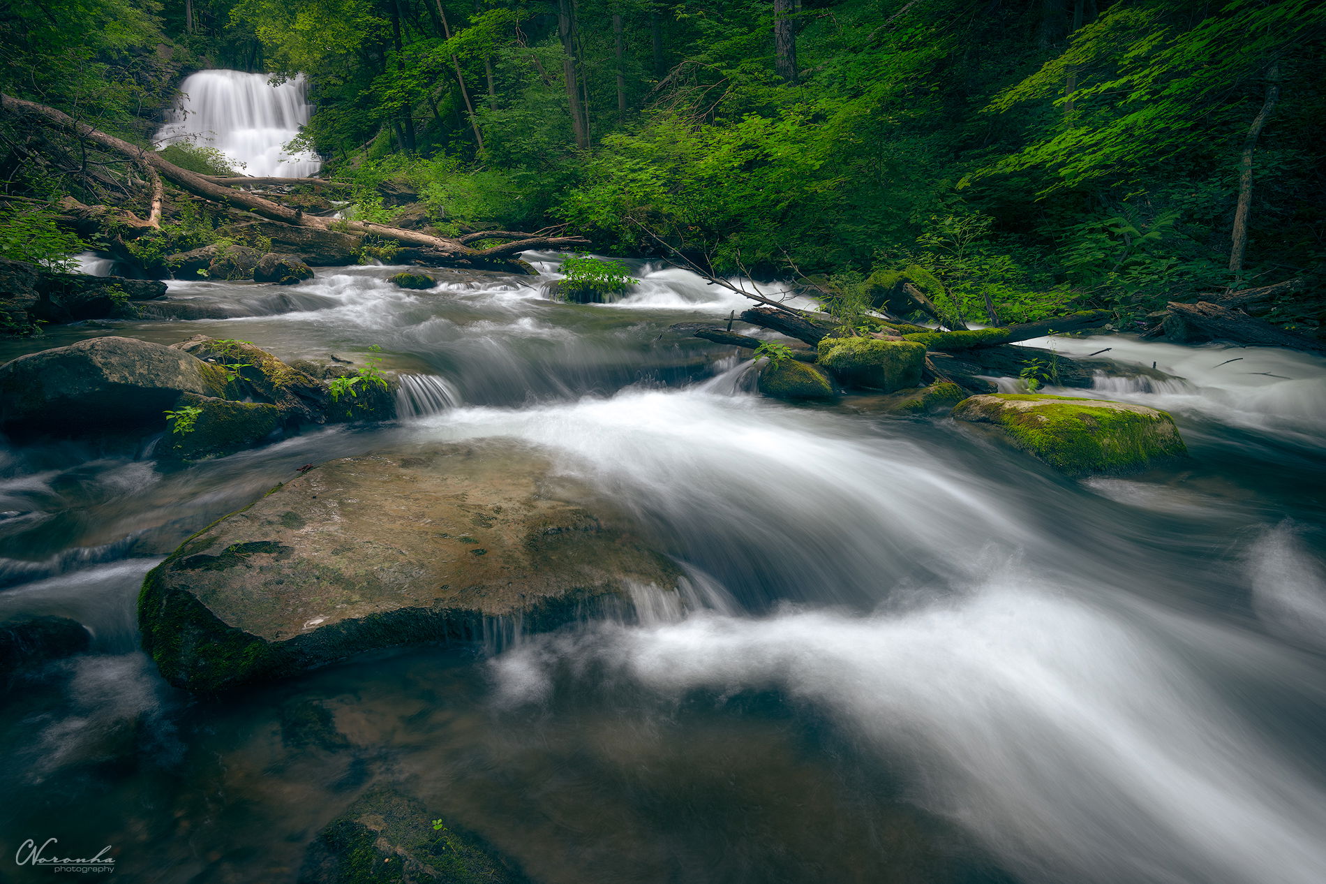
I’ve been digging through my LR catalog during this time at home and came across this shot from last September, that I had not edited yet. I figured it was a perfect time to try out some new techniques I’ve recently learned. I was going for a dark/moody look, and tend to process these overcast waterfall shots on the cooler side.
Really interested in any feedback, but specifically in the greens and if they are too saturated or not. Over saturating my images is one thing I’ve struggled with in my PP, so I’m trying to be mindful of it.
What technical/artistic feedback would you like if any?
Any Feedback greatly appreciated.
Pertinent technical details or techniques:
18 mm - ƒ/14 - 0.5 sec - ISO 50
If you would like your image to be eligible for a feature on the NPN Instagram (@NaturePhotoNet), add the tag ‘ig’ and leave your Instagram username below.
Hey Chris…great scene. Looks like a fantastic place to hang out. The diagonal direction of water is nice and effective in drawing the viewer into the scene to the distant sizeable waterfall. I like your shutter speed choice as the texture of water is great.
From a luminance standpoint, I’ve definitely seen darker/moodier forest scenes and of course that’s not a “critique”, but reflects your personal vision and choice. I would argue that your shadows could even be darker, but that’s certainly not a recommendation as I like this as presented. As for the highlights, I think the water in the emidground and foreground are quite bright…I’ve had similar shots and tend to darken the highlights as a personal choice to allow the eye to wander more around the scene. Finally, I’d be tempted to burn some of the brightness of the fallen tree on the ULCrnr as it serves as a visual barrier to completing the stream to my eye.
As for color, I love the greens and think they look great - again a completely personal statement. The shadows have a stronger blue cast than I prefer and it looks a bit strong thus challenging the sense of reality to my eye.
From a detail/texture standpoint, the sharpness looks good on the screen and for the image size. Water texture was commented on above.
Finally, from a compositional standpoint, I do wish there was a bit more visual weight in the LLCrnr. This serves as a bit of empty space and the tiny leaf and wet moss creates a bit of unbalance to my eye. This may not be a deal-breaker to you or others and I’d be interested in yours or others thoughts.
Thanks for sharing…I love streams and waterfalls, so really enjoyed (can u tell!!!) reviewing your image. So, take that with a grain of salt.
The composition works wonderfully for me, Chris. I think everything is placed at the right spot. I have one suggestion and one comment. My suggestion is to burn slightly the brighter part of the fallen tree in the BG (especially the short branch pointing almost vertically downward). It is pulling my eyes a bit towards that branch and so a bit of a distraction in my opinion. My comment is more on a personal and subjective level. I think the blue-ish overtone in the shadow is a little bit heavy handed for my taste, but everyone has a different taste about this. Thanks for sharing such a beautiful image.
the saturation and hue of the greens doesn’t bother me, but i’m not crazy about the blue shadows. i think the color palette would work better if the shadows were more neutral or even a chocolate brown. i’ve found dark chocolate shadows with a bright green can be a really moody look.
i like the slight blur over the image, it gives it a mystical feeling.
Chris, this a really nice waterfall, and shot in really lovely conditions, a strong interesting flow of water (perfect shutter speed used here BTW), and really nice spring green colors in the foliage. I do not think the greens are too saturated as presented either. But like a number of the other comments provided here, i think the shadows are too cool, especially in the greens. In real life, the color green is naturally cooler in tone, but I think this takes it a bit too far for my taste, although I’ll admit that is a matter of subjective personal taste. The large rock in the stream in the LLC looks to be naturally a warmer brown/gold color, but for my taste that also looks too cool.
In terms of composition, I also struggle a small bit with the amount below that rock in the LLC. I know that it is there to allow you to show more of the flowing water in the LRC. But for my taste I would prefer to see a crop that reduce the negative space, while trying to retain as much of the flow in the LRC as possible.
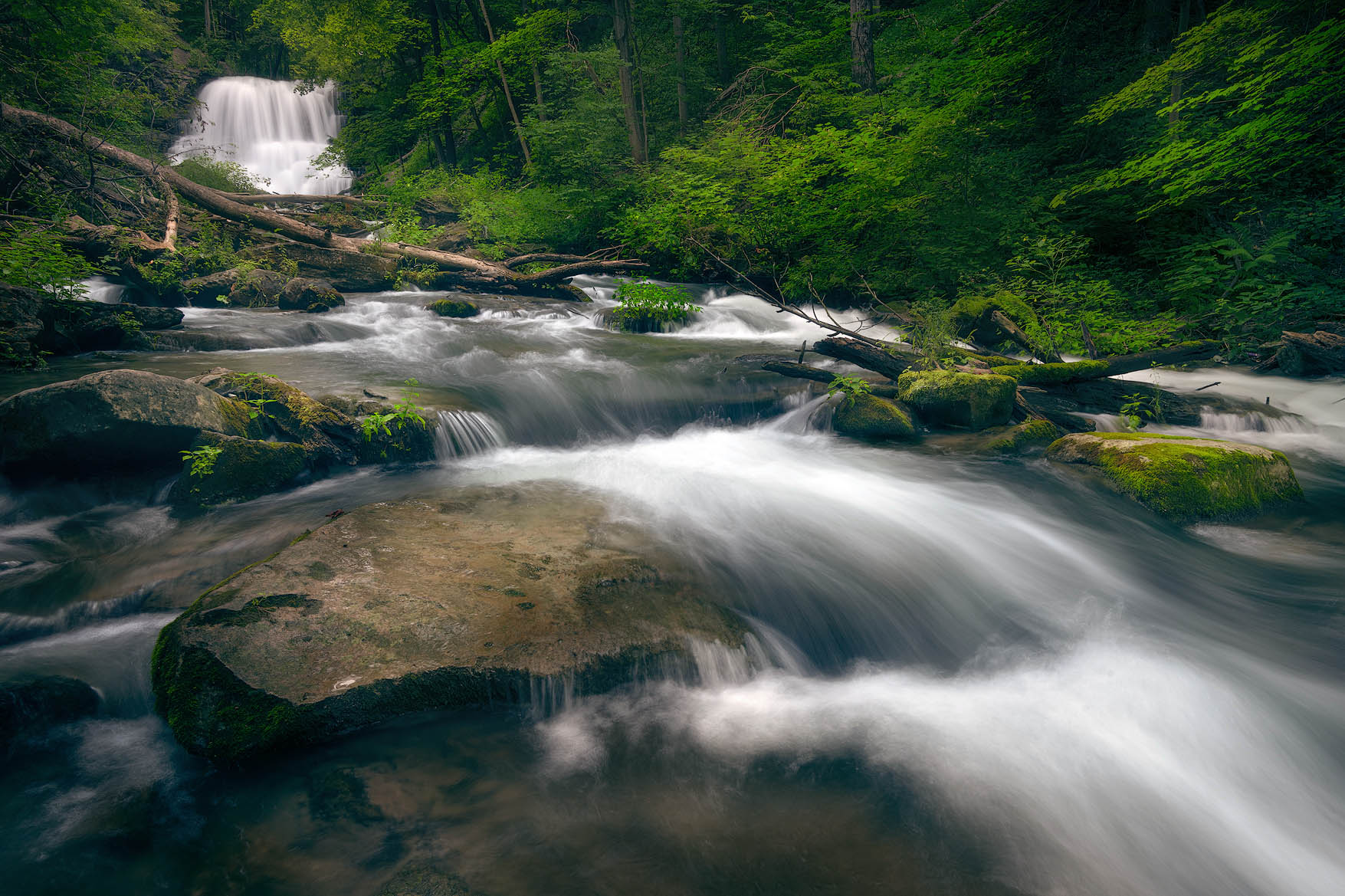
Here is a rework reflecting my suggested crop, as well as running the Photoshop Warming Filter, warming up the entire scene, (except I masked the cooler white of the flowing water back in to avoid the warming filter being applied to the white water.
Chris,
This is a gorgeous scene with some wonderful depth to it. The diagonal placement of the water is perfectly done and draws me nicely into the image toward the falls. I also like your chosen SS for the water flow. The greens look just fine to me and I like @Ed_McGuirk’s small tweaks as I think it elevates this wonderful post another notch. Great work.