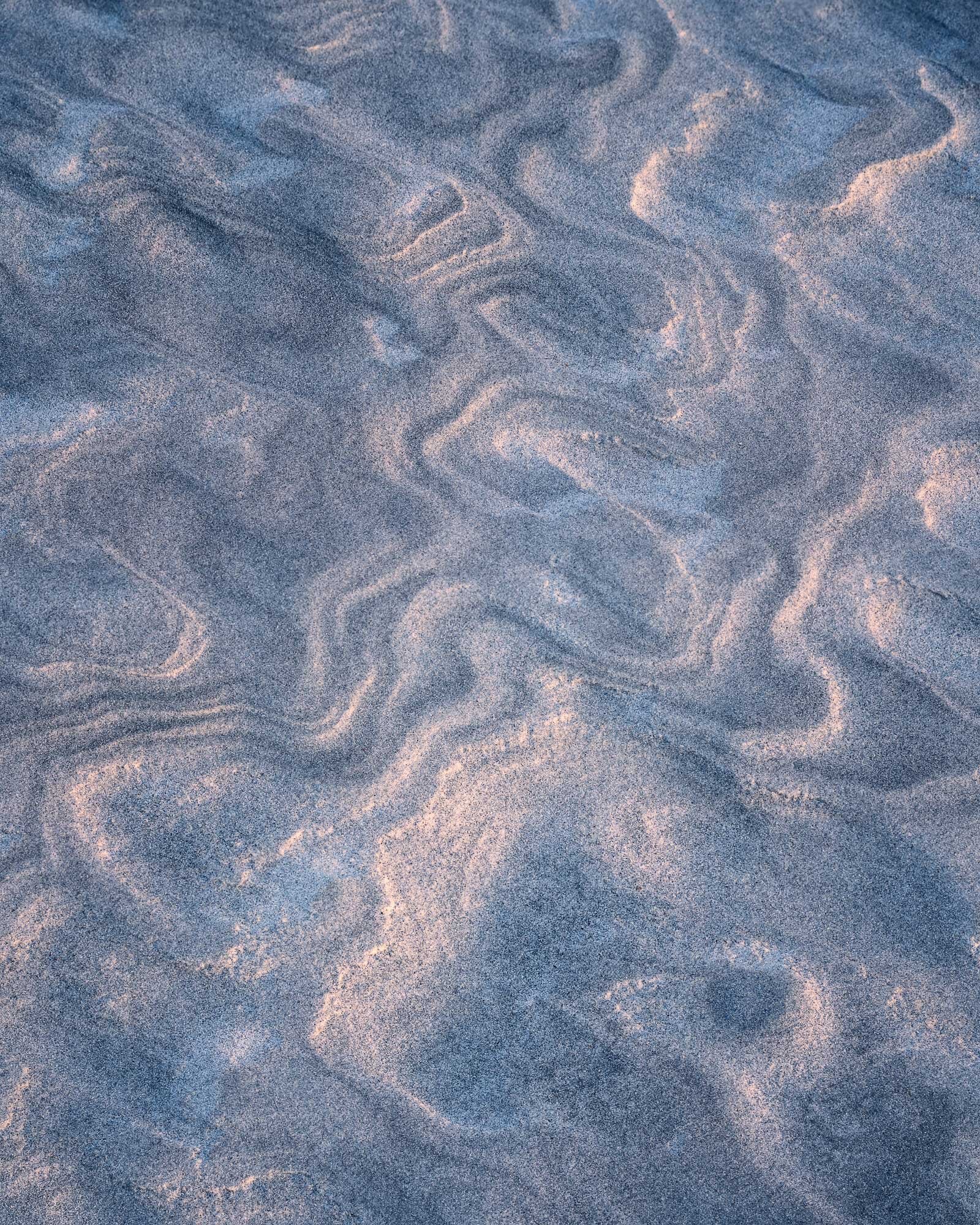
This image was taken shortly after this one (Sand Topo (+Re-edit and New Crop)) and was intended to encompass more of the scene. Overall I think I like the composition better. In my opinion, there is more interest throughout the scene instead of localized at the top (which lead to the square crop in the first) it also has a better focus stack for everything except the extreme bottom of the frame. These were taken just before the sun came up as the first light was coming across the horizon so I’ve tried to retain that feel even though it is an abstract small scene.
Specific Feedback Requested:
I’m really torn on the processing. I like both of them for different reasons and I’m trying to get feedback about the effects of each and suggestions for tweaks that could improve either of them. The second is probably closer to the actual scene and I like how it pops the highlights more. The second has a more calming serene feel (in my opinion) which is common feel on beach vacations…Torn!
Pertinent technical details or techniques:
Is this a composite? (focus stacks or exposure blends are not considered composites)
No
100 mm, f7.1, 4 sec, ISO 100
If you would like your image to be eligible for a feature on the NPN Instagram (@NaturePhotoNet), add the tag ‘ig’ and leave your Instagram username below.
I have viewed this several times now, but I’m still having difficulty deciding which I prefer. I guess given just these two choices, I would say I prefer the first (lighter) version, but with additional processing I believe the darker version could pull ahead. The is one issue I am having with both versions however. Neither version appears to be either fully in focus, or perhaps just not fully sharpened. Perhaps it’s just my aged eyes, but even when I downloaded and played with it I couldn’t get it to a point I was happy with.
Hey Dave…I definitely prefer the 2nd one. The subtlety of the light is more apparent and creates greater depth for my eye.
I will say that the perspective is a bit disorienting to me…it seems as if this may have been CCL rotated or that I’m looking up a strange wall? I can’t quite tell but there is something about the perspective that is throwing me a bit. You may like that I’m thrown by it however!
Finally, I won’t say I’m having the same difficulty as Bill is regarding focus. As an abstract, the sand pattern is the primary element, with that delicious light. The texture/detail isn’t quite necessary for me and I will say I didn’t notice it to be an issue.
David,
After going back and forth a couple of times I do prefer the first version as I just like the soft lighting so much better. This works for me very nicely as is, but I think a crop from the bottom to just above the round hole in the sand would work better. I find all those graceful lines to be much more compelling with the bottom third cropped off. Just my opinion of course.
@Eva_McDermott I think that is where I lean as well, thank you for the feedback!
@Bill_Chambers Funny you should say that…I never applied any sharpening to it! I went back and added some in, thanks!
@Jim_McGovern The perspective throws me off a bit as well. I think what happened is that my camera was “level” but it wasn’t square to the scene. I have tried rotating it, and I will be honest, there was one point I was looking at it and it almost made me dizzy. It was like my brain couldn’t quite comprehend the shift
@Mike_Friel and @Ed_Lowe I worked another version where I cropped to a 4x5 but reduced the pull of the darker hole by lightening it significantly, I think that helped keep more of the image but reduce the weight of that spot in particular.
Davis, abstracts are so hard to critique because they are so subjective. Colors, contrast, WB, everything is so personal in the world of abstracts. So all I can do is express personal preference. I like the light and colors in the first of the two original images posted. The lighter version has more energy and vitality. I think you made a good choice to crop the bottom in the rework, IMO it strengthens the composition and patterns considerably.
My own personal preference would be to take your rework, and darken the darker tones to add some contrast. Here is a rework where a TK Darks 2 was applied to a curves adjustment layer, and then the curve was pulled down.
I like added contrast in your version. I will attempt something similar on mine as well. I agree, abstracts can be harder to critique in that way, I guess I was just wanting to make sure that it didn’t move too far from reality to be displeasing.
Abstracts are good images to experiment with more aggressive processing of color, saturation, contrast etc., because most photographers making critiques recognize that abstracts are not necessarily intended to reflect reality. This often gives you more processing latitude, and you can have fun playing with variations.
I like that with it slightly darkened, I will probably add that adjustment to mine. I agree, you can push things further and try on different edits to see which you like best!