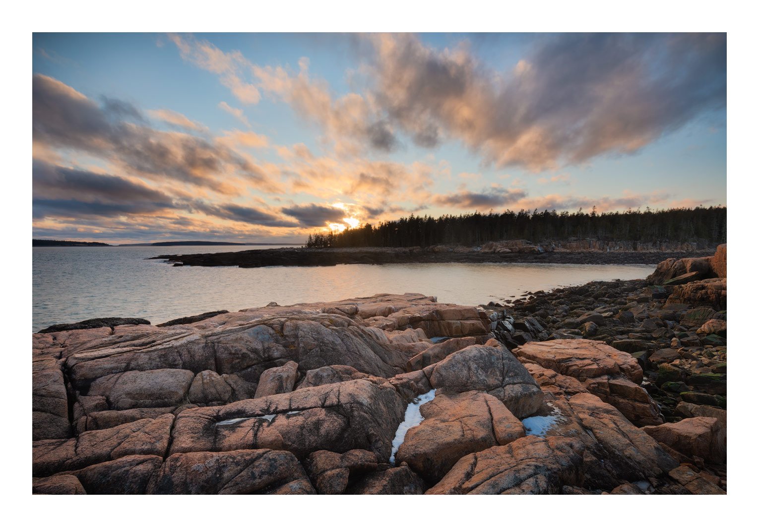
In February 2020, @Alan_Kreyger and I took a trip to Acadia National Park, Maine, to photograph winter seascapes. In the 6 days we were there, we had 4 days of rain, snow and ice storms. We had 2 cloudless sunrises, and only one sunset with clouds, and this was it. This was taken along the Ship Harbor Trail.
This is a blend of multiple exposures for dynamic range, using TK luminosity masks. Sunset was essentially at low tide, which exposes what Alan and I called the Black Rocks of Death (dark algae, seaweed, etc.), a few of which you can see on the right. We initially tried shooting about 30 feet in front of this view at the top of the rock cliff, but this resulted in a foreground of mostly Black Rocks of Death, so we pulled back to get these pink granite rocks to hide most of the BROD.
This looks really good. Great foreground detail and excellent depth with interest front to back. The processing looks good to my eye. No suggestions here.
Ed,
This came out really well! Unless you see the BROD in person it’s hard to appreciate how nice a job of blending you did. No suggestions from me. You definitely made the most of our one nice sunset!
I like the fact that this is not a typical purplish sunset shot. The blue color in the sky goes really well with the brownish foreground. And even though the foreground rock and midground water are static, the clouds and how they are arranged in the image create a lot of dynamics, some sort of rush towards the setting sun.
I’ve only been to Acadia once, but this really captures my memories of the place. This is a nice combination of the ocean, rock, and trees that make is special. The sky is a nice icing too.
Have you tried framing with a lower luminosity? Matting/framing of wall hangings only reflect light, but our monitors are able to be so much brighter since they are active lighting; the brightness competes with the image IMHO. If I crop out your frame I can see the shadow detail better. I wonder if framing with something a little less bright might let the image shine through a little more???
Thank you folks for taking time to leave some comments, I do appreciate it. I like to post current work here at NPN, and this was a decent trip despite the weather. You will be seeing more from this trip.
@John_Williams I appreciate the candid opinion on the border, I do see where you are coming from. I’ve only been trying the borders for about a month, after having some discussions about them with Igor and Adhika, who use them extensively. Both of them use borders with RGB values of 256/256/256, but both them also have photographic styles that tend to lean towards overcast or less contrasty light in many of their images (not always though). I wonder if high contrast scenes like my image here may be more suitable for borderless presentation.
Here are some side by side comparisons. maybe the idea of lowering border luminosity is a worthwhile consideration
Thanks for taking the time to do that @Ed_McGuirk! I’m slightly ambivalent to the use of borders, I don’t use them currently but they really don’t bug me; I have used them in the past.
However comparing your two examples with the border, I strongly prefer the dimmer one.
I don’t see a big difference between the two borders. Perhaps a light grey border would meet John’s suggestions.
I have flipped between all 3 images and am not noticing any effect the white border is having on the darks. I’m not sure if that’s because I’m specifically looking for it. Perhaps a more casual look brings out these differences. No, actually I can see what John means in the lower right corner. Well, the lighter areas should glow in darkness.
By the way, did you see the Scarlet Letter in the rocks?
Actually @Alan_Kreyger who was with me during this shoot, put that there to remember where he wanted to stand when sunset got to showtime (just kidding of course)
Actually, I did not see it before , but do now, thanks @Igor_Doncov
Sorry for your poor luck with the weather that week, Ed.
What I like about this image is the composition because the foreground rocks have some patterns to the fractures and forms so they are relatively unified as a comp element. Same with the clouds - patterned and unified, plus the long exposure gave them directionality toward the setting sun. Nicely done.
What I would do differently is make the image a bit darker to enhance the interest. This original post is quite bright - uniformly so - and I think that prohibits or counteracts the drama that was probably there. I know luminosity masks give you a wide range of light values to work with so I wonder if a different value mask would improve it, or maybe just work with this one and enhance what you’ve got.
I scrolled to see that you reposted it although since I purposefully don’t read the comments to remain objective, I don’t know what you did to it. The differences are so subtle I don’t see them.
I also wonder if a closer position to the foreground rocks would enhance the perspective. Did you take any images between this position and the one too close to the BROD?
I have a darker version of this that I previously shared with a couple other folks, they both told me it needed to be brighter. I guess it comes down to personal taste.
Moving forward even 5 feet would have also involved stepping up 3 or 4 feet onto the rocks, and the higher view would fill the mid-ground with BROD (some visible on the left as is). Alan and I thought this was a good compromise.
Ed,
Way to make lemonade out of lemons. I had to laugh when I read the BROD description as they are definitely not photogenic in any shape or form. You did an excellent job of minimizing them with your positioning of the camera. My preference is for the original as it seems to bring out the pinks of the Acadia granite better. I particularly like the way the clouds seem to fan out across the sky from the setting sun. Even though you only had one sunset you nailed it.
Another beautiful Ed Mcguirk piece of art!, Personally I dont like the white border - detracts from the actual image - A black border might work. I do think though, that the main interest is the dramatic sky. And so a slightly darker foreground may achieve that.
It is obvious that you have spent quite some time paying attention to detail and the end product is this lovely piece as is echoed by everyone else!