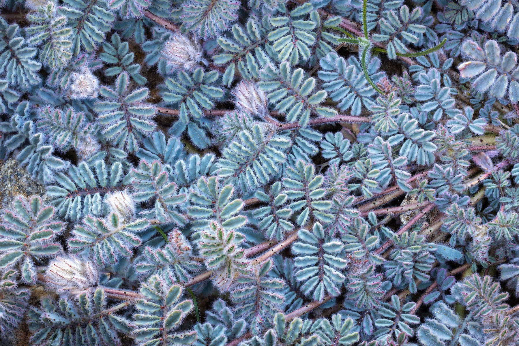
This is one of my favorite plants from the Mojave Desert, the soft prairie clover. It is a small plant that often grows upward instead of in a flatter mat like this specimen. This is one of the cleanest and largest specimens of this plant that I have found but it still presented some photographic challenges, mostly due to the bright rocks and messy specs in the background.
Specific Feedback Requested
There are some visual distractions, like empty spaces and things in the background (rocks, dried leaves) that attract a bit too much attention. I feel like the rest of the subject makes up for those deficiencies but I am curious to hear what others think.
Technical Details
100mm macro lens, f/16, ISO 400, 1/6 second. Ten file focus stack using Helicon Focus. Lightly processed in Photoshop.
3 Likes
Hello Sarah thanks for posting. An attractive plant. I think you have already pointed out some of the issues you had to deal with. I think my approach on this would be to have a much tighter crop particularly in the central section where the two flowers are, this would eliminate most of the other problems that you mentioned! I think the divergence of the two branches there would be in your favour! Its always difficult with plants such as these to get a clean image across the frame. You are better trying to isolate a section with a strong graphical appearance!
2 Likes
Thank you for the feedback, Robert. My goal was to focus more on the extensive pattern and repetition of the plant with this composition but I also appreciate your feedback about a tighter crop.
1 Like
I think this is sensational Sarah, as posted. I love the horizontal branches (for want of a better word) coming out of the right side of the frame and running across the entire frame. I love the texture of the leaves and the flowers and the depth you attained from all of the dark spots throughout the image. At first I thought that little green plant coming out of the URC was a distraction but the more i look a it, the more it looks like a starfish in a colony of coral. I know, whoa, crazy imagination but this is just beautiful. I really love the LLC flower but it may be just a smidgen too bright as it does draw the eye but my eye is happy to go there so take that for what it’s worth. The rock along the left edge doesn’t bother me at all. It makes the image real. Sometimes when you have perfect coverage from edge to edge people tend to start things have been cloned and photoshopped but this just looks real to me and the rock is no bother at all. What a great find, Sarah!
1 Like
Sarah, I think this is an excellent view. The dark spaces don’t bother me in the slightest. My eyes are caught by the few branch ends that are noticeably brighter than everything else and slightly different in texture. If you like those, I be tempted to do a bit of local dodging in the right hand 1/3 to provide matching eye catchers. Alternatively, some burning-in of the brighter bits would even out the viewing. The variety of subtle colors (greens, blues, and occasional pinks) is lovely and restful.
1 Like
@Mark_Seaver and @David_Haynes - Thank you both for the kind feedback and detailed critique of my photo. Your suggestions, especially about the overly bright spots that are catching too much attention, are very helpful. I’ll consider them when I reprocess this photo. Much appreciated!