The photographer is looking for generalized feedback about the aesthetic and technical qualities of their image.
Description
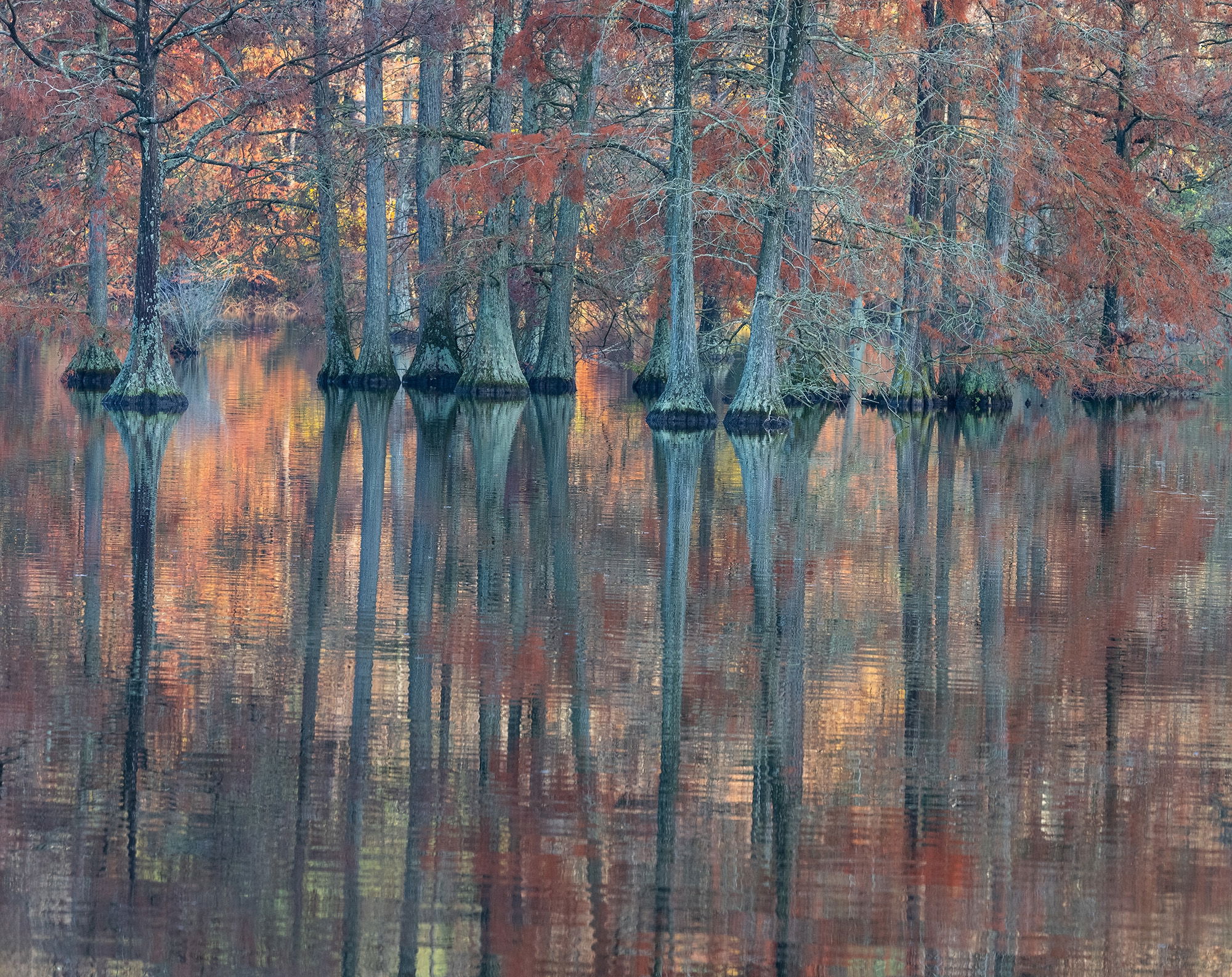
This is from our last trip in early November to Trap Pond SP, DE. It was getting close to sunset and I knew from prior visits that the setting sun would light up the far shoreline behind this lovely stand of bald cypress. I was not disappointed. For the sake of honesty there were three very bright dead snags that I removed as I could not hide them by moving right or left. One of these years I might get up the nerve to put my gear in a kayak and paddle out to these magnificent trees; or maybe not.
Specific Feedback
How do the colors look? I removed 10 points of cyan as I thought the tree trunks were a little cyan. Anything else you notice please feel free to mention it.
Technical Details
Nikon Z 7, Nikon 100-400 @ 210 mm, f 11 @ 1/60 sec, ISO 800, Kase magnetic CPL, cable release & tripod.
Critique Template
Use of the template is optional, but it can help spark ideas.
Vision and Purpose:
Conceptual:
Emotional Impact and Mood:
Composition:
Balance and Visual Weight:
Depth and Dimension:
Color:
Lighting:
Processing:
Technical:
Ed: What a marvelous scene and a spectacular color palette. I also like that there is some movement in the reflection and it’s not glass smooth. Definitely gives it a more painterly feel. Exceptionally well done. >=))>
Nice, Ed. Glad you found this spot a couple years ago. I like how you composed the shot. Most people, including me , would have gone 50/50. I also agree with @Bill_Fach about the reflection. I’m leaning more and more to this type as opposed to a mirror look. Top notch work. It’s probably just an illusion, but I almost feel like it’s leaning to the right. Still a bit of cyan, but I like my trees blue/cyan.
Wonderful!! I love that the “horizon” is above center, giving more importance to the lovely reflections. (But I hope you have dozens of compositions here to delight us with!) The cyan is lovely against the warm colors. After the gasp of admiration, my first concrete thought was the same as @Michael_Lowe’s, about a rotation. It’s hard to justify exactly why – it just feels that way. (Or maybe just a distortion, pulling down the LL corner.) Gorgeous any way!!
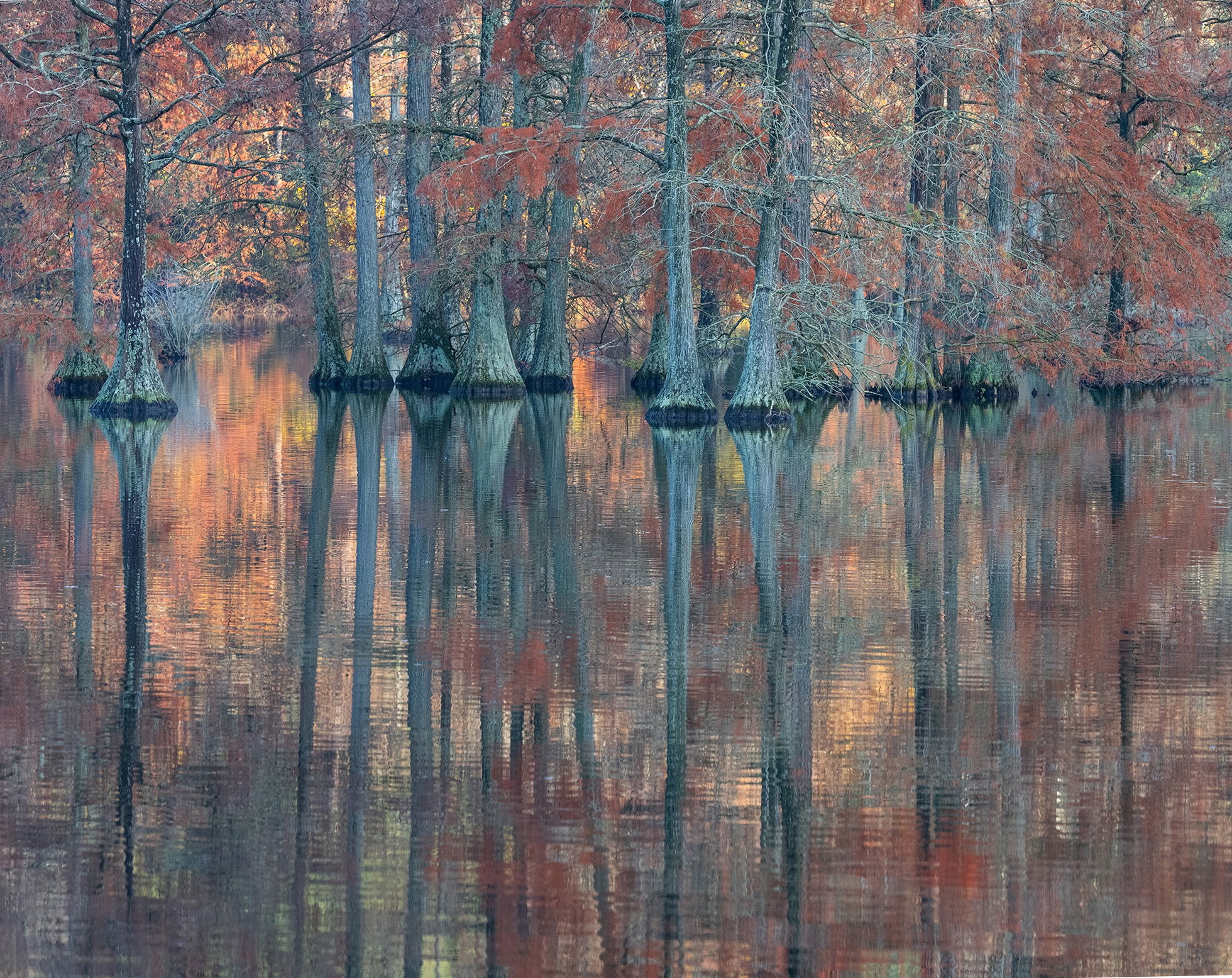
Ed: After noting @Michael_Lowe and @Diane_Miller comments about the rotation I did a little checking and it does seem to be rotated clockwise a tiny bit more than 1 degree. Not sure if you’re familiar with this technique but for reflections you can use the ruler tool in PS to draw a line from corresponding points on the land and the reflection. Then go to Image Rotation and select Arbitrary and it will show you the deviant angle. With a mirror smooth reflection it’s pretty easy but on one like this it’s tough to find the corresponding point in the reflection. I did find one and applied the correction. Back to you.>=))>
Just lovely, Ed. I always forget these kinds of places exist in the Mid-Atlantic. It feels very bayou to me. I grew up in Maryland, so I connect with a lot of your work in WV and PA, parents being from Cumberland and summers spent at DCL, MD.
What I love about this is the color palette: the cool tones of the bark/trunks and the warm colors in the foliage. The reflection and sense of calm at the same time as a palpably autumnal chill make it very evocative.
Not sure I would have notice the rotation, but Bill’s correction feels right there.
Well, I don’t know about the trees up north, but the trees in the south bayou’s all seem to have blue/cyan in the trunks which the camera makes more noticeable. I like a little blue in the scene so good of you not to remove all of it as it makes these trees seem more tranquil to me. I love that almost all of the leaves are orange/red. Yep, there are a few greens and yellows but the majority are that deeper color that I love with these trees. What’s really nice though is the sense of depth. All of the trees in the front are in shadow and much of the trees behind are in bright light. It adds pop and sense of liveliness to the image and the reflection is alive with contrast and color. I like the crop you’ve chosen for this. I never would have thought to do something like this. It’s so counterintuitive to me but I really like more water and less trees withe reflection providing most of the interest in the image. I do like the slight rotation that @Bill_Fach shows in his rework.
The colors look spot on to me. Most people would probably crank up the saturation but it would be wrong to do so. Perfect as is. Beautiful image, Ed.
I don’t have much to add but wanted to pop in and say that I love this image. Bill’s ever so slightly rotated version does look better to my eye. Without ever having seen a scene like this with my own eyes it’s hard to judge saturation but it certainly doesn’t appear to be oversaturated at all. It feels just right to me. I love that there are some brighter pops of color in the reflection that aren’t as visible in the trees above and those warm colors contrast beautifully with the cooler trunks. Bravo!
Ed, this is lovely. I think your comp., which emphasizes the reflections looks great. You’ve got plenty up top to set up the reflections with the transition from bright to dark angling across the frame looking good. The colors look fine. Swamp trees have a habit of pointing in many directions besides vertical. While Bill’s approach does give you a number, I’m not convinced of the accuracy of that number since it’s very small and working from the NPN version is very limiting in terms of how accurately you can apply that pencil and find a specific reflection point (or line). It’s a better approach when you’ve got the image at 100% to work with.
The color palette is beautiful and the whole image is splendid - I like the non-symmetric composition and the reflection with some small waves disturbing the water. Really nice! (and such a beautiful place)