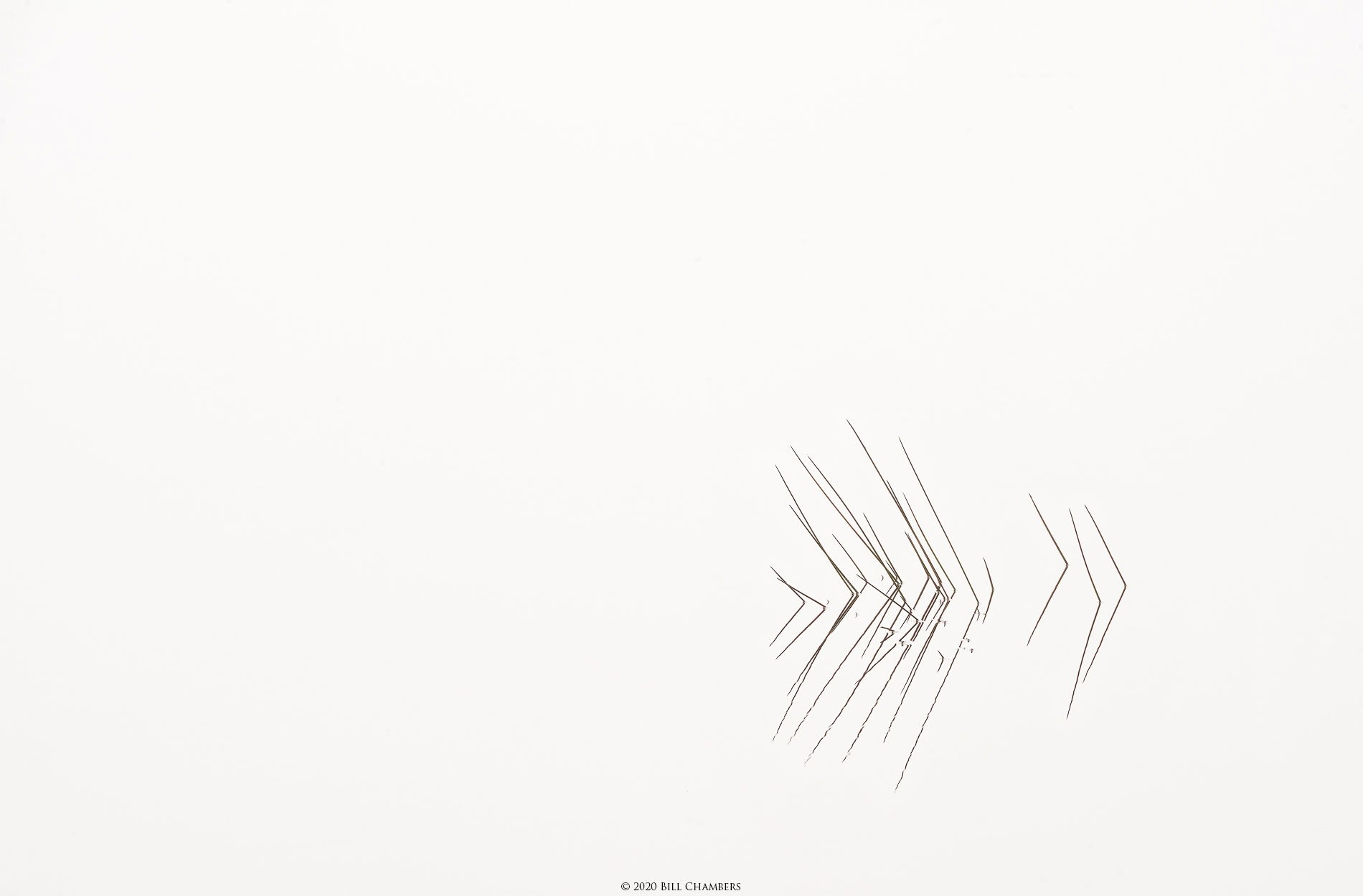
I shot this well before sunrise in the marsh. It was absolutely quiet without even a hint of a breeze. This is actually a color image and I did nothing special at all in the post processing except for burning the grass slightly.
What technical feedback would you like if any?
Any & all
What artistic feedback would you like if any?
Any & all.
Pertinent technical details or techniques:
(If this is a composite, etc. please be honest with your techniques to help others learn)
If you would like your image to be eligible for a feature on the NPN Instagram (@NaturePhotoNet), add the tag ‘ig’ and leave your Instagram username below.
Minimalism at it’s best, Bill! I love these kinds of images as they are so soothing and peaceful; a moment of zen if you will. I only have one small suggestion; just my personal preference; would be a little crop from the left and the top just to zero in on those reeds a little more. Anyway this is beautifully done.
Good minimalist image. A comment I’ve made in the past seems appropriate here. The negative space in such should still have some tonal variation for best results. It’s that nuanced variability that draws attention and interest.
I thoroughly enjoy this image, Bill! It has the Michael McKenna / Bruce Percy feel to it, but you’ve made it uniquely your own. I appreciate the high-key, minimalist nature of it and that fact that you retained the subtle color in the reeds. I don’t know that I agree with others about the crop, as I think the negative space works well… However, I am interested in getting a better understanding of how to accomplish what @Igor_Doncov mentioned, as I agree some more tonal variance could help to enhance the image, but I’m not sure about how to add that tonal variance in a tasteful manner. Igor, any suggestions for introducing the “nuanced variability” you speak of? Perhaps, a subtle horizon line or something of that nature?
Thank you @Craig_Moreau, @Igor_Doncov, & @Jimmy_Arcade for you comments and suggestions. Igor, Jimmy & I both have a question about the tonal variation . Are you taking about natural tonal variation or are you talking about introducing tonal variation from an outside source? I’m asking because I was wondering if you thought I had eliminated any type of variation? In this case, I didn’t eliminate anything at all as there was nothing to eliminate, but I probably have toned down larger variations in the past.
I went back and cropped a bit as you suggested but don’t know if I cropped too much or not enough, so please give me your thoughts. I’m one of those who happen to like negative space so I’m probably not the best judge. Thanks again for your comments!
No, Bill. I just meant that have various shades of white would have been nice. I had no idea if this was possible. Sometimes people do raise the exposure in whites to remove all tonality for their negative space. It looks nice as a graphic in the manner you have created. It looks artistic to me.
As a big fan of minimalist landscape photography, this shot ranks with the best: Simple, elegant, well-seen. Many photographers walk past scenes like this oblivious to the potential. I think the amount of negative space is fine. Deciding on the correct amount is always a struggle. Great work!
Your edit nailed it for me, Bill. I think the crop places a bit more emphasis on the reeds while still retaining some negative space, which is so essential for this wonderful scene.