The sun was popping in and out of the clouds and these dunes were briefly lit up while my location was not. A few seconds later, the light was gone.
D850, 70-200mm
Repost:
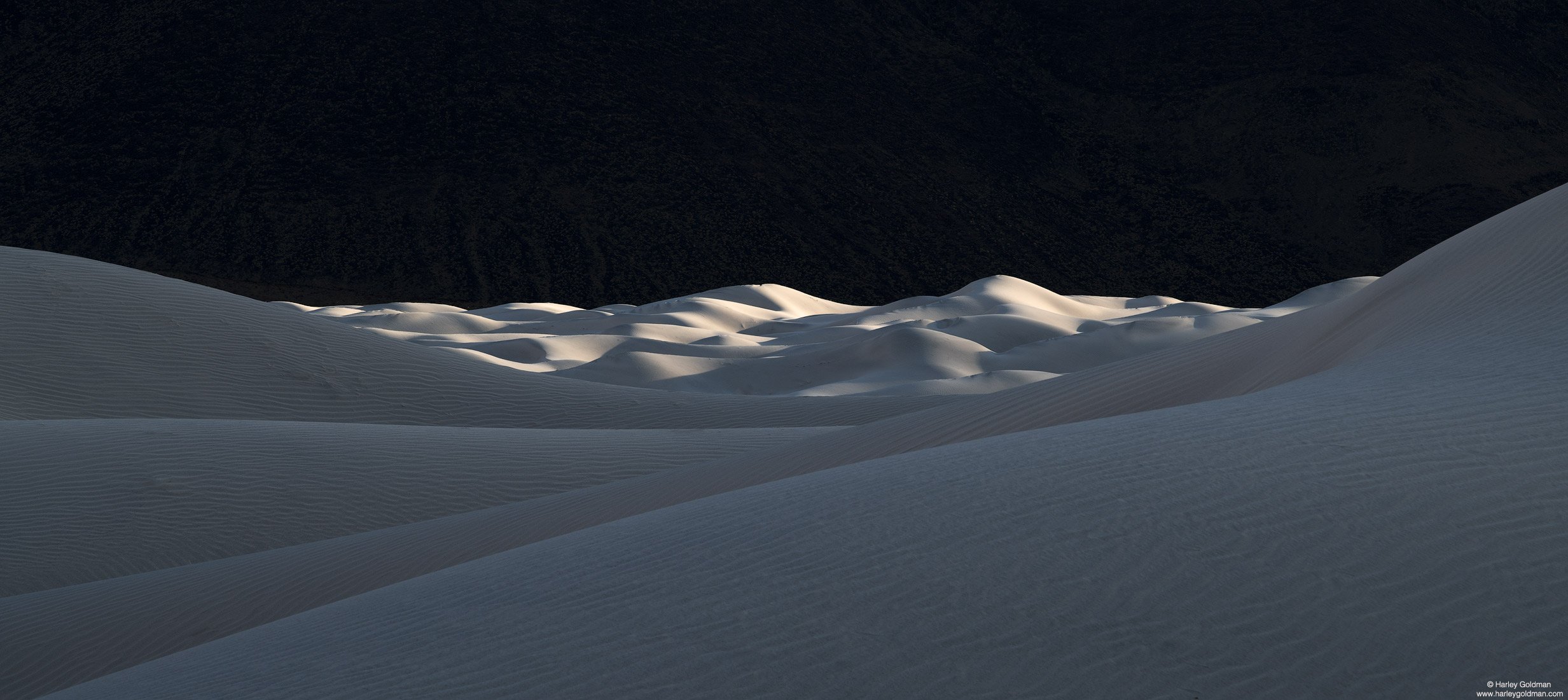
Original:
The sun was popping in and out of the clouds and these dunes were briefly lit up while my location was not. A few seconds later, the light was gone.
D850, 70-200mm
Repost:
Original:
On the first look this looked like a moon shoot.
This is gorgeous, i love the luminosity of the on the dunes. Whats that dark background? Rock?
I can see this on a big print on a wall, no doubt.
Thanks for sharing,
Cheers
Harley,
This is a very unusual take on the dunes; almost looks as though it was from our moon. I am enjoying the undulating shapes of the dunes and the light on those in the BG is sublime; almost as though they have a spotlight on them. My only suggestion would be to darken the BG some more as the details look a little weird; at least to me. I really like this. Glad you were there to capture this for the rest of us.
Gorgeous, indeed. I am, however, with Ed in suggesting a darkening of the background.
Thanks for the comments, @João_Ferrão, @Jim_Gavin and @Ed_Lowe. Good suggestion on the background. I added a repost. Does that do the trick along the lines of what you were thinking?
The repost does it for me.
This is real nice, Harley. Probably my favorite of your recent dune posts. Post in the repost looks spot-on to me. Fine as cropped but I personally prefer a 16:9 which places more emphasis on the lit dunes.
Harley,
Phenomenal. You’ve really elevated your dune work with this last trip. Love this dunescape. Of course the light is gorgeous on the dunes, but your treatment of the dark, mountainous backdrop is masterful. that dark background is truly mysterious - almost out of place, like this is a composite or something… I was quite enamored with the image as posted, but the rework is even better! It’s important that there remained some texture/detail in the darkness to retain the mystery - and you’ve managed that beautifully.
The lines and the soft roll of the foreground dunes really give this scene great depth.
Can’t offer any other improvements. Love this!
Lon
Harley, take my money. This is amazing. I don’t have anything else to add.
Interesting. It has a Space Odyssey 2001 look to it. I like Dave’s crop but the original makes it look more expansive which goes with the galactic theme.
Outstanding, Harley. I agree with Igor, the expansiveness is an important part of this image, at least for me. I definitely prefer the repost - such an otherworldly feel. Excellent.
Spectacular take on this subject, I love the contrast and layers between foreground, mid and background! The blacks in the background are perfect with just a hint of detail once you open up the image!!!
Nice work Harley! Truth to tell, I get tired of seeing the same old takes on the dunes and this is a marvelous and spectacular variation. I prefer the uncropped version.
Possibly one of the best dune images ever. The shapes, the light, the background . . . everything works. I think your original background is better than the darkened version. That textured background only adds to the overall mystery of this composition. Well done!
A wonderfully different view with an amazing FG. in perfect light! I can love both BG treatments, but if I had to choose, the darker one would win.
Spectacular image Harley. I like your repost best.
I love this somewhat different take on a dunescape, this looks like something from an alien landscape in a science fiction movie. The rework nails it for me, the darkening of the background takes the surreal-ness of this up another notch.
Harley - what a spectacular image, especially with the darkened background, clean lines and flawless focus throughout. I can’t imagine a more perfect image to end 2020 on and open 2021 with a clean slate. You’ve got winner - thanks for sharing!
Harley, this is an outstanding take on these dunes. The comparison between your two versions is extra fun. While the repost emphasizes the foreground well, I find the extra texture at the back adds to the sense of place (being on earth rather than on the moon.) You can’t go wrong with either.
Late to the party, here, but this is super. I prefer the original, with more detail in the background. The rework feels sort of artificial to me. I do like your crop for the expansive, horizontal framing.

