Repost:
Repost #2:
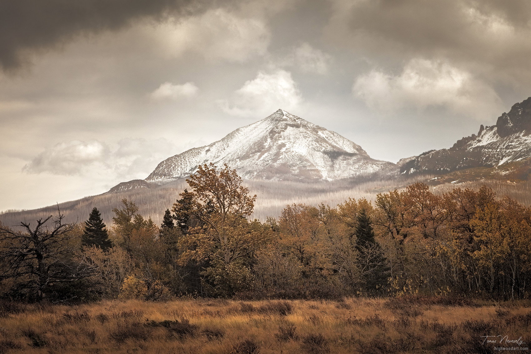
Original:
This is an image that I found in my archives over the weekend while looking for something else. I was surprised, because I don’t even remember have this and it sat there unprocessed for the past 10 years!
It was shot on a particularly stormy autumn day in Glacier National Park. I remember the day well, it was raining on and off, it was extremely windy, the stormy clouds were flying through the sky and we even saw a rainbow or two.
Specific Feedback Requested
All comments and feedback are welcome.
Technical Details
1 Like
This is a very nice composition, Tom. The tree line gives it depth and the snow covered mountain draws the eye. I think the biggest problem is that there is an orange cast which gives the photo a flat look. I hope you don’t mind. I wanted to play with this photo just a little.
Took the orange cast out using TK8 panel (one of the actions available).
I brought it into ACR
Did the regular sliders - highlights, shadows, contrast, curve, calibration, sharpen, etc (I did not do any masking in ACR because I use PS for masking, but you could use the masks in Lightroom (if you use it) to work on the sky with a gradient and work on the tree line with a radial gradient.
Brought it into PS - used H/S, burned a little, took some orange out of the grass and darkened the light spots in the grass, used contrast and brighten slider, and did a light vignette.
I cropped the image on the left to take out the dead tree. That was just my preference.
I did these changes quickly so it’s not a finished product. If you like how this looks, you could do a little more D & B to see if that gives the photo more depth.
You’ve got a good photo here. It just needs a little more processing to really bring it out.
2 Likes
Hi @Donna_Callais , thank you so much for your awesome feedback! When I processed this I wanted to make it/ keep it as sort of a warm monotone image, but after seeing your take on it I’m going to scrap that idea and make it more like what you did because it just looks so much better. 
What did you use in the TK8 panel to take the orange out? Was it the Neutralize Color Cast action?
I’m going to work on the image some more (hopefully tonight) and will post the reworked version when I’m done…
So glad I could help and you liked the rework, Tom. I did use the Neutralize Color Cast action and I lowered the opacity to 90%. If you have questions on anything else I did, just ask. I think you will be able to get more out of this photo than I by spending more time with it. I look forward to seeing what you come up with.
So I’ve reworked the image based on some of @Donna_Callais 's suggestions and I like must say that I think it looks much better. No, I’m not even sure what I was thinking before because it just feels so flat.
The rework is amazing. I like the original as well but maybe not as much. They’re just different interpretations. The clouds arranged themselves nicely for you. Clouds are often the weakest part of grand landscape compositions. the ulc needs to be lightened but that’s easy to fix.
I think both are very nice, just different. The original has a sort of faded film look, but in a very attractive way. I think a little more contrast on the mountain and the hill to the right would be a nice touch, along with lightening the dark cloud in the UL.
But @Donna_Callais brought out quite a surprise, with wonderful color that looks natural!
I love the rework Tom. You have an effective composition that creates depth.
The rework is awesome, Tom. Well done.
@Igor_Doncov , @Diane_Miller , @Eva_McDermott , and @David_Bostock , thank you all for your comments and feedback.
Truth be told, the original version is closer to the raw file but as this was shot quite a while ago, I honestly can’t remember what the scene looked like to the eye. I imagine it was most likely somewhere between the two but that’s not really important…
I like the rework, Tom. You did a very nice job processing it. It’s always amazes me how the processing can totally change the feel of a photo. I’m glad you like the reworked image , but don’t disregard you’re first image. Try making the changes that @Diane_Miller suggested. With a little dodging and burning, you might find that you like that one just as much. It’s good practice sometimes to make two versions of a photo you really like.
Agreed with everyone. The re-work looks great Tom. I like the cool tones of blue that balances the rustic yet very beautiful look of the gold tones.
Thank you @nickincalifornia and @Donna_Callais , I’m glad you like the rework!
I’ve uploaded another rework version (based on @Diane_Miller 's suggestions) that I worked on last night. It’s based off the original but with a bit more contrast and dodging and burning. I think I still like the first rework best but this one is still a huge improvement over my original.
There is nothing wrong with getting a three-fer! I really like them all!