All thoughts, critiques and opinions are very much appreciated.
What crop do you prefer?
Thanks for looking ![]()
All thoughts, critiques and opinions are very much appreciated.
What crop do you prefer?
Thanks for looking ![]()
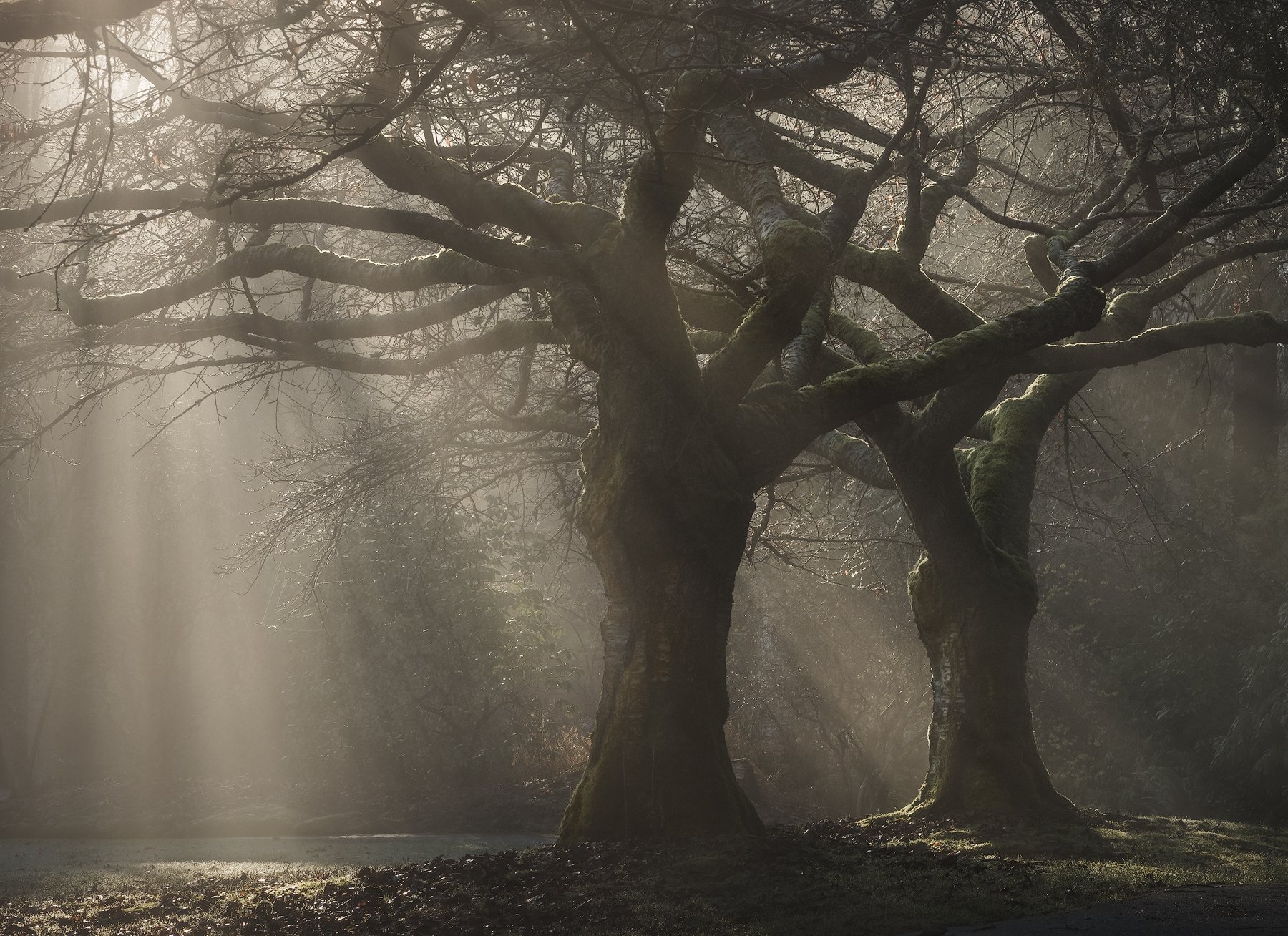
I like the bottom photo because it includes more at the bottom, but the part of a big branch in the upper left draws attention. It is not in the top one. I do prefer the light in the bottom one so with a crop on top it would be my preference. Nice light and good shots.
Blake,
What a gnarly looking set of trees - and the beams of light - wonderful!
My thoughts echo exactly what Jim wrote, all of it. What’s weird to me in the original post where the images are right next to each other, the top one appears slightly darker than the bottom one. It must be an illusion because when you open and look at the larger view, the luminosity appears equal. weird.
Anyway, agree, keep the extra room at the bottom and crop out the heavy branch in the ULC.
I’m not sure if b&w would make this stronger (it’s already a very strong image,) because this is so monochromatic. If keeping this in color is the goal, then I think somehow you could bring out the greens inthe grasses where the light is landing. Very minor thought, but something that came to mind.
Great mood and atmosphere!. I can imagine some little hobbits running around.
Lon
Love the lighting and subjects here. I’ve cropped away that branch which seems to interrupt the flow of the branch network. As an alternative in processing I’ve gone for a cooler balance in the shadows and golden in the rays.
I agree on cropping the top but keeping more of the bottom. The horizontal upper-left branch and some of the busy stuff up top is all that needs to be lost. I also like what Kah did with the processing, really makes the light stand out and lends the image more of a mood. Excellent image!
The first is better. It’s a more direct statement. It has fewer distracting elements. It gets to the heart of the matter better.
I also like Kah’s crop because it shows the rays hitting the ground as well. But the first image was good enough for me.
Il prefer the second image, but with that branch and busier stuff cropped out. I also like the warmer color balance of the second image.
I love the mood, and ths soft light.
–P
Hi Blake. I agree with everyone else and that I like the top crop. I wander around more in the bottom one. I like what Kah did in the crop but don’t light the tone/color he gave to the light. Prefer your “whiter” light.
I prefer the wider view, but with the top crop. Gorgeous light and scene!!! Really like the warm look, too.
A powerful image for sure! I like the crop off the top and with more room at the bottom. Your original tonality is nice as well as is Kah’s rendition.
Hi Blake, you caught some great light. I agree with Chris, cropping off the top but keeping more breathing room at the bottom.
Blake, I like the second image here because of the extra room at the bottom. Also agree with cropping away the branch in the upper left corner. The cooler balance that Kah did looks nice but so does the version that you have. Very nice work!
@Jim_Gavin @Lon_Overacker @Alex_Noriega @Igor_Doncov @Preston_Birdwell @Greg_Stokesbury @Harley_Goldman @Chris_Chamberlain @Dave_Dillemuth @Nick_Bristol @Kah-Kit_Yoong Thanks you all for the excellent feedback, it;s all extremely helpful and appreciated!