Hi everyone,
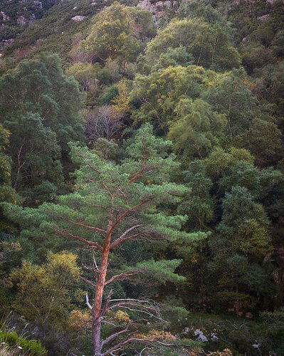
This image was taken on last fall but i never stopped to look at it and PP it as iwanted.
But finally i did it.
The first image i took of this pine tree (Pinus sylvestris i think) i used a very wide apperture but theres was not a noticible separation from the background, some minutes later the wind pick up shaking the leafs other then the pine (protected by a stone wall on the left).
What technical feedback would you like if any?
Any as allways. Is the PP balanced? It has a dodge (by colour) layer to greens yellows and some browns. Vignette and level correction.
What artistic feedback would you like if any?
Any. Composition wise what would you change? Does that green patch on the LLC bother you?
Pertinent technical details or techniques:
(If this is a composite, etc. please be honest with your techniques to help others learn)
Single tripod shot, 0.5s, f/9 ISO50 at 50mm.
Thank you all,
Cheers
If you would like your image to be eligible for a feature on the NPN Instagram (@NaturePhotoNet), add the tag ‘ig’ and leave your Instagram username below.
@jferrao88
Nice image. I think it could be tightened up a little. The top and LRC are not adding much IMO. I would clone out the LLC and dodge the tree a little to get more separation from the BG. I really like the colors and tonesd in the image. This is JMHO about the rework.
Thank you @Michael_Lowe.
I left the top part because i liked the background trees, but i do like your rework, ill have to try and see if a can find a half way between, and that LLC more clean is a plus indeed.
Thanks again,
Cheers
@João_Ferrão I like this image very much, it does really convey a feeling of stillness, and calm, I think primarily due to the soft, muted earth tone colors. I also like how you have the small yellow tree to the left of the main pine tree, it mimics the leaning shape of the pine.
I do think the composition could use a little simplification. While Mike’s crop does simplify the scene, I also agree with you that the multiple tones of yellow and green in the trees above are really nice, and would prefer to see a crop that keeps more of that, while eliminating the rocks at the very top (the bits that I find more distracting).
I also think that if you are going for a mood of stillness and calm, then I would suggest dialing back the saturation and luminosity of the red/brown pine tree trunk, trying to better balance the saturation of that trunk with the saturation level of the background trees. I would also suggest cloning away some of the bright spots in both the LLC and LRC. Here is a rework reflecting my comments.
2 Likes
Hi @Ed_McGuirk thank you for the feedback.
Here’s a rework having in mind both your’s and @Michael_Lowe feedback.
I recropped to remove that top area and still maintain the trees on the background.
Did some “cleaning” of branches and rock that were just stealing attention from the main tree, and lowered the red saturation on that tree trunk.
These small things made a great diference to the image IMO.
Thanks again,
Cheers
I like Michael’s version the best for both composition and color combination. The tree being cut off by the bottom of the frame doesn’t work very well for me, You might try vignetting Michael’s version to reduce that feeling. somewhat. Or even cloning out some lower branches. But overall, that bluish green works well with that cinnamon color imo.
1 Like
I @Igor_Doncov thank you for the feedback, indeed the croped tree seams a bit off but ill try to clone that green patch a bit more to open the crop.
Thanks again,
Cheers


