The photographer is looking for generalized feedback about the aesthetic and technical qualities of their image.
Description
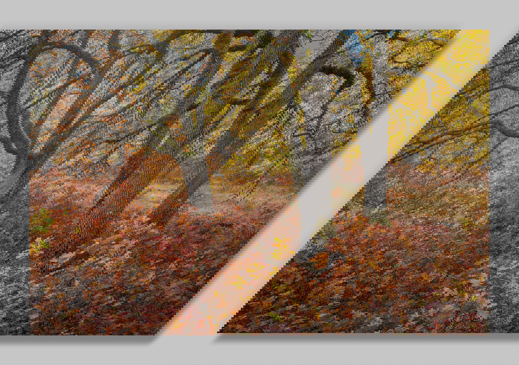
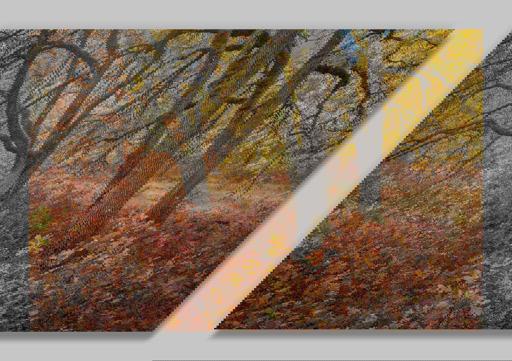
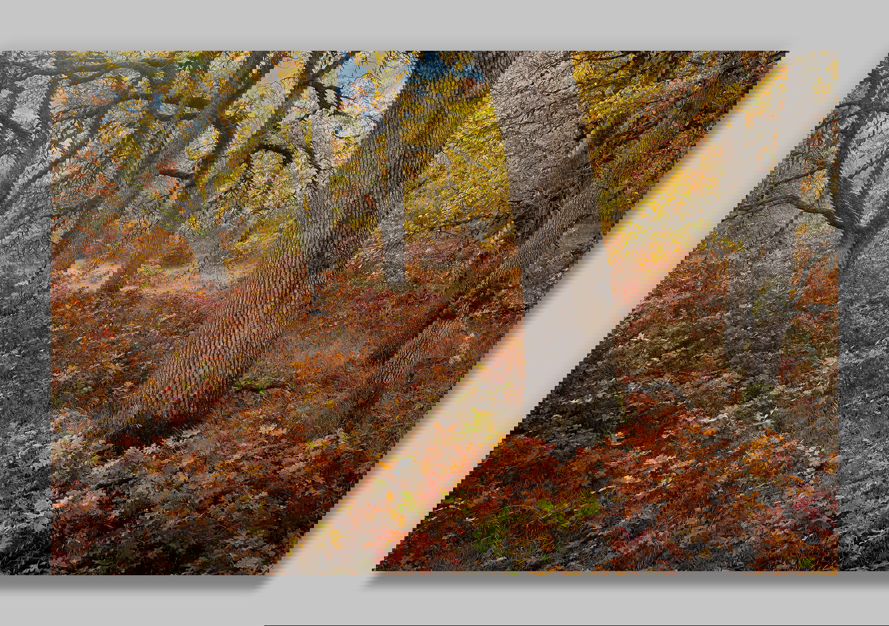
@James_Lorentson and I were able to sneak away for a day to try and catch fall color this past Thursday, and the oak in the Klickitat River area were just about at peak.
There was a lot of prescribed burning going on in the general area, so unfortunately the grand views were all hazy. That was okay for the smaller scenes though, because the smoke added just a touch of ambiance and a bluish tint to the background.
Specific Feedback
I’d love to know if you have a preference between these two compositions. For me, the second image has a bit more depth, but that one big trunk dominates more than I would prefer. (As you can see, the trees in the first image are in the background of the second.)
Any other comments and suggestions are more than appreciated.
Technical Details
The technique was the same for both images:
NIKON Z 7II
NIKKOR Z 24-200 f/4-6.3 VR at 30.0 mm
1/40 sec. at f/8.0 and ISO 64
4 images stacked for depth-of-field using Helicon Focus
Critique Template
Use of the template is optional, but it can help spark ideas.
Vision and Purpose:
Conceptual:
Emotional Impact and Mood:
Composition:
Balance and Visual Weight:
Depth and Dimension:
Color:
Lighting:
Processing:
Technical:
I definitely prefer the first image. I love the composition. The way you captured and processed the colors is magnificent. I think you’re right about the tree trunk in the second image.
John, the first one, definitely! While the color and tonality is excellent in both images, the composition in the first one has a much more elegant balance.
-P
Wow, John. This is excellent. Personally I’m happy that you turned away from the big landscapes to this. I was marveling at the first image unaware that there was a 2nd as well. Originally I thought the 1st was unequivocally better. But the quirky composition of the 2nd does draw my attention. The foreground tree, which I originally thought was peculiar due to its shape and how it rises out of the frame, became unique and interesting the longer I looked at it. It’s kinda in your face and almost apart from the rest. I like that about it … for now. One thing I would suggest would be to brighten up the tree trunks in the first to the level of the second. Yes, I like how you processed the light in the 2nd over the first.
So, after putting more time into it I prefer the 2nd image. But it’s very close. The 1st is an almost perfect composition. The 2nd is more alive somehow.
I’ll say one thing. There have been some excellent images posted this week. I think autumn brings out the best in photographers.
A little late to the party for this one John but I thought I’d at least chime in to let you know how lovely both of these are. I honestly can’t pick a favorite from these. I LOVE the green patch of leaves in the second frame and the bright patch of orange leaves steering the eye from those green leaves to left and through the background. I wish there wasn’t as much blue sky in the second version but I don’t hate it. I believe the more I look at these the more I like the second version with the larger tree in it. It’s unorthodox but feels more complete if that makes sense. You had beautiful Fall colors to work with. Wish I was there with you guys.
John, I too prefer the first post. It offers very balanced viewing with the main trees almost centered while their branches reach mostly to the left. The colors are gorgeous, set off nicely by the blues in the distance. Your subtle brightening in the repost makes the view even more inviting.
John, your first version is a wonderfully balanced composition to my eye. I especially like the arches provided by the larger branches at both sides. Great colour palette, and the cooler shades in the distance at the top add a lot in my opinion.
Peter