The photographer is looking for generalized feedback about the aesthetic and technical qualities of their image.
Description
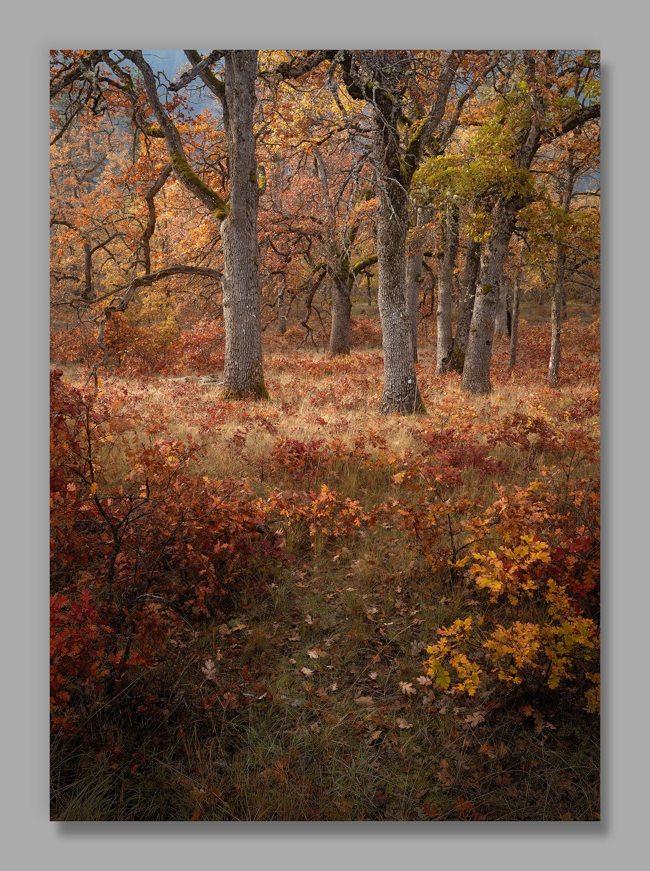
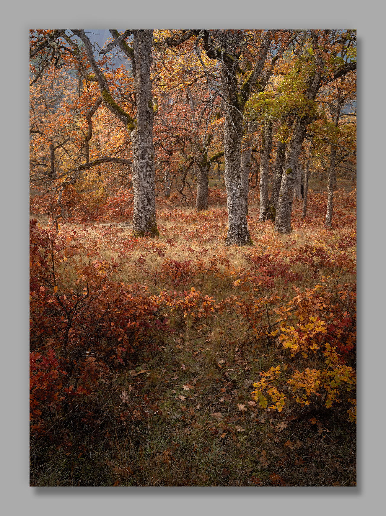
This is likely a final oak image from this fall’s outing to the Klickitat River. My personal favorite was “Acorn Factory,” but I wanted to post a vertical to mix it up a bit.
I’m truly thankful for the joy that photography brings to my life, and appreciate so much the community we have here to share that joy. My hope is that you and yours share in a wonderful day today.
Specific Feedback
I like that there was a little path leading through the foreground oak, although I wish it angled left instead of right, toward the side the sun was on. Hopefully that’s not crucial?
I’ve left that upper left smoky area fairly bright. Should I darken that?
All thoughts and comments appreciated! It’s often the answers to questions I don’t think to ask that are the most helpful.
Technical Details
NIKON Z 7II
NIKKOR Z 14-30 f/4S at 30.0 mm
1/25 sec. at f/13.0 and ISO 64
Critique Template
Use of the template is optional, but it can help spark ideas.
Vision and Purpose:
Conceptual:
Emotional Impact and Mood:
Composition:
Balance and Visual Weight:
Depth and Dimension:
Color:
Lighting:
Processing:
Technical:
I like this a lot John. I love the color palette, and the textures in the tree trunks. I feel pulled into the scene by the path, and until you mentioned it, I hadn’t really noticed that it curves to the right and out of the frame. I felt more like it just goes to the tree and stops.
The smoky sky or hills in the upper left do pull my eye, but I also think that’s why I didn’t initially notice the path pulling to the right. I’ll be interested in what others think about that.
It would not be too hard to curve the path more to your liking IF that’s within your practice (my new favoite phrase, taken from my yoga instructor).
I too am thankful for the joy photography is giving me. I’m glad I pulled it back into my life this Fall. By the way, I ran into Joe Campisi and Bruce King from NPN 1.0 days. I remember meeting up with you and those two and maybe Scott Smorra for a print exchange–once at Kennedy School and once somewhere up near Centralia at a barbecue place. Good times and always good to see your work here still.
ML
It’s the perfect Thanksgiving image. I love it. The color palette is wonderful, I love the leading pathway to the trees. It’s like they’re welcoming you to the feast. Wonderful textures in the leaves and tree bark.
I’m not bothered by the smokey bit in the ULH corner. I can kind of mentally draw a diagonal line to the lightest bunch of leaves in the foreground, so it has kind of a purpose.
agree completely about being grateful for photography and all it can bring to our lives!
I hope you have a wonderful Thanksgiving!
Wonderful photograph. I love how the pathway is dimmer in brightness compared to the opening where the trees take center stage. The light on the trees and rich and creates a nice three dimensional effect on the trees. The detail is great and I do not mind the ULC.
This feels very much like a painting, John. It’s really beautiful. I would not darken the smoky area in the upper left. I immediately noticed it even before reading your description and I like how that hint of blue provides some relief from the otherwise warm tones throughout the image. It isn’t distracting at all. The soft light, loads of texture and detail, muted colors…this is a real winner.
Hi John,
First off, I have the second your sentiments on the joy that photography brings to our lives and the wonderful NPN community of like minded individuals that we share our images with. I too hope that everyone and their loved ones have had a wonderful day as well. This woodland scene looks like another winner to me. I love the opening in the FG grasses and juvenile oaks as my eye is directed back toward the more mature trees in the BG. The color palette and details in the large version are a real treat. I am on the fence about the area you mentioned toward the ULC. I definitely do not mind it, but I think a crop would also wotk here. Sorry that was not much help. Anyway you slice this it is definitely another keeper!
Wonderful image, John. I love the effect of the various warm tones. I also like the foreground you’ve captured of scattered leaves. Can’t think of any way to improve this. I do have a thought for you to consider. What if you created a very gentle radial tone filter right in the foreground where the path is. The leaves draw attention but a brighter area around them may do so also. The blades of grass at the very bottom are awesome as well.
I remember those well! I recently ran into Scott at Trout Lake; he’s still very active in photography. I see Bruce and Joe’s images on Facebook, but haven’t run into them since those days. Good times!
A perfect Happy Thanksgiving Day image, John. This just says Fall in a way that aspen and other Fall color trees can’t say. It’s the orange, orange red and yellow green that pull it off. Those oaks sure have charismatic branches and as I’ve said, their colors are pure Thanksgiving Magic. As for the gray area in the upper left, you could easily reduce the saturation and then burn it a bit so it’s not such an eye magnet but that being said, it’s not that big a deal. You could also dodge and burn your way through the foreground to curve the path whatever way you want it to go. This is a sensational image in every way.
I also want to say how much photography makes my life so much better. And being able to participate and share with like minded people here on NPN is such a benefit for me. I cherish the time I get to spend here every week and I’ve learned so much from all of the members. I hope you had a wonderful Thanksgiving, John and I’m glad that we’re friends!!
John, this is a lovely, warm, inviting view. I like the opening between the shrubs and how it leads my eyes to the trees. Yes, after spending some time I notice that it is indeed a path angling off to the right, but it’s not heavily used so I don’t see that as being very significant. The bluish area in the distance looks like it could be fog (or smoke). I suspect that it’s source plays a major role in how warm and inviting the colors in the leaves and grasses are as well as letting all of the details show. I tried to better match that area with the dark bluish bit touching the right edge using a blue desaturation layer with a lot of darkening. That helps reduce how much attention it gets.
I love this so much! The dusty warm tones are just pure magic. I like the bluish tints at the top as it gives a subtle complementary color contrast and really adds to the vibe.
Really nice composition, I don’t think the path going off to the right is significant, it is fairly subtle. If it were a more major element of the scene I think it would have a more negative impact as it would lead your eye off of the image . I am a big fan of this type of fall color image, where it doesn’t have the usual bright foliage, but instead has all the beautiful subtle fall colors of the brush and grasses. Very well conceived!
This is gorgeous, John. Thee composition appears carefully constructed, and love how the colors complement each other so well. Thee brighter sky in thee UL doesn’t bother me all, but I think Igor may have a good idea. Would be worth testing that, perhaps, as long as it doesn’t take the emphasis from the main vocal point. This is really enjoyable!