The photographer is looking for generalized feedback about the aesthetic and technical qualities of their image.
Description
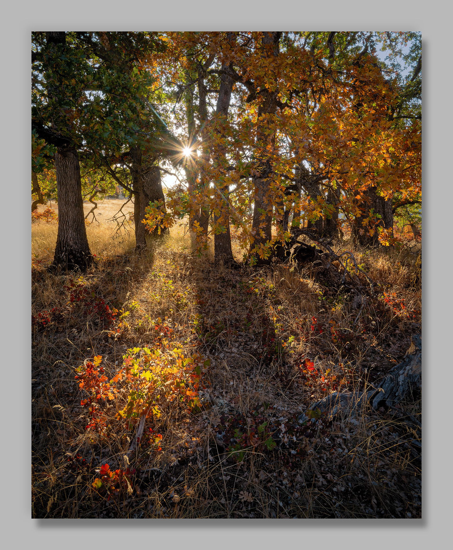
As with other forests, I find the amazing oaks of the Klickitat River area to be challenging. It’s frustrating to be surrounded by such beauty and to come away with so many pictures that are destined for the Recycle Bin. Once in a great while though, I find a setting that I hope at least heads in the right direction.
Specific Feedback
When I composed this I was mostly focused on the grouping of trees. This was the best angle that showed them balanced, but it also left that lower right corner fairly empty. Is that a deal breaker?
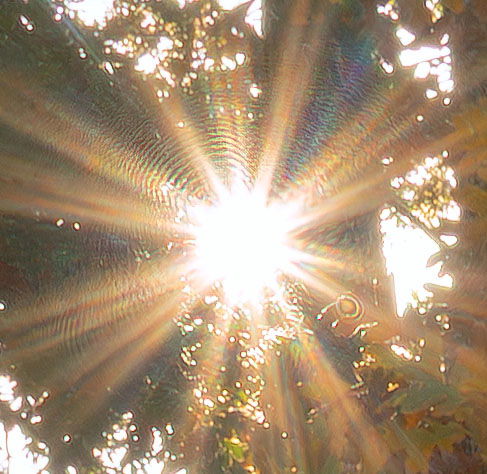
The sunstar has some concentric rings near the center that I don’t remember seeing before. Should I remove them?
All thoughts and suggestions appreciated.
Technical Details
NIKON Z 7II
NIKKOR Z 24-200 f/4-6.3 VR at 26 mm
1/15 sec. at f/25.0 and ISO 64
Critique Template
Use of the template is optional, but it can help spark ideas.
Vision and Purpose:
Conceptual:
Emotional Impact and Mood:
Composition:
Balance and Visual Weight:
Depth and Dimension:
Color:
Lighting:
Processing:
Technical:
A keeper. I can just feel the crisp autumn air. I wouldn’t waste time removing the rings. They’re not visible unless you tick your nose right up against the image at higher magnification.
John, I really like this image for its originality, and it seems like many fall color photos fall into set formulas and this doesnt. In repsonse to your immediate questions, the sunstar looks fine to me…I wouldn’t change it. As to the lower right area of the image, it also looks fine to me with a place for the shadow to extend.
Hi John,
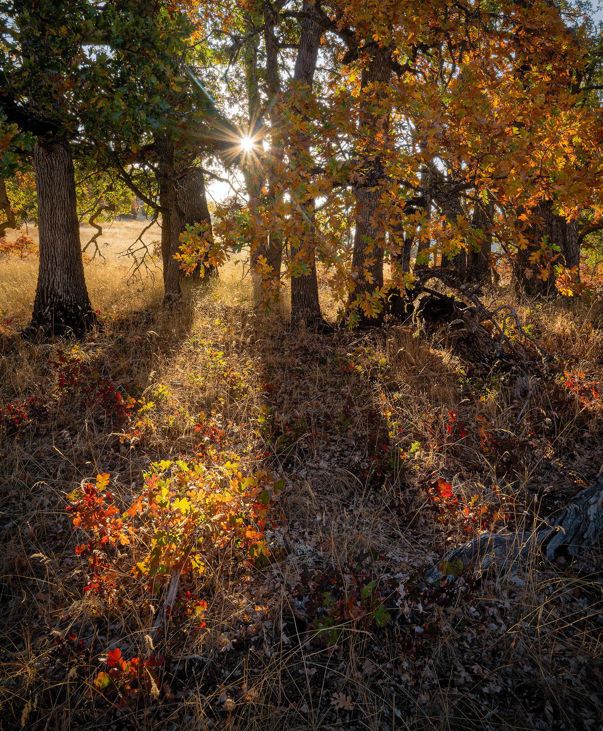
Looks like a keeper to me as the LRC does not bother me at all nor do the concentric rings around the sun. I am enjoying the backlight on the trees as well as the way the light is illuminating the forest floor showcasing those lovely grasses and immature trees. My only suggestion would be to mitigate the sky in the URC with a crop. I hope you do not mind, but here is a rework with what I was thinking. Just my opinion of course. Beautifully done.
This is gorgeous!! I don’t find the dark corner to be an issue at all, as there is so much nice detail there. I hadn’t noticed any issue with the UR corner but @Ed_Lowe’s crop is appealing.
Staring hard at the enlarged image I can’t see the rings but the detail you show is puzzling. You say you didn’t see them before – they are not in the raw file? Should be possible to isolate them to a processing step – or maybe to something that happened in upload?
I agree with all the compliments but especially this one:
The composition is not perfect but it’s real. It doesn’t appear to be artsy. By that I mean a design of trees and their shadows. I suspect that this was handheld although 1/15 second is pretty slow for that. I usually pass up scenes like this because by the time I set the tripod up the sun has moved and what is lit up has changed and so has the composition. I think what stands out from the usual such shots are the backlit red leaves in the lower left and the lower right. For me they make the picture. I also like the darker shade version because it’s more realistic (less contrived) and because l enjoyed looking for grass details in those shadows. They seem like an added bonus when you find them. I’ve never been a fan of sun stars. I find them too gimmicky. I like it here but think the image would have been just as good without it. The upper right quadrant is less organized but I like that about it. The processing is first rate as is always with your pictures. I like it very much.
John, I’m betting nobody would have even noticed those concentric rings around the sun star had you not pointed it out. I love shadows cast by backlit trees and in this image I just love the foreground red and green shrubs getting hit directly by the low light. I find the colorful foreground the best part of the image as it really catches the eye and leads the eye through the scene directly to the sun star. I agree with @Ed_Lowe about the URC. It’s certainly not bad in any way but it’s noticeable so I would consider cloning in some new leaves there or crop off the right side of the image. I am not a real fan of sun stars either but I have to say that I’m currently working on an image that I shot with a sun star and I’m rather liking it compared to the same image without the sun star. Yours is very small in the scene and doesn’t overwhelm and I love the shaft of light leading the eye directly to it.
Good of you to actually see this scene as I would have probably walked right by not noticing it but I think it’s well organized, the balance is good and as others have perfectly stated, feels real and not contrived in any sort of way. The more I look at this the more I like it. Well done, John!
John, I think this looks great. It’s a very inviting fall color view. The tree group looks good and I especially like the long shadows and how they lead into the scene. The sun star is a good extra. I can’t see those concentric rings even in the largest view, so they’re not likely to be a problem unless you go for a wall size print. Your expanded look at them suggests to me that they’re diffraction from the small diaphragm, plus I can’t imaging the amount of work needed take to make them disappear…
You did an incredible job of managing what appears to be a very high contrast scene. Your processing looks natural to my eye. The rays of light illuminating the forest floor, leading back to the sunburst, do a great job of driving the viewer right through the image. I’m not bothered by the LRC corner. There’s a natural diagonal between the sunlit foliage in bottom LC and URC, and my eye isn’t settling on the LRC at all. Really a masterful composition and image, John.
Thanks Ed. I played with that and made the decision that I liked leaves touching the edges of that corner, but based on the above feedback I’m reconsidering. I hadn’t thought about cloning in leaves @David_Haynes , so I’ll have to play with that too.