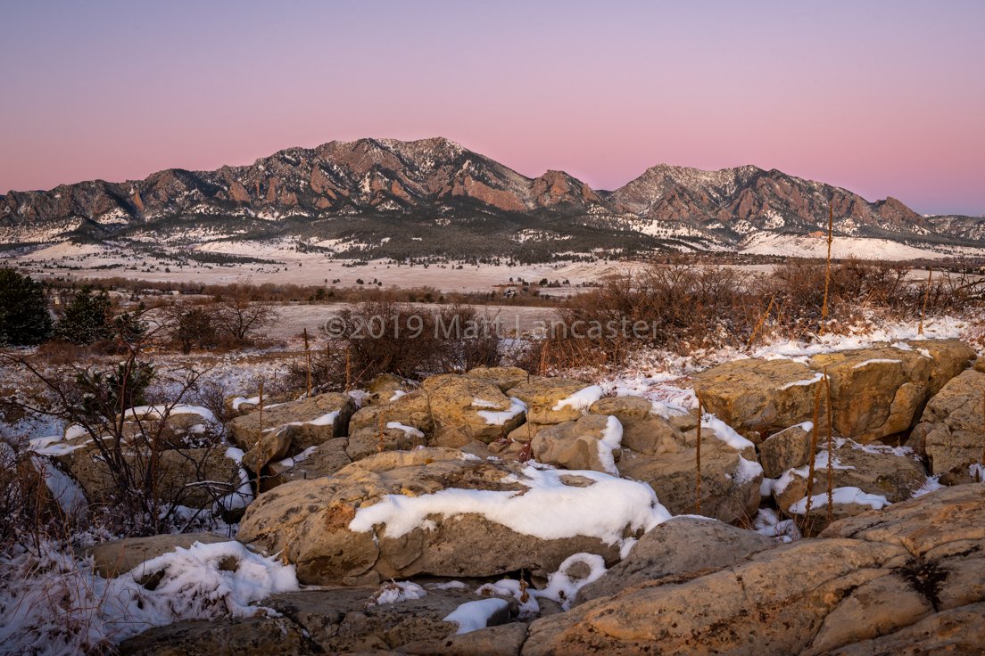
A sunrise image of the Flatirons in Boulder, Colorado is nothing new, however, this is my take on it on a cloudless morning. I like the softness and color of the light throughout the scene. Does this image have value or is a cloudless magic light image of mountains too commonplace to be compelling?
Also, any comments on composition would be appreciated.
Pertinent technical details or techniques:
This is a 6 image composite, cropped.
1/5 sec
f13
ISO 400
45mm
Nikon D610, tripod mounted
28-70mm f2.8 lens, vertically-oriented
Lightroom processing with nothing fancy. Some dodging of the foreground boulders and the face of the mountains. A slight vignette.
If you would like your image to be eligible for a feature on the NPN Instagram (@NaturePhotoNet), add the tag ‘ig’ and leave your Instagram username below.
You may only download this image to demonstrate post-processing techniques.
Matt, in response to your question, “Does this image have value or is a cloudless magic light image of mountains too commonplace to be compelling?”, is very subjective…personally when I shoot, I am usually looking for some drama in the sky or diffused clouds or some soft fine gradient tones as opposed to a harsh blue. I think your sky here is hardly commonplace, the pastel gradient of blue, purple and pink is very compelling. It washes the mountains and snow fields beautifully and is the reason I am drawn to the image. My comment would be that the image would be wonderful as a full panorama of the snowy foothills and the mountain ridge-lines captured against your sky. The current foreground of rocks and scrub brush does not compliment any colors in that lovely gradient and competes with the top portion of the image. Your subject matter of Sunrise light on the Flatirons is more fully and beautifully captured by isolating the top third of the image in a full panorama format. The captured sky is one of the strongest elements of this sunrise show. If you could go that way I would increase the exposure value on the snow fields to contrast with the sky colors.
Thanks, @Stephen_Stanton. That was precisely the type of response I was hoping for - in depth for what value this image has. Stay tuned - I’ll crop and post the next iteration.
I think the image does have value, you don’t always need dramatic clouds in the sky. In fact, I really like shooting scenes with the pastel colors of twilight and the earths shadow like you have here. The light at this time of day can create a wonderful mood, and nice soft colors in the landscape too. I agree with @Stephen_Stanton that the top third of the image is stronger as you have presented it here. The foreground does have some potential though, the brighter highlights on the rocks and snow patches are nice.
I think the foreground struggles a bit because it is very busy, and this complexity competes/distracts from the relative simplicity of the mountain/sky. To me the complexity of the foreground derives from the vertical stalks of vegetation, the areas of shadowed land to the left, and lack of a more prominent rock in the foreground to serve as an anchor, or entry point to the image. The bright center rock with snow on it is somewhat of an entry point, but there is just so much going on around it, that it prominence gets diminished IMO. This is a case where searching for a simpler foreground might have helped the image.
Great compositional analysis, @Ed_McGuirk. I appreciate it. Your compliments are very kind. I’m a big fan of the pastels of magic light and Earth’s shadow, too.
You’ve identified my primary concern - chaos in the foreground.
It was my first time at this location so I’ll search for more simple foreground material.
Hmmm. I agree that the distant hills and sky are really well done but I think that the fg does go well with the bg, to a degree. As Ed points out the vertical sticks are an issue but also the darkness on the left with the dead tree. I think that if you had stepped to the right so that the right part of fg had the same bg as you have now it would be stronger. But I really like the overall color cast that imbues the entire countryside here.
Thank you, @Igor_Doncov. I agree about stepping to the right. Lucky for me, this location is closeby and I can return easily. Maybe I’ll even get some clouds…
Love this view of the Flatirons. I spent most of my childhood growing up in Boulder, so this brings back some great memories.
This is such a refreshing view - and kudos for capturing this without any real signs of Boulder itself… (although I think I see CU through the trees…)
For me, this is more pastoral and so I wouldn’t call it “compelling” - but that by no means doesn’t mean it doesn’t hold great value - I believe it does and I’m thoroughly enjoying this landscape.
I respect the holding back of colors and enjoy this as presented. I too love the earth’s shadow and could see bumping it up a little and gaining more of a transition between the pinks and blues; but that’s all personal choice. Beautiful as presented.
I took the advice of @Stephen_Stanton and cropped the image to eliminate the fussy foreground (and a couple of vertical vegetation stalks), and balanced the remaining foreground by cropping the sky as well to center the mountains in the composition. I think the result is, unfortunately, an awkwardly narrow panorama. I would rather return to the location and reshoot it to add a more complimentary foreground.
Anyone disagree? Is this a marketable aspect ratio for a photograph? In the end beauty is in the eye of the beholder but if I’m investing time, energy and resources into a print, I want to do so to a marketable one.
I agree that the image has become less interesting by removing some of it’s complexity. It’s still a fine image, in fact better than the original, but is now starting to look more clicheish, less unique.
Yes I think panoramic ratios of 1:2.5 and 1:3 are marketable aspect ratios. There’s many photographers with galleries that specialize in the panoramic format. I find they work well for a piece that sits above a couch for example.