Sunrise, Mt. Zirkel Wilderness in Subdued Color

What technical feedback would you like if any?

Interested in all feedback, particularly composition, light values, and low color-saturation processing tips.

What artistic feedback would you like if any?

Do you like the low-color saturation style? Why or why not?
Does it strike you as a pleasing or intriguing rendering?

Any pertinent technical details:

Nikon D610
Nikkor 18-35mm f/3.5-4.5
20mm
1/10 sec
f/22
ISO 100
-1/3 EV
Graduated neutral density filter very likely
tripod & ballhead
cable release

Years ago I began experimenting with low-saturation images for landscape photography as a way to draw greater attention to light values than color and to dramatize my images. I am continuing to explore this idea with this image.

You may only download this image to demonstrate post-processing techniques.

Excellent idea, and I’m enjoying this image very much. I do feel like the right side trees keep pulling my eye away from what is truly interesting, so you might play with ways of reducing their impact. One possibility would be to crop down from the top, keeping only the lowest, long scraggly branch that projects into the scene. You would lose the fun steal blue in the sky, but I think it draws the eye to the cliff face as well as those wonderfully lit fir branches in the foreground.

1 Like

Matt, I give you credit for going bold and dramatic here, it certainly creates a strong mood. I am in the same camp as @Marylynne_Diggs on the composition though, while i like the steel blue sky, I find the trees on the right are overwhelming the mountain and dramatic sky. I would also clone away the left most rock jutting out of the lake, it distracts without adding anything. Here is a re-work addressing these issues, minimizing the trees while retaining the blue sky.

Now in terms of do I like the low saturation color as a way to draw more attention to light values and dramatize images. I like that you are will to experiment boldly like this. Some parts of this approach work for me and some don’t (but don’t stop experimenting, that’s how we grow as photographers). I like the steel blue sky, and I like the look on the sunlit mountain, but I don’t like the green on the spruce in the LRC, it looks a little sickly to my taste (though I could possibly see that working with less color)

Traditionally many have used B&W (including color toned B&W) to accomplish your stated purpose of emphasizing the drama of light, shapes, textures (via color removal). You may want to explore there a bit as well. If you have already considered the more traditional B&W for this purpose, I would be curious to hear your thoughts on the pro’s and cons of your low color approach vs. B&W

1 Like

Matt,

As others have commented, kudos for stepping out of the box a bit. I really like Ed’s crop in terms of simplifying.

Personally, it’s a little dark for me. Not sure though in bringing up the values, even slightly, might reverse your intent. I think from a color perspective, the pine bow and even the blue sky up top could be increased, if even ever so slightly (color and luminosity) But you’re in the personal choice realm at this point.

It does have a colorized/painted b&w look to it. And for that if you like retaining the color, all be it very subdued, I would at least try and match that color and luminosity of the pine and match that with the bit of blue in the sky. as presented, it’s basically black, with just a faint hint of color.

Lon

1 Like

@Marylynne_Diggs, @Ed_McGuirk, @Lon_Overacker Thank you all for your constructive criticisms. I appreciate all your comments and your patience with me responding.

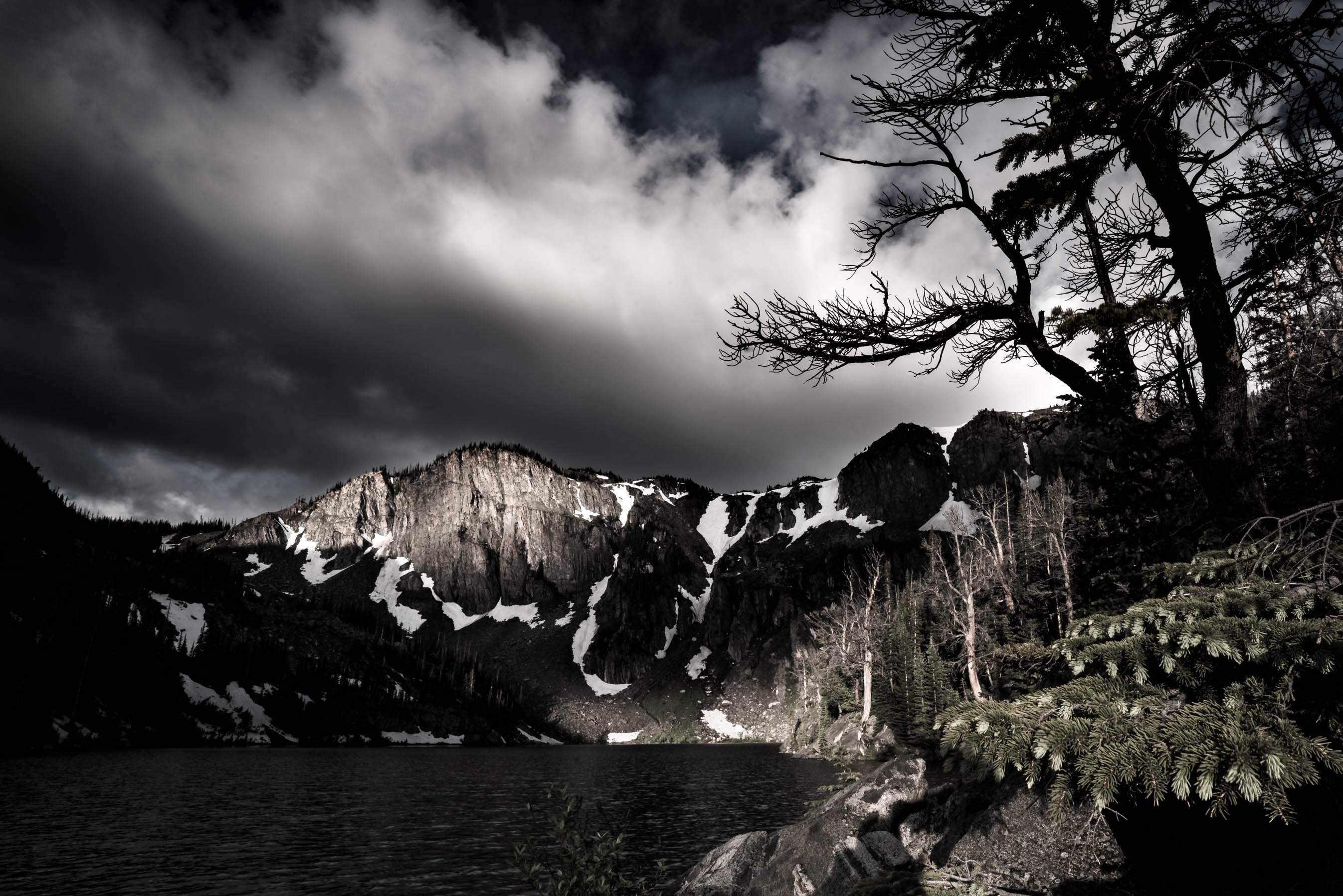
My choice to subdue the color is an exploration for something different and personal. For many years I pursued color in my images as so many of us have and was happy doing so. Velvia was my film of choice for how it rendered colors in the landscape. I only shot B&W film very occasionally but without much interest because I was mesmerized by color.

After so many years I’m looking for something else now because I am not satisfied doing what everyone else is doing. I am pursuing my own vision. Shooting for a color-subdued expression actually changes how and what I shoot: it retains a fraction of the natural colors that drew me in for so many formative years, yet it presents it as a secondary-level element.

My primary elements are then reduced to, as Ed states, shapes, textures, and light. I appreciate that not all landscape compositions make good color-subdued images, such as wildflower scenes and magic light, although I continue to explore those for instances that run counter to the trend. Subdued color photography, like B&W, extends landscape photography across the clock whereas full color photography is generally not great in the middle of the day. I also like that subdued color images can have a vintage appearance.

On the down side, color subdued images can appear unnatural to certain eyes, and in some cases, can render elements unpleasant, as Ed says about the spruce foliage.

As for the darkness of the image, I enjoy the dark end of the light value spectrum for how it creates mystery and drama and helps focus the eye on the high-end value compositional elements. You are welcome to disagree because this is a personal preference.

Again, thanks for your previous comments. In the attached image I cropped the frame a bit and added a slight bit of color back into the lit mountain face and the spruce. Also, I find my images are darker here than in Lightroom. Nevertheless, Please let me know what you think.