The photographer is looking for generalized feedback about the aesthetic and technical qualities of their image.
Description
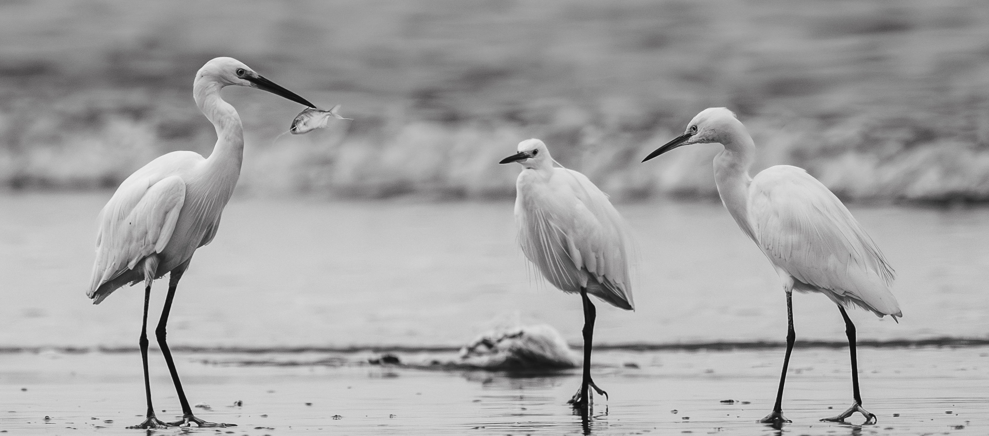
I found it interesting to observe this small flock of egrets on the beach in Kerala, India early in the morning. One of them picked up a fish and the other birds didn’t chase or try to steal, but looked with some hope of the bird perhaps dropping it. A very peaceful but dull light, so I chose to make it a BW image.
Specific Feedback
Does the monochrome work for this? It was a dull grey morning, nothing interesting about the colours, so I chose to desaturate completely.
Anuradha, this is a good (and fun) look at these three Egrets and their interaction. It has me grinning as the two birds on the right look very hopeful and somewhat wistful. You’ve caught that feeling well. The abrupt transition from grey and very out-of-focus to sharp and bright white feels awkward. You might want to smooth out the brightness of that transition, especially the dark line/bright white at the upper edge.
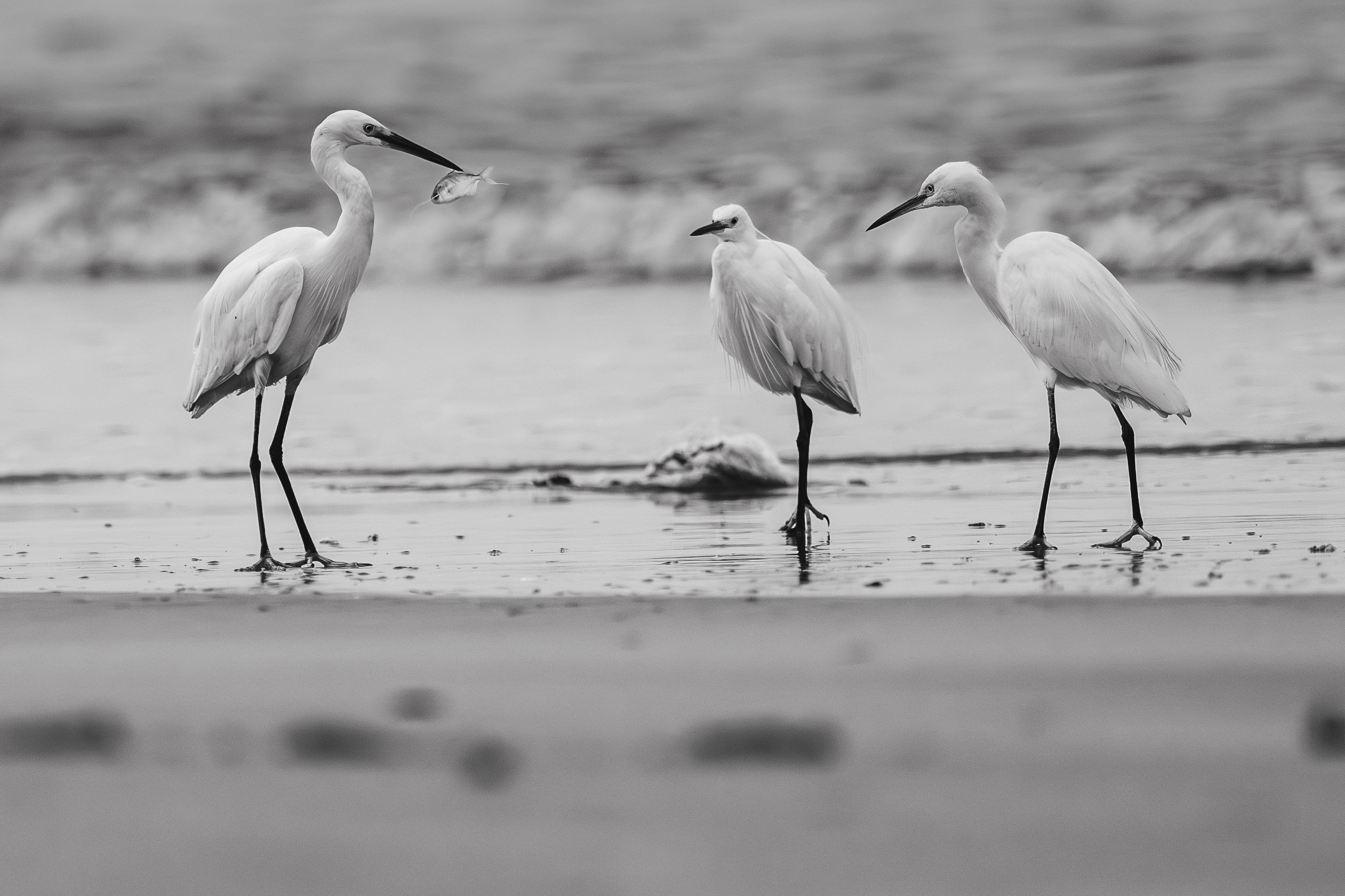
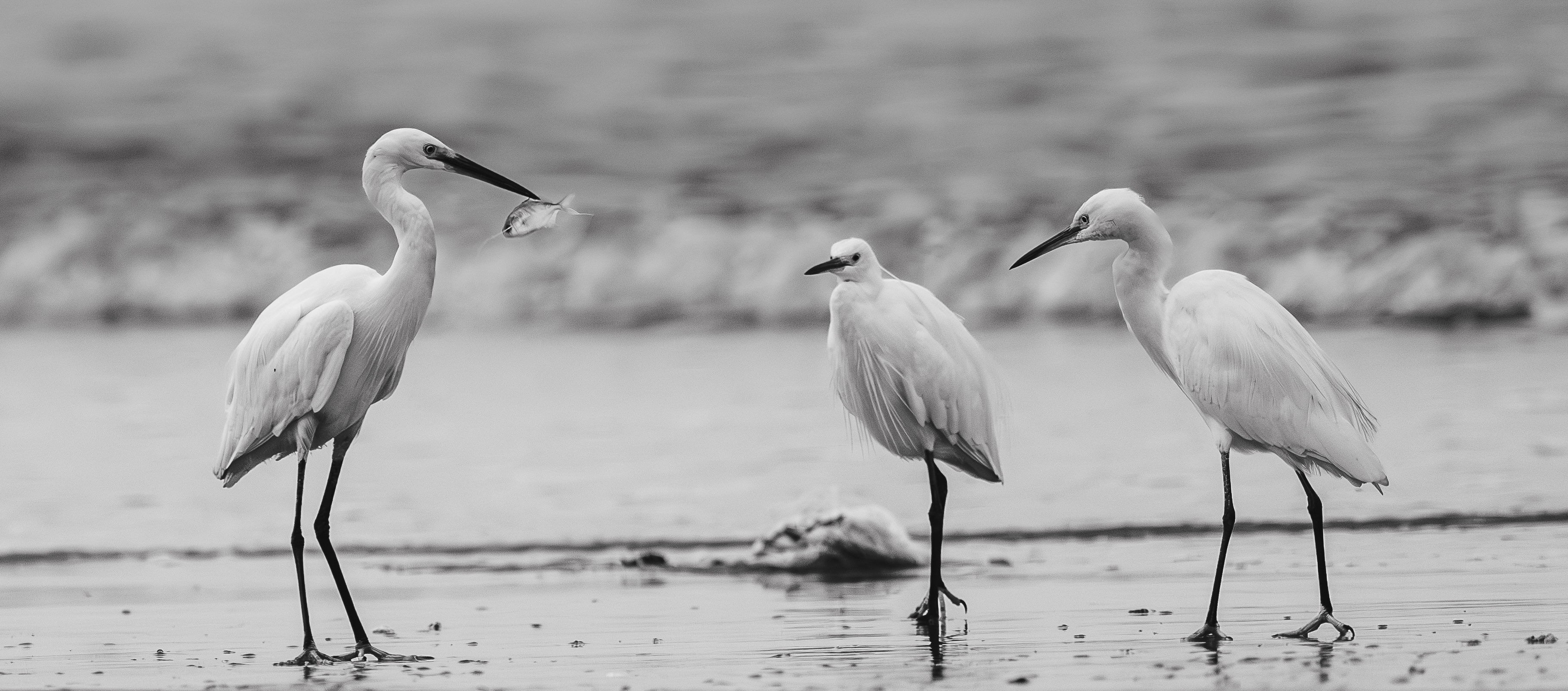
A very nice group of egrets, Anuradha. I had the same feeling about the gray foreground as @Mark_Seaver but I think it is more easily solved by simply cropping out the entire gray area at the bottom and going for a more panoramic aspect ratio.
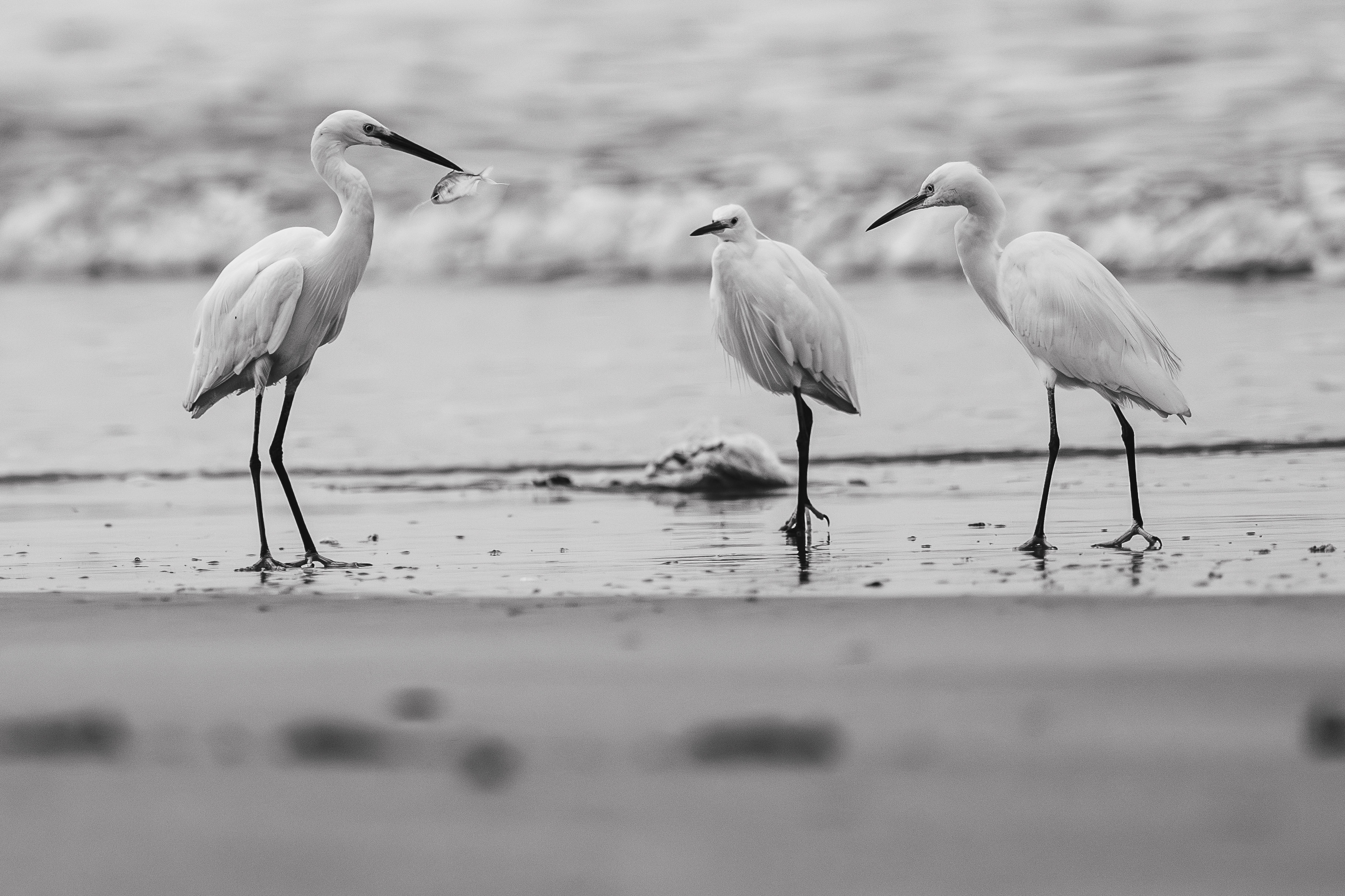
Thank you so much. Does this work better? I’ve reduced the brightness on the upper edge section of the water. I feel now the subject seems to be more visible and not lost in the brightness of the background.
On an administrative note, it helps people compare versions if you put all of them in the original post, usually with the most recent version at the top. That way people can just use the arrow that will appear to page through the large versions. To do this, just at the bottom of the original post, you’ll see some icons, one of which is a pencil.
Click on the pencil and you’re in the edit mode for your original post. You can place your cursor at the top of the post in the edit screen and click on the little rectangle with an arrow pointing up to upload the new version.
If you scroll all the way up, you’ll see that you can also edit your title. People usually add something like “and repost” or “and new version” to the title to catch the attention of the people who have already commented.
I, too, am a fan of the cropped version. The lower, blurry portion serves no purpose.
Tones and contrast are lovely, and the interaction between the birds, combined with the sharp “snack”, makes for a good story. I must confess, I do not love the thing behind them on the beach, and would like the water’s edge to be level (as if it were the horizon). I do think you could get away with some generative expand in PS to create more space beneath the feet. Maybe.