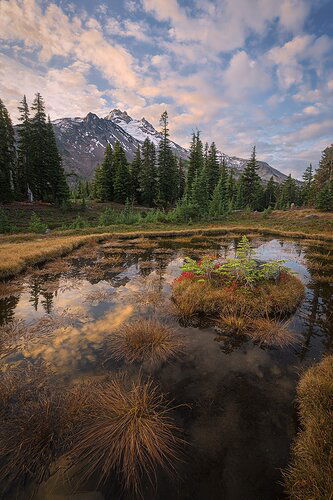
The Baptismal

Thanks again for all the suggestions! Here’s a second go incorporating some of them; cropped, shifted the color balance a bit, and reduced saturation.

Critique Style Requested: Standard

The photographer is looking for generalized feedback about the aesthetic and technical qualities of their image.

Description

Many conflicts have kept me from getting out to photograph since the end of winter. They’ve all been good things, but nevertheless I’ve really been pining to photograph again. As @Steve_Kennedy noted in his recent Editor’s Pick image, he, @James_Lorentson , and I were able to spend a magical weekend backpacking into Jefferson Park a couple weeks back, and we had the good fortune to catch an amazingly mild fall weekend. Unfortunately most of the vivid red leaves that can blanket the park had dropped, but the dozens of tarns from recent rain were full of water and we had reflection after reflection to play with.

On an exploratory hike, we passed by this tarn and I was intrigued by the island; I decided to return for dawn the next day. There were minimal clouds in the sky when color would have been at its peak, but shortly after they returned and I was able to capture a little of the late warm light.

(The title of this image comes from the fact that my camera, realizing the wicked state of its soul, decided to cleanse itself by full submersion in this little tarn. Fortunately, it survived this impulsive decision.)

Specific Feedback

I still wish that lower right corner was different. I tried a lot of angles, but didn’t find a different one that kept the mountain reflection visible. (Back home looking at this, the reflection is a small enough part of the image I’d probably not worry about it if I was shooting it over.) How annoying do you find it?

As always, any other thoughts and suggestions are much appreciated.

Technical Details

This is a blend of two images for depth of field. I’ve cropped this a little from the original, moved the color balance slightly warmer than this actually was, cloned out a contrail, and warped that lower right corner grass just a tad to the left for a better flow. I transformed this a little to make the trees straighter, but didn’t correct them completely because the image just got a little too weird. I worked with the raw images, but I’ll post one of the sidecar jpgs the camera recorded with the raw so you can see what I worked from.

NIKON Z 7II
NIKKOR Z 14-30 f/4S at 14.0 mm
Two images at 1/15 sec. at f/8.0 and ISO 64
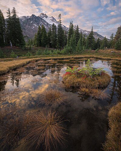
2 Likes

Here’s the jpg.

1 Like

Wow. That raw file is so different. But you exposed to the right and that’s how it’s done. The image has your trademark careful composition and processing. I do have a preference though. I think you would have a strong image (perhaps stronger) if you had made the island as the main focus of the foreground. I just think that that splash of lime green and red would have really stood out amongst all that brown. Perhaps you do have such an image as well that you are planning to share. Or maybe those hummocks around the island prevented you from a good composition.

1 Like

Great comp and perfect control of the dynamic range. I wonder what it would look like with that wad of weeds in the LRC removed.

1 Like

John: Marvelous scene and IMO a fine comp and capture. I’m OK with the LRC as is and think it almost works as a framing element. I’m loathe to use them but some of the new AI fill tools in PS might help you get rid of it if you were so inclined. I envy you the image and the experience, perhaps minus the dunking :stuck_out_tongue_winking_eye:. >=))>

1 Like

I admire your persistence in the field and creative work at home. Fine payoff!
For me, maybe too much beautiful sky, as I want the photograph to emphasize the stunning textures in the water, so I might crop pretty close to the top of the mountain or the top of the trees.

1 Like

Hi John.
Sorry about the camera. Glad it survived. Enjoy that it gave you the name for the photo. I find naming landscape photos to be kind of challenging. I also had not heard the word ‘tarn’ before reading about your photo. I like the way you use the bunch of grass in the center to lead into the photo. I think if you took of the LRC grass the composition would wander off in that direction too much. I already find myself wondering where the pond edge might be in the middle right. I think you could lose the mountain reflection as it is pretty small. Great image and thanks for sharing.

1 Like

Glad you were finally able to get out and do some shooting with your pals. I hate that you had an immediate name for the image by way of your drowned camera. The good news is that it came back to life. That’s a miracle in and of itself.
Lovely scene here, John. Perhaps just a smidgen less sky and maybe slightly less warm foreground as the reflected clouds in the water are pretty warm compared to the sky.
I do find that the LRC keeps my eyes from going out of the frame but It’s not ideal. Because of this I downloaded your image and attempted a crop. I
m not sure it’s any better but it does eliminate the LRC intrusion. I also think this image is about that little island in the center of the tarn. This crop makes that Island a little bit more prominent. Again, not sure it’s better but it is different. For what its’ worth. :slight_smile:

5 Likes

Thank you all for the feedback! I love the suggestions. I had this as a 2x3 for another purpose, but am partial to shorter portrait crops and will play with those ideas.

Hi John! I’m in Fairbanks playing with the grand kids so I’m a bit late to comment. You got some really good comments and suggestions. I can’t add much. I really like the original, but I’m partial to David’s edits. It does emphasize the island more which has some great colors.

2 Likes