Critique Style Requested: In-depth
The photographer has shared comprehensive information about their intent and creative vision for this image. Please examine the details and offer feedback on how they can most effectively realize their vision.
Self Critique
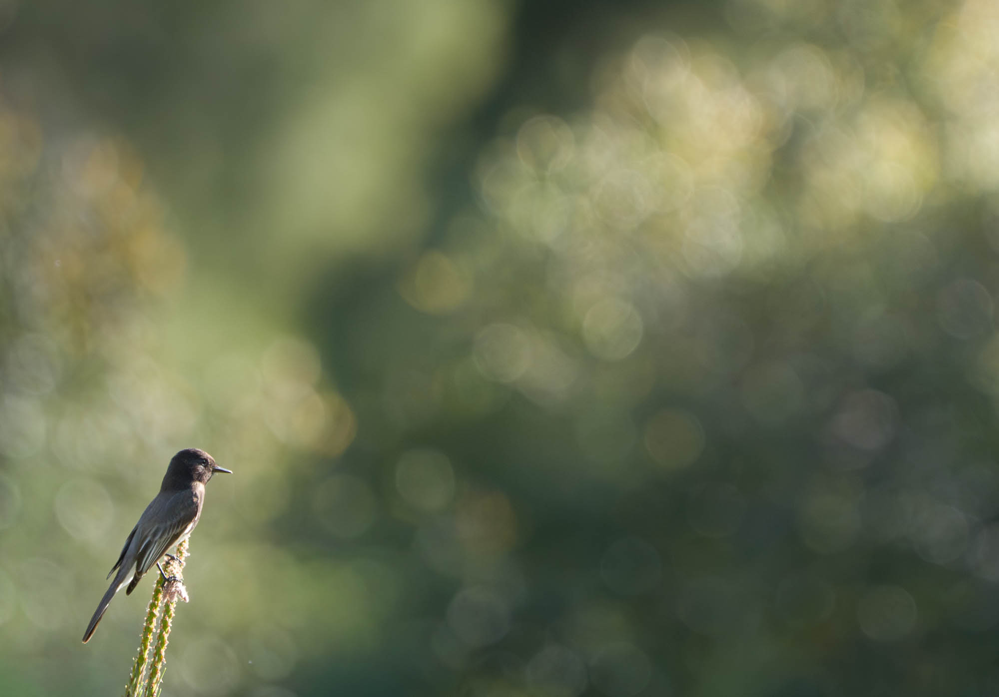
I like the subject/background separation and the isolated nature of the bird. Uncertain about the amount of negative space.
Creative direction
Wanted to practice creating a minimalistic image of a bird. Often the background is either too busy or too bland.
Specific Feedback
Use of negative space and background design to isolate and add significance and power to the subject
Technical Details
Shot at 600mm processed in LRC in which I removed a few distracting branches. Added a broad, soft radial gradient positioned from the upper right corner to lower left (subject) to add a tinge of luminance and warmth. Added a slight, small radial gradient over eye to sharpen and lighten
Description
Came across this scene with enough separation between the subject - isolated on a bush - and the background to blur out and create bokeh. I tried to position myself relative to the subject to incorporate the directional early morning light and the ‘leading lines’ created by the light/shadow contrast of the distant shrubbery.
Critique Template
Use of the template is optional, but it can help spark ideas.
Vision and Purpose:
Conceptual:
Emotional Impact and Mood:
Composition:
Balance and Visual Weight:
Depth and Dimension:
Color:
Lighting:
Processing:
Technical:
I’ve been trying to do the same, Ted, incorporate more of the environment in my bird shots. Of course, the birds don’t often cooperate. Nice background colors with good bokeh and I agree the light and leading lines direct the eye to the bird. Cropping might diminish that effect.
I like this very much! It’s different and wonderful! You have certainly succeeded with the lead-in light and shade. The colours are super. I like where the bird is positioned and even though the bird is not looking at the viewer it shows (to me) a sense of “i don’t really care if you’re there” look.
Your processing looks good.
There maybe another version with a slice off the top?
I love the bokeh in the background of this image, Ted, and I like the placement of the bird. I’m a bit ambivalent about the way the bird is looking since the background is such that there’s nothing for it to “look at” back there. However if it turned much more toward the viewer you’d have lost the light on the face.
Hi Ted - Love the post processing that you did. It was very thoughtful guiding the viewers eye with the light from the upper right-hand corner down to the bird. I also like the negative space - but do feel that there may be too much and as a result, the subject, especially being low in the bottom left is lost a bit and the size of the subject is quite small in relation to the space. If you don’t mind, I took a crop from the upper right corner down diagonally to the lower left corner trying to keep the open space while bringing the subject slightly larger into the frame. Just a thought…
A gorgeous BG, but I wish for more detail in the bird. A different light angle on it would have been better. Is there any more detail in the bird’s back? The small areas of bright white could be toned down, too. Maybe a linear profile??
I often have reason to hate that we can’t have everything at once!
Hi Ted, I like this image quite a bit. I appreciate the background forming subtle leading lines to the bird. Well seen and taken. You could play around with crops and I like Stephen’s version too but the original is a fine image as is IMO.
Thanks for your commits and your thoughtful crop. I did struggle with the amount of negative space and feel that your slightly tighter crop works. For me I wouldn’t want to make it any tighter for fear of losing the feeling of isolation that I was trying to achieve
Diane - I honestly wondered if anyone would comment on the bird. I too would have liked a little more definition of the Phoebe but chose to go with what nature presented to me and create less of a portrait and convey more of the sense of a small bird perhaps pondering its place in a slightly mystical world.
Your welcome. I left the negative space as that is what you are going creatively. I think the crop works better because in the original the subject is small. I always ask people before they start editing is what / where do you want the viewer to be drawn to in the photograph. I felt that in the original image my eye was always drawn to the negative space first. Now that there is more of the bird, that is where you want to add definition as Diane suggests. Good luck - lovely photograph.