The photographer is looking for generalized feedback about the aesthetic and technical qualities of their image.
Description
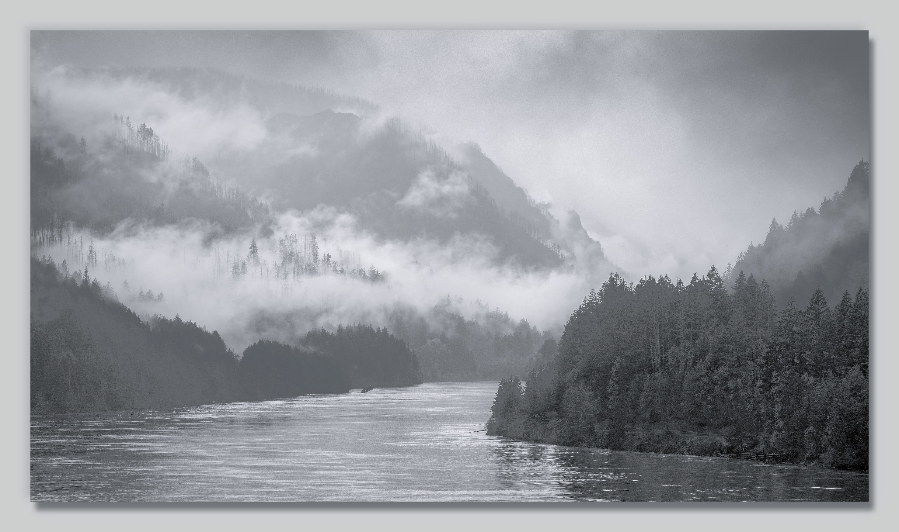
I’ll lead with the fact that I like my two prior Columbia River Gorge posts better than this one, but decided to post this regardless. I thought it might be complimentary to the prior two, since it shows what it looks like when the fog clings to the gorge walls in a wider view.
I’ve been naming these gorge scenes after the parts of a castle, so I stuck with that here.
Specific Feedback
I’d love your thoughts overall, but especially on the composition. I wish there was more water, but there’s vegetation below this that intrudes with a wider angle. (I also wish there had been more cloud drama in the upper right corner.) All thoughts appreciated.
Technical Details
NIKKOR Z 24-200 f/4-6.3 VR at 115 mm
1/200 sec. at f/9.0 and ISO 64
This was shot from the parking lot under the Bridge of the Gods. There’s a rock wall on the edge, and I put the tripod on it to get higher. Even so, there were couple small twigs that stuck in at bottom edge, and I’ve removed them.
I like the curve of the river here, and it doesn’t bother me that the river gets narrower in the frame. In some ways, it adds a sense of depth (what’s that principle called where railroad tracks seem to merge?) I love the clouds and fog settling in the creek drainages of the gorge walls. The mood is wonderfully mystical.
At first I thought this was a color image, and in the thumbnail, the trees on the little peninsula on the right look like they have a green hue, but in the larger view, that impression disappeared. I kind of like that green toning (if you did some), but I get it if you want to stay completely black and white.
The only thing in the composition that keeps snagging my eye is the old pilings in the distant shore along the left. It’s a working river, and it’s real, and that might actually add interest for some, so I’m not suggesting removal, just recognizing that it attracts my eye to that part of the frame when part of me really just wants to go up or down river and float with the fog.
I see what you mean about more river. Some of it may be due to the visual weight of the dark trees near the bottom. It pulls the eye down. I don’t know if having more river would be the answer. You would have more space in the lower left. Depends on how much texture would be there.
Here’s my go at it. I think those trees should be lightened. For the rest I kept the highlights as they were but did a global drop in tones. Excuse me if I’m wrong but I feel that this isn’t a foggy image. It’s an image with wisps of fog here and there. If that’s the case then why make it look as though you’re in fog.
Hi John,
This is quite the view from a parking lot; especially when you have moody atmospheric conditions like this. I tend to agree with your thoughts on the URC and the water, but they are definitely not deal breakers for me because this is pretty darn nice as is. I particularly love this little area.
I like your composition, especially when viewing the larger image. I think the amount of water is quite enough as is. I could also see an alternate square crop of just the left side of image, aa lot of great stuff going on over there! Nicely done! A great series so far, would love to see more.
I really like the composition. My eyes follow the river naturally to where the two mountains meet down below. I think the cloud drama is perfect. I like that it actually doesn’t have any in the upper-right corner because it adds some juxtaposition to the said drama of it all.
Hi John, very nice image! I think the composition works as-is. I agree with Marylynne, when I view the image zoomed in, my eye immediately goes to the old pilings. When zoomed out, they don’t catch my attention as much. I wouldn’t remove them though, they are part of the story and history of this place. I think the amount of water works well too, and I like how the lightest fog is directly above the darker trees.
This is a wonderfully moody image. The composition looks fine to me. I would maybe increase the contrast a little bit, but without spoiling the foggy mood–the trees at the bottom seem like they would benefit from a little more darkening and the whites from a little more brightening.
My first thought was, maybe to crop it a bit at the bottom. On the second look, no, it is how it should be.
I agree with Igor, the trees on the right could be a bit lighter. The eyes are drawn a bit too much to them.
John, this view feels very different from the previous two. This one is much more gentle and relaxing with the inviting eye pull down the river’s curve where the other two are fairly dramatic with their strong series of rising ridgelines. I’m intrigued by the feeling that you’re trying for a somewhat high-key view, which the darkness of the closest trees (on both sides of the river) take away from. It’s also interesting to compare this view directly with your earlier two because this one shows as slightly blue while the other two are brown.