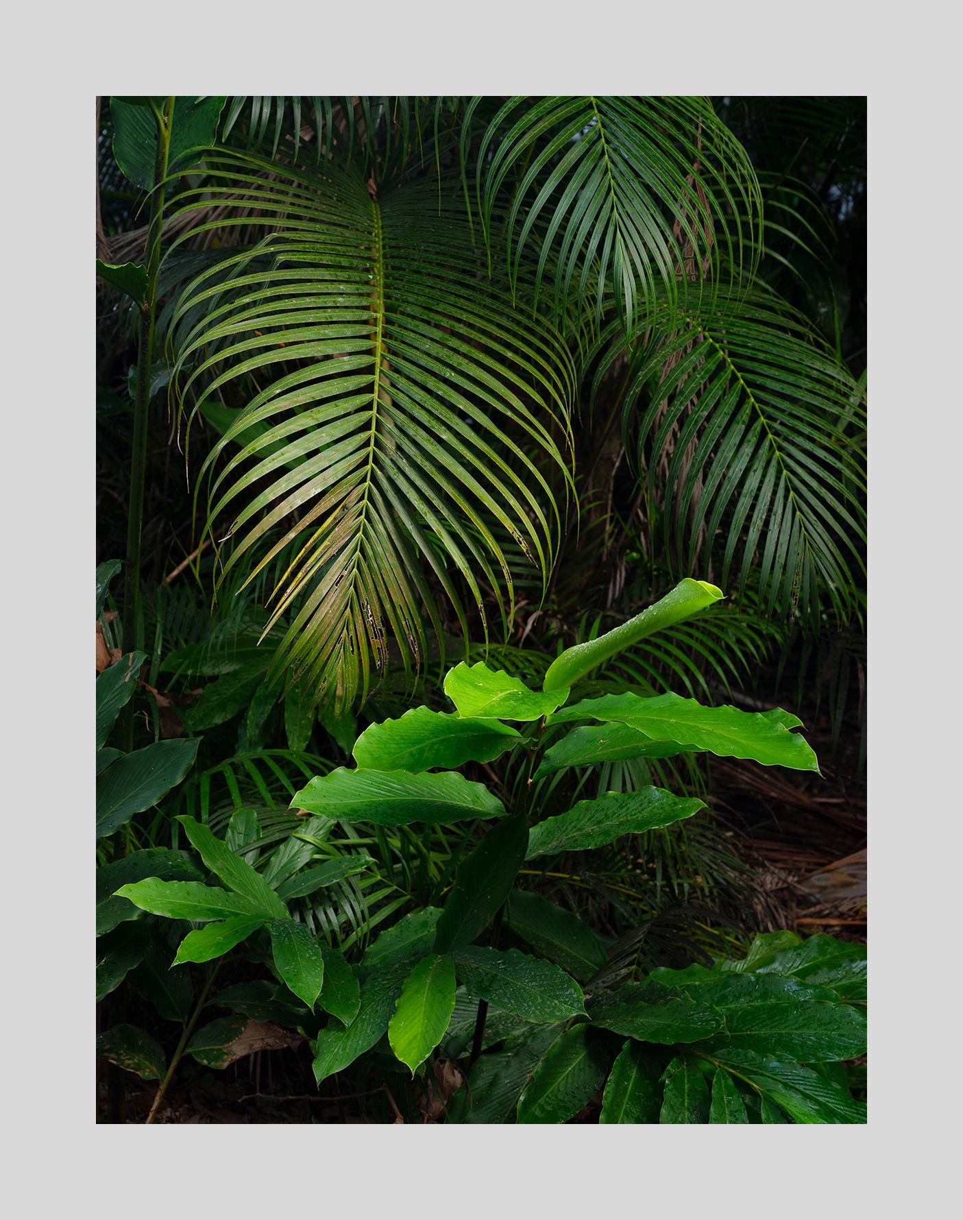
ORIGINAL:
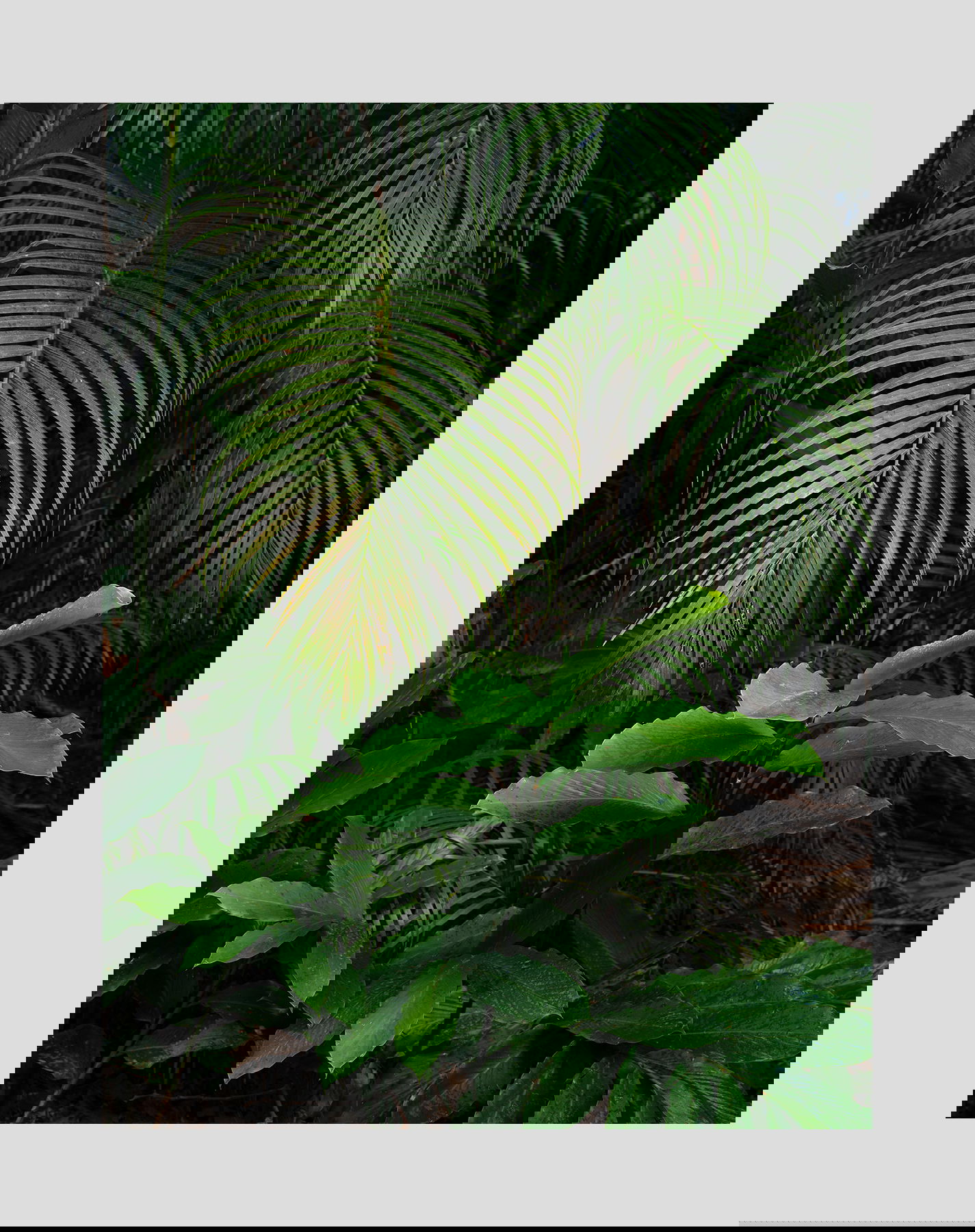
NEW VERSION:
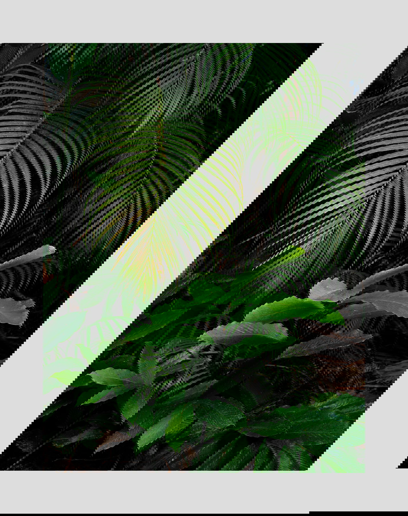
Still NEWER VERSION:
Critique Style Requested: Standard
The photographer is looking for generalized feedback about the aesthetic and technical qualities of their image.
Description
I was delighted by the forms and colors of the tropical plants. This was one of the first plants that caught my eye in Hawaii near Hilo.
Specific Feedback
I’m not sure what sort of feedback to ask for in this image. It’s pretty straightforward. The lower plant dominates a bit. I tried to reduce that by cutting back on it’s brightest areas.
Technical Details
This was not focus stacked due to movement caused by a gentle breeze. Therefore the vegetation further back is not sharp.
Critique Template
Use of the template is optional, but it can help spark ideas.
- Vision and Purpose:
- Conceptual:
- Emotional Impact and Mood:
- Composition:
- Balance and Visual Weight:
- Depth and Dimension:
- Color:
- Lighting:
- Processing:
- Technical:
2 Likes
Another gorgeous Hawaiian image, Igor. The way you’ve framed this up is masterful. The URC and the LLC play well off each other. The light hitting the foreground plant and leaves and the tips of the palm is soft and beautiful while not totally dominating the scene and they play well against the almost black backdrop. The colors look and feel right to me and everything looks just as you would expect it to look in a tropical forest. Not neat and clean but dotted with debris but in this case, the debris actually feels neat and tidy. I said this on your last image and I’ll say it again, it amazes me how you find these beautiful little scenes in nature that almost everyone would walk right by.
It almost pains me to give you a nit on this image but if I was forced to, I would say burn the orange leaf on the very left middle edge of the frame and also the stem in the LLC just a smidgen. I feel guilty even making those suggestions but I have nothing else for you on this. You should think about doing an intimate tropical forest project. I would love to see that.
This is a really nice study of greens, shapes, and tones! The only thing that bothers me a little bit is that spot of brown along the left edge near the middle but otherwise I like this very much.
Absolutely elegant. I love the delicate draping of the palm fronds, and the leaves in front (Ginger?) are lovely.
And idle thought would be to balance the two just a little more by tweaking the greens on the front plant to a little more reddish, and the palm fronds the other way, to a little more cyan-ish. Just by a subliminal amount. But that might spoil the tropical vibrance which is so lovely here!
Thank you for the suggestion Diane. I made the changes you suggested. What do you think?
I agree with Diane - this is elegant. As far as your rework, the warmer front leaves work, but not the more cyan-ish back leaves. Just my taste, though.
I don’t really like the warmer lower leaves. The problem it seems to me is that they are starting to have that neon light look (the original, not the rework). I tried to fix that by desaturating them a bit. The best part for me are the palm fronds and I don’t want the lower plant hogging the show. I also prefer this image fairly dark. I want the plants to seem to emerge out of darkness. That seems to be the approach to everything on this trip, except for one image I haven’t posted yet.
Igor,
“Elegant” seems to be a very descriptive comment, and I agree. The light is gorgeous - and you have a knack for taking advantage of the dark/light elements in a scene - kudos for that!
After just now seeing, I think I prefer your latest (3rd) version. My initial comment (nitpick) was that the 2 competing elements/plants were creating a ping-pong effect with the eye bouncing back and forth. This latest version and the subdued color/sat really helps reduce that effect. Touch choice on the color balance of the upper palm fronds - I guess more a matter of personal choice, and more importantly, the photograher’s recollection of scene at hand. We weren’t there of course so can’t really say with the color temp should be.
Don’t really have any other nits or suggestions. You’ve done a fantastic job with vision here, considering the difficulty in seeing and finding compelling compositions in a rain forest full of chaos.
Igor, this is a fine study in greens and shapes. While the lower, more saturated green leaves get the most attention, the lighter, finer leaves of the palm balance well and keep my eyes moving throughout the frame. I prefer versions 1 and 3, with more yellow in the palm leaves. The slightly reduced border in V1 is subtly better that V3 as it add a bit more presence. Although that would not be noticed except in a side-by-side comparison.
I think you hit it in the last version, but I have a hard time choosing as all are very special. I’l enjoying it even more than when I first saw it.
Too much was revealed in previous image. Some of the mystery is gone. Need to put it back. Here is a rework:
I like this last version a lot. Is a small hidden place, full of attraction, with a sort of benevolent mistery and promise in it. At least so I perceive it… Very nice image and a “study in green”…