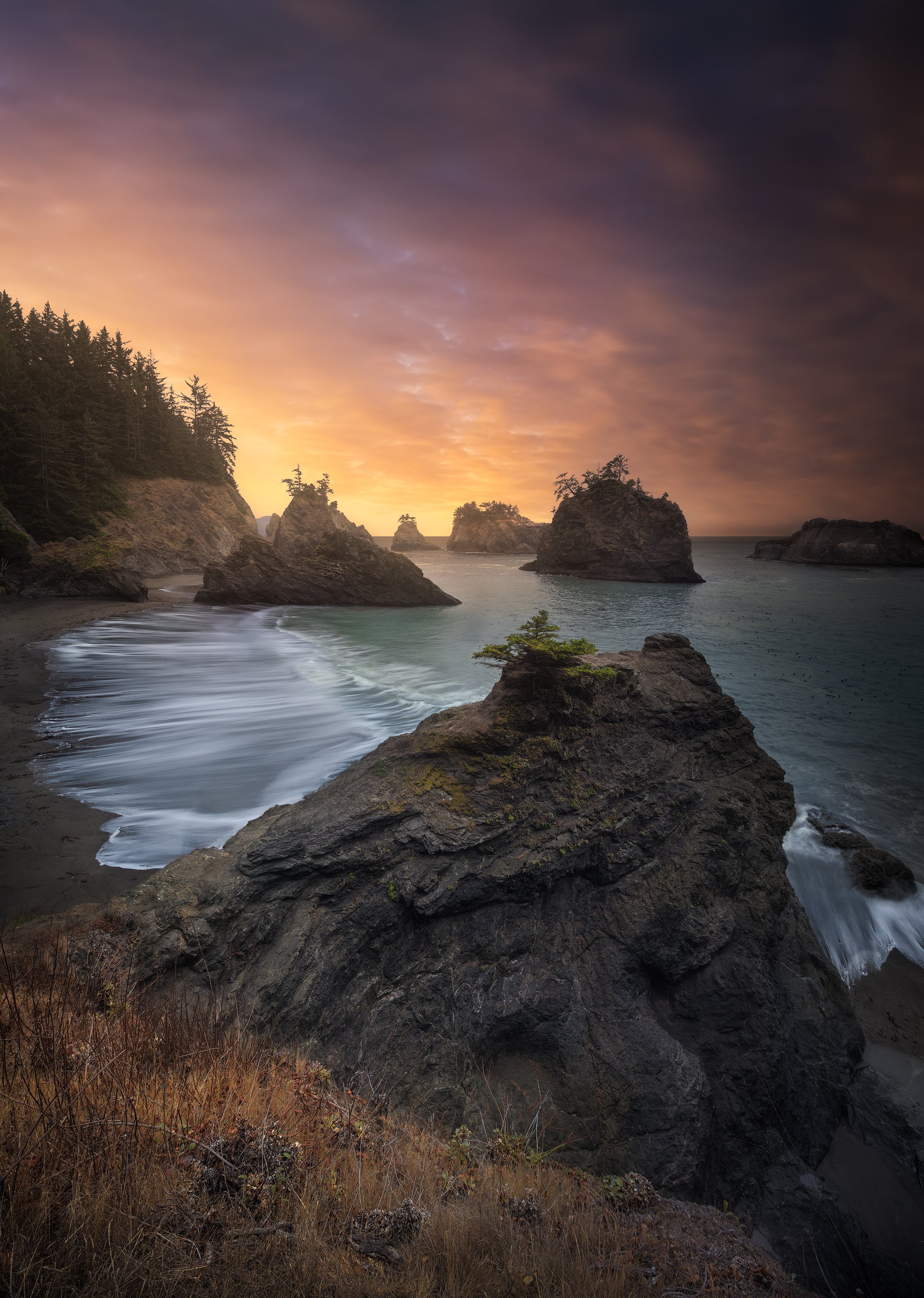
Hey all! Here’s a new piece. It seems to really lend itself to an Instagram crop (4x5) but as far as printing - I really like to stick to at least 5x7 or even 2x3 and there just seems to be too much sky would you agree? I’ve tried to minimize it, but then I’m starting to crop more of my foreground rock.
I’ve attached a few versions, let me know what you think (as well as any other CC) thanks!
@Jordan_Inglee personally I’d go with the original or the 4x5. The main reason here is that you preserve the small amount of wave on the right hand side that you are losing in the other crops. Cropping in from the right removes that waves and creates unbalance. There is a argument that landscapes look better in 4X5 as they are not so tall. In this case I think you lose too much sky. If you want to keep it 4x5 then you can always crop a touch of grass off - see below (its only subtle but makes a difference i think)
First off, this is awesome! Great light color mood and subject!!! I like your original crop just fine. Personally, I wouldn’t want to lose any more sky with any of the other crops. I would choose to go with the last one(2/3) and tighten it in from the right and bottom to not have any of that small patch of surf there.
But the original would probably remain my first choice.
I have seen a fair number of shots from here that made me think this was a tough spot compositionally. But this proves that it is not. The best and my favorite from there that I have seen!!!
I like the 4:5 also.
Interestingly, I find that the 4:5 puts more emphasis on the waves to the left. the more vertical crops seem to point to the sky. That’s not what I expected when I first looked this, but that’s how it comes across to me.
Lovely image!!!
I like the comp and light. Very dramatic. I feel the foreground could maybe use a bit more contrast to better balance with the sky. There’s a lot of drama here, but it still maybe feels a bit flat.
The second image gives the viewer room to explore the scene and feel the drama it contains. Great subject and presentation. Do you have a horizontal? I would like to see a wider view.
Very nice image Jordan. My vote is for the 4 by 5, it retains the wave to the right, and eliminates the darkest part of the sky in the URC of the original. I agree with Tony Kuyper, the foreground rock (and maybe part of the grass) could benefit from some additional contrast, which may have been lost when you tried to lift shadow detail here.
First of all, you’ve got a wonderful coastal sunset from the start. Hard to go wrong with any of these options. But since you asked…
Personally, would rule out anything that crops the right where the small wave action is cut in to; so that takes out the 2:3 option. In the end, I would favor the 4:5 image and mostly for reasons already mentioned. To me, with the original, the UR is too dark and by cropping down a little the sky is a little more even (although it’s understood it’s not even given the sunset angles, etc.
Jordan, put me down for the 4x5 as well. It seems to have the best balance for me, and I wouldn’t want to lose that small wave on the right. The colors in this are fantastic, and the comp is good too. As others have said, I could see a little more contrast, particularly in the FG rock, but this looks really nice as presented.
Wow - first off huge thanks for all the feedback! Really appreciate you all taking the time to offer some CC especially from the Composition perspective. That’s where I spend a lot of my time nowadays, focusing on comp, analyzing and thinking about how I would have done it differently.
I too have kinda settled on the 4x5 I think because the others just seem to have a bit too much sky. I really should have captured a little more foreground so I had option of a narrower portrait crop for printing. I think If I were to reshoot this I might have tried to get my tipod a little higher and pointed down a touch. I do think I could work with the sky a bit more though in PP and maybe keep that Z shape going out to the URC.
Oh and @Tony_Kuyper and others - I appreciate the tips on the PP. I’m still really working on getting that “dark yet sharp but not crunchy” look and have been working on having just enough contract. I’ve been editing with my monitor around 90 cd/m2 and am thinking I should go lower. And SWOON Tony - way to make a girl I don’t know where I’d be without your panels!
I’m going to take another stab at it and I’ll post my results. Thanks again everyone!
Ok - so I stuck with a 4x5 and with the help of the magic content aware fill, gave myself a little more working room/bleed. I also did some D&B in foreground to try and bring some more contrast down there!


 I don’t know where I’d be without your panels!