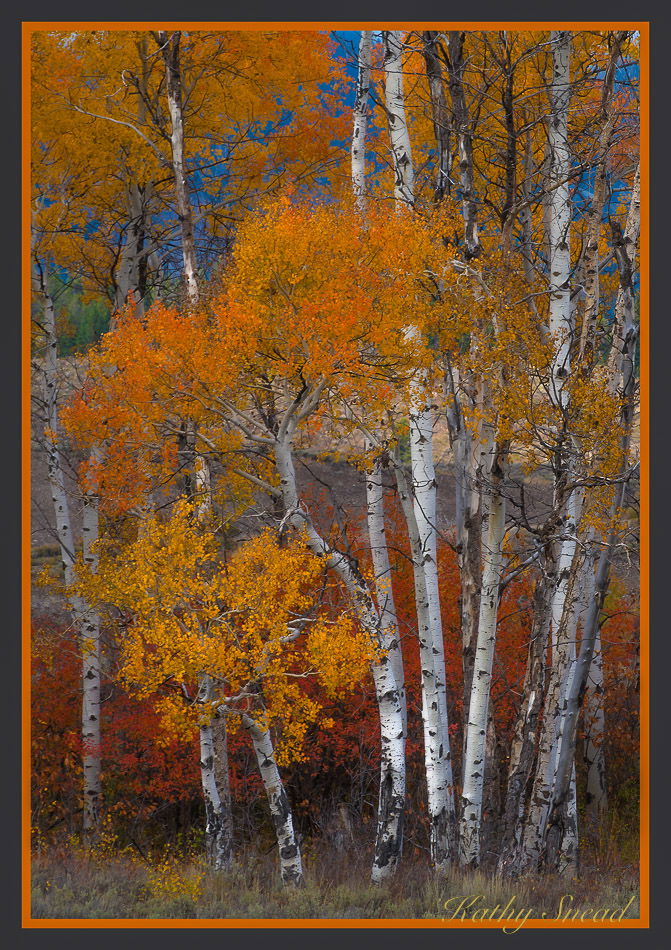
I am starting to like the image.- and wondering if I should. I have been working at my landscapes and find I seem to lack a “landscape eye” right now… Any critiques are fair game , artistic or other.
D800, 300 mm f4 at 18, tripod, ISO 200,
1/125 sec.
You may only download this image to demonstrate post-processing techniques.
Kathy, this is a beautiful group of trees very well composed. I really like the composition and scene. The sky seems a little on the dark side give the lighting on the trees, but not a big deal. You seem to be doing well with your landscapes based on this result.
Beautiful color in the leaves and foreground. The sky does appear to be on the dark side. I would also like to see a bit more of the foreground-looks a little tight on the bottom. Also, I am on the fence with the orange border. I think white or back would work better. The contrast looks great, and the composition works nicely to honor the group of trees.
-P
What a beautiful grouping of aspens, Kathy. I love the rich colors contrasted against the white trunks. The composition looks good to my eye but I think I would burn down those bright sections of the trunks in the bottom right as they tend to grab my eye. As Harley mentioned I also might lighten the blue sky a bit.
Wow Kathy, I’m finding this beautifully unique. So much so it’s hard to put a finger on it. The vibrance and saturation of the color seem overboard, yet the only color that seems off is the blue sky - as others have noted it being too dark. I would say the yes, the blue is a little dark, but also a little “pretty blue” than one might expect. However, the oranges and reds look natural. But also the whites are stark, clean and beautiful. The colors are almost like a color wheel which even include the nice spot of green.
Please take this is a positive comment, but my first impression of the scene was like this could be a natural history diorama! I wonder if anyone else see’s that?
I’m really loving this image overall. I do think it’s unique and the tight composition accentuates the colors.
Could do without the orange border, but that’s the member’s choice for display here. no biggie.
Lon
This is a very artistic interpretation of nature where the colors have been exaggerated quite a bit. I particularly like those dark orange/browns behind the trees in the lower section. The composition is really good. You’ve isolated this group nicely. I much prefer the lower half of the image than the upper half. A comp with white trunks with earth tones is personally more appealing. The sky looks like it’s been painted. I would also desaturate that small patch of green on the left.
I don’t make it much to the art gallery. With more exposure to that part of photography I would probably be more open minded for this type of imagery. A crop just below the green section appeals to me personally.
Hi Igor, Lon, Dave, Preston, and Harley
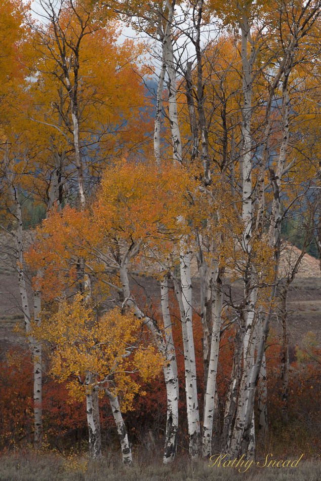
Thank you for the great comments. I really see what you mean about that blue . If I had not posted it here , I would not have realized how it looks like sky. It is actually a mountain. I am posting the original that I cropped from. When I took the picture I was taken by the grouping of trees, but then when I pulled it up for edits, the actual sky was distracting. That is why I cropped it the way I did. Now that I look at it, I probably did pull that vibrance slider up a little much. I might have used a little Orton on this scene, but I waited a bit to post this, forgot to put notes into lightroom so I’m not sure if I did or not but I’m finding that using it sometimes makes things look more intense. Which I kind of like. So, anyway, will be interested if you guys have any comments based on the original. I should have posted it to begin with but it did not occur to me.
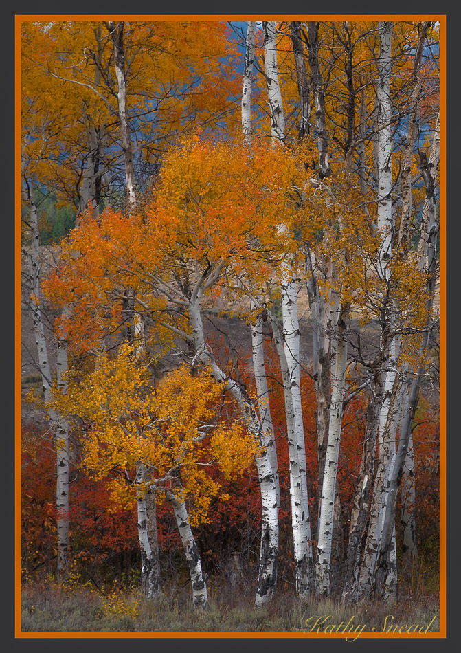
And here is an edit with the vibrance toned down a bit and the blue saturation backed off
. I think I like it better
1 Like
Thanks for sharing the original and your second repost looks great. Wow, I never would have thought otherwise that the blue wasn’t sky. But now it makes perfect sense! Good job to crop this as well. Thanks for the follow up!
It’s amazing how blue that bg mountain became when you just move the white point. I prefer the space you gave the trees on both sides in the original crop. The color pallete in the original is wonderful. It does look a bit flat. I would have added more contrast and a bit more color but not as much as you like. To each his own. I would have raised the exposure a bit perhaps.
Igor
That’s interesting. I will try those exposures just to see what happens. I appreciate the additional feedback.
I do agree about that crop on the right re giving the trees more room. My eye though focuses on the descending line of that light butte in the BG and that line goes right out of my picture. That’s why I cropped it the way I did. To keep the focus on the middle parts of those trees.
Thanks again
Best
Kathy