Critique Style Requested: Standard
The photographer is looking for generalized feedback about the aesthetic and technical qualities of their image.
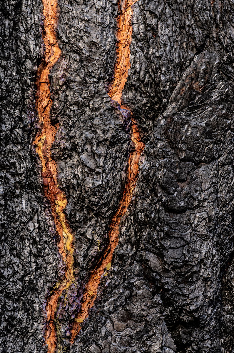
Description
I found this charred Ponderosa Pine in Yosemite Valley one Autumn afternoon. I found the textures of the char and the ‘v’-shaped bit of colorful sap quite intriguing.
Specific Feedback
Just wondering if the tonality of the char and the color and saturation of the sap works for you.
Technical Details
Nikon D-7100
Nikkor 18-140mm @ 140mm
F 22 @ 1/2 s, ISO 320
TK Lights and Darks masks
Some minor dodge and burn
TK Saturation Painting at low luminosity for the sap
Neat Image NR
Critique Template
Use of the template is optional, but it can help spark ideas.
- Vision and Purpose:
- Conceptual:
- Emotional Impact and Mood:
- Composition:
- Balance and Visual Weight:
- Depth and Dimension:
- Color:
- Lighting:
- Processing:
- Technical:
1 Like
Preston, the processing looks fine to me. A very interesting find here. Thinking back, never saw it, but there was a tv series called “V” as I recall. As always, we need to look down sometimes or at a lower perspective to see scenes like this one. Again, works as presented here for me without any thoughts for change… 
Very interesting find, and well presented. Colors and tonalities look fine to me. I wonder about adding a bit of 3D with a gradient burn from both sides?
My first thought was that it was a lava flow. Processing looks great. I could see it flipped 90 degrees clockwise - maybe because I see a lava flow!
Another option would be to cool this image down and have the “fire” offset the blues. Since this is an abstract I would take liberties and not to be faithful to the color of charred wood.
Thank you for your comments, everyone. They are always appreciated. 
-P
Hi Preston,
Sorry I’m a bit late on this one, been side tracked lately.
Love this! Most certainly looks like lava flow - or more specifically, a crack in the charred surface with lava flow beneath.
To me, the tonality, contrast, saturation, etc. all look spot on. Your processing is consistently top-notch.
The only suggestion I have is simply a personal preference one. I personally don’t care for the tall digital format. Unless the info capture is important to the scene… but here I think perhaps 10% could be nipped off the top as the info is really kinda repetitive. Other than that, this is so very cool!
Yes. It’s a good composition and I have no criticisms to offer. Well done.