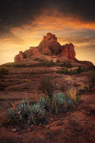
This one is just about wrapped up. Really trying to get that dark vibe without crushing the image. Any tips there would be great. Also - is the comp too obvious? I left my self open to a tighter crop but stuck with 2:3 for the ability to print long.
Thanks!
You may only download this image to demonstrate post-processing techniques.
1 Like
Looks good, in order to evaluate it would be helpful to know your shooting techs? Also might be nice to see if you framed it from slightly different camera positions. For me the plants directly below the distant formation comes across as rather static.
1 Like
This is a fabulous photo! I love the light and the mood and the way the clouds mirror the rock and wrap themselves around it. I would like it better without the plants, although I seem to often have a stick up my arse about foreground objects.
1 Like
You’ve got a beautiful photo here. My only feedback was the dark band across the top of the sky looks unnatural and detracts from the rest of the processing.
1 Like
I like the drama in the sky, the foreground cacti and the leading line of lighter colors which takes the viewer up to the rock face. Everything combined makes one great image.
1 Like
This turned out really well. The dark sky works. I like it both as is and with a little of the dark top cropped. Great depth to the image, too. Nice lead from the fore to the mid and then back. I like it.
1 Like
Thanks all!
Yeah - I’m still working on my vignette especially around the top of the frame. Depending on how I crop for output, I typically like to adjust my vignettes accordinging so if I crop down to 5x7 or 4x5 I’ll try and not crush it as much. I get a bit anal with them lol, and usually have multiple auto and custom ones blended.
What’s peoples thoughts on overall contrast and color? I’m not sure if I’m totally sold on the reds, especially in the shadows.
Also info on the shot:
Nikon d850
Nikon 16-35 @ 16 F11
Focus stacked, Sky blended from a later exposure, foreground from before golden hour
Jordon,
A terrific and dramatic image. I really like the inclusion of the foreground desert garden.
Personally, I think the sky “vignetting” is a bit heavy handed; from your description it sounds like you darkened it more from original? I love the set up and framing of the daunting sky, but the amount of darkness detracts a little for me. But as always, it’s really up to you how you want it presented.
Reds are fine by me.
Lon
Excellent job of blending; the transition to the sky looks great.
I have no problems with the crop; I don’t mind obvious when it works well with the subject.
Definitely play with that upper sky; it’s taken on an artificial look. Other than that, I really like the darkness you are chasing. For my taste, the foreground could be even darker.
I always cut saturation in the shadows (using a saturation layer restricted with “Blend If” sliders) in a saturated image; it looks more natural to my eye. With that said, yours look pretty good.
