The photographer is looking for generalized feedback about the aesthetic and technical qualities of their image.
Description
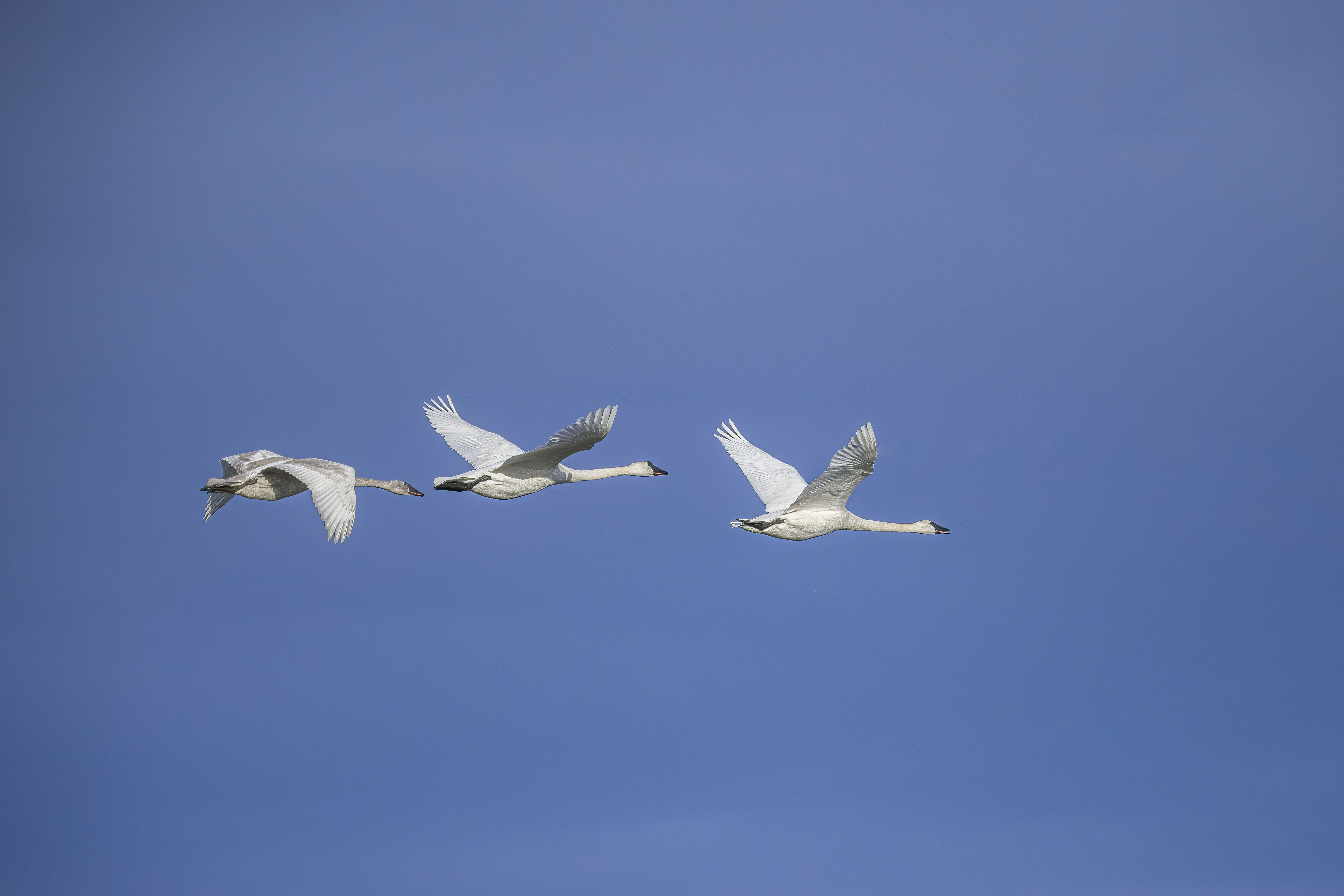
I took this photo a couple years ago and posted it in the Avian gallery. I was very surprised when the comments identified the whites were blown. I knew they weren’t blown in camera and out of simple stupidity, I didn’t notice before posting. This couldn’t be corrected in LR. Later I figured out the problem was the Adobe profiles, so I reprocessed using Tony Kuyper’s linear profile for the Nikon D850. As you can see the whites in the new version are no longer blown. I now my first step in processing new images is changing to the linear profile.
Technical Details
D850, 150-600 at 280mm, f6.3, ISO 1600, 1/8000 sec handheld
a. post a shot of Trumpeter swans
b. had a problem with highlights in them
c. solved it with a linear profile
because I just finished writing a blog post about this exact same issue with the exact same bird solved the exact same way. It won’t go live until July, but it’s written. Are you in my brain?
The top photo (which looks to be a different image) is clearly not blown and looks quite natural. The other one has a weird sky color and yeah, the birds are very bright with little detail.
I don’t always go to a L.P., mostly using a Camera matching profile as part of my import settings, but when even that looks to be too contrasty, I’ll switch to the L.P. It takes some getting used to and moving sliders so drastically seems weird until you realize how much of it is baked into Adobe’s standard profiles.
Thanks for the comment @Kris_Smith ! You are right. The 2nd photo, the original, had more wrong than just the highlights.
Maybe I was in your head! I’ve been meaning to comment on this for some time now. In this photo’s case I tried all the profiles available and none solved the problem until I tried the last one available - the LP. It is a very different animal and I can’t say I’m used to how it works, but I do prefer to start with now “canned” adjustments that may or may not fit my intended approach.
I’ll have to read your blog post when it goes live.
I like what your post processing produced. The sky is wonderful and the highlights have been handled well. I prefer using linear profiles because they allow the user to have more precision when adjusting regions of the histogram. Well done…Jim
I’ve been using an LP now and then for a couple years and one thing I find that improves things and brings back the snap is to use the Calibration panel in Lightroom. It boosts colors at the pixel level - so it changes the value of R, G or B in the mix of each pixel. The HSL panel affects colors as they are produced and generally will only make changes to those individually, if that makes sense.
Hi Steve,
wow, what a difference in the bright details.
Thank you for mentioning the linear profiles. I wasn’t aware of them. But I have to check it out since I also have images with problematic highlights.
@Jim_Zablotny and @Jens_Ober thanks for your comments! Sorry for the late response. I’ve been traveling and haven’t had much connectivity.
Jim, I agree the LP allows more control. It takes more effort, but the results are exactly what YOU make it.
Jens, you probably already found Tony’s linear profiles, but just in case, here is the page.
@Kris_Smith thanks for the info on the calibration panel. I haven’t been using that with the LP. I expect that it will help with a few of my images where I spent too much time working the colors.