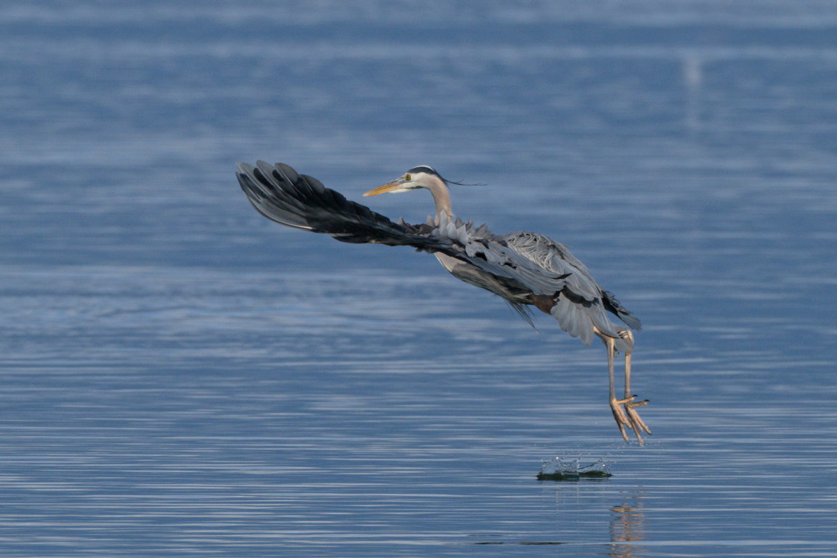
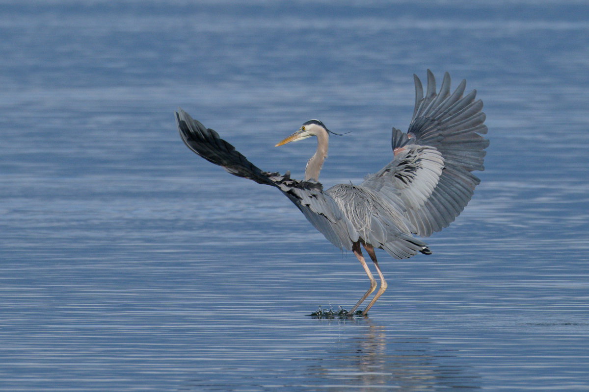
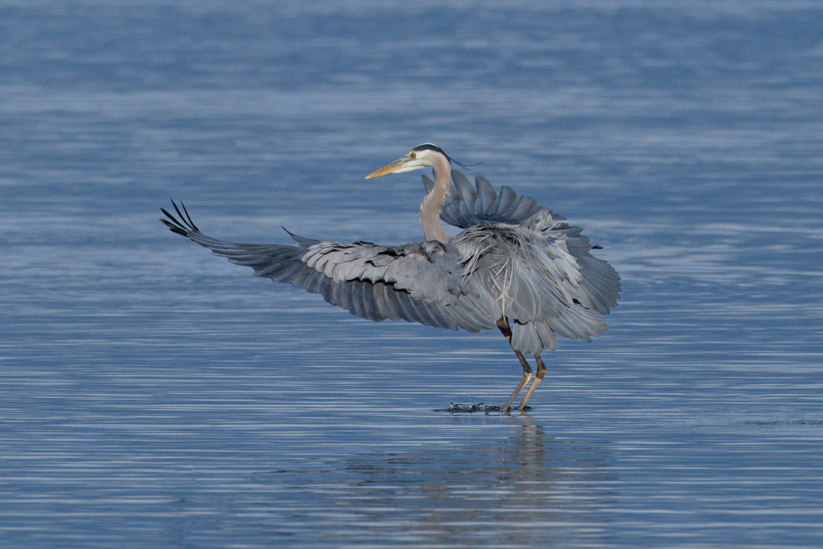
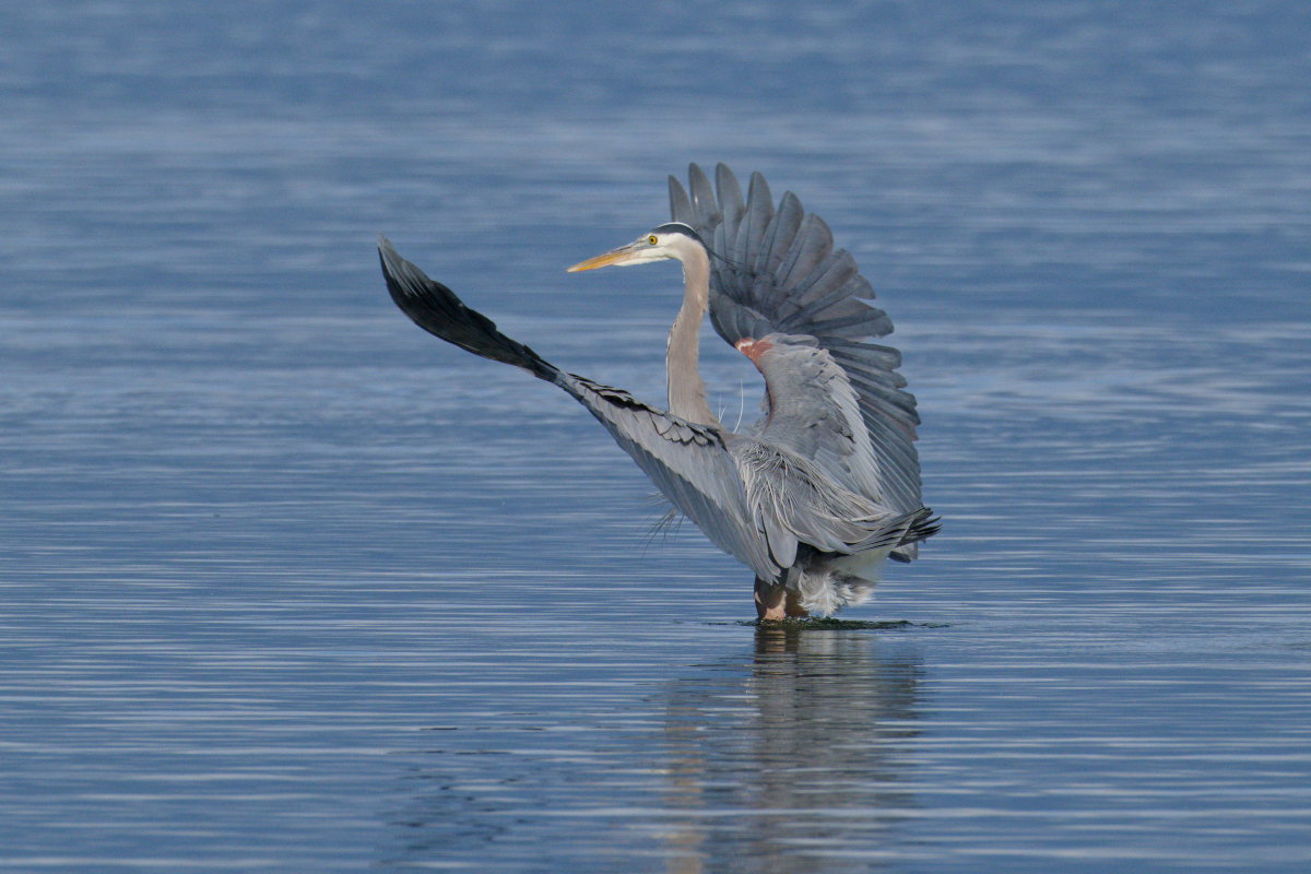
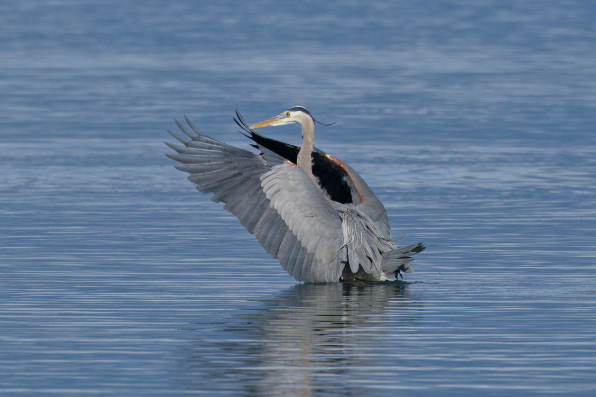
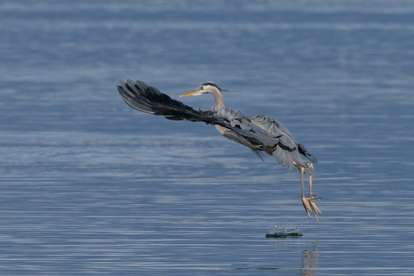
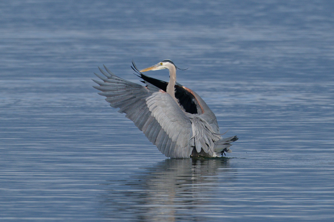
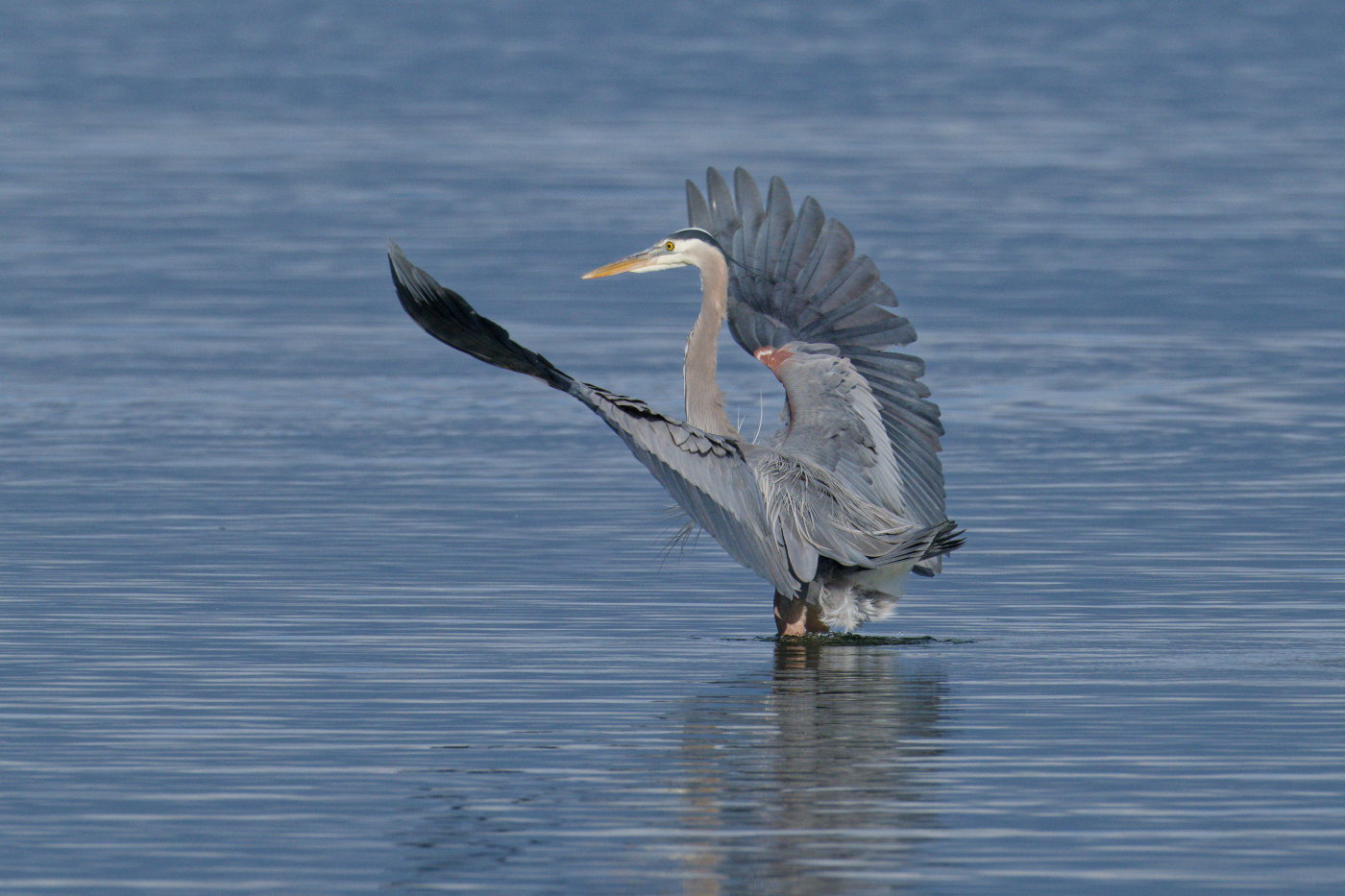
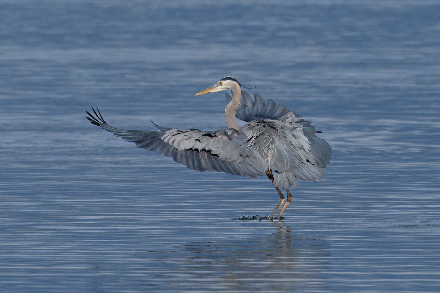
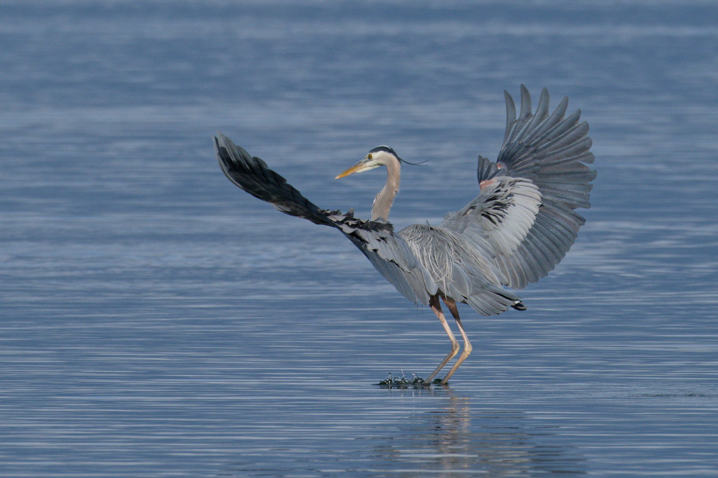
I like additional images 2 and 3 the best. The head is slightly softer than the rest of the heron. You could add a little more sharpness to the head and bill if so desired with enhanced micro-contrast. In the first image, there’s a lighter colored vertical area in the upper rh area of the frame. You can edit that out or remove it via cropping. Otherwise, I like the color and the comps that were presented. Well done…Jim
Thank you for the comments. Here is a repost with the bright spot blended, a -10 unit in the blue water and micro-contrast added to the head of the Blue.